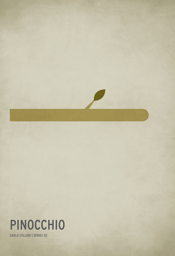
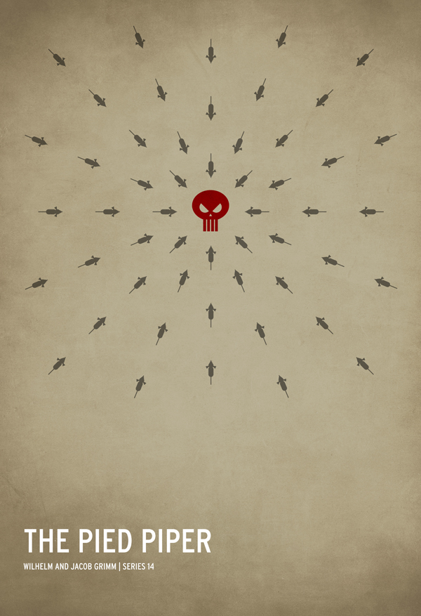
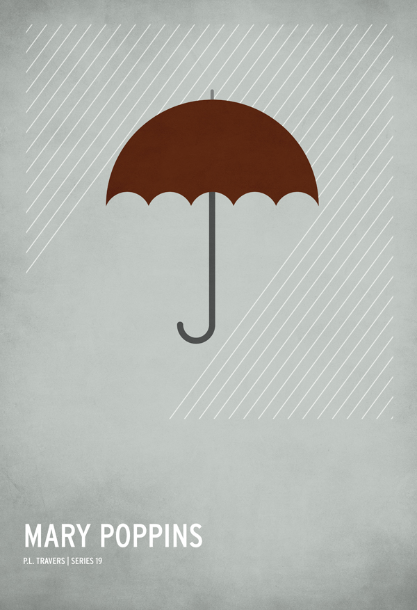
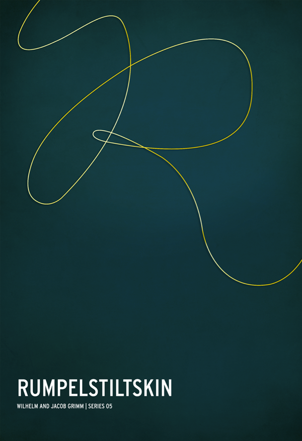
We'll always have a soft spot for minimalist movie posters. (See here, here and here.) But combine classic fairy tales or fables and minimalism and you have something even more special. With just the right amount of cleverness, these posters by Christian Jackson take us back to our own childhood, making us (dare I say) giggle with glee.
Update: After we put up this post, we got in touch with Jackson for the behind-the-scenes scoop. Read that brief Q&A, below.


Why did you decide to illustrate children's stories?
My life was thrown in very childish direction when I became a father a little over 2 1/2 years ago. I guess this series was my way of releasing some of that energy creatively. I can't really say that I “decided on children's stories” my lifestyle pretty much demanded it. When the idea for the posters came to me, the iconic images for each story just sort of poured out. The hardest part was whittling them down to the 15 you see now.
Which one was the most fun to make?
Though it's the last in the series I would say Little Red Riding Hood was the most fun – and the most challenging. There were a lot of “awe” moments in it for me because I didn't know how I was going to represent the story while keeping it minimal. There are so many elements to the tale that seem equally important. In the end it turned out to be the most symbolic and my personal favorite.
Which has been the most popular?
According to sales, Little Red Riding Hood is the most popular. However, as far as web analytics are concerned, The Princess and Pea has been reposted and viewed the most by far.
Any stories you'd like to share about making these?
I'm not sure it's a story, but a lot of folks have been puzzled by the Wizard of Oz poster. The last symbol in particular. And with the recent boom in the popularity of the series this trend has become more apparent.
Since I don't consider myself an artist, I don't care about the mystery or letting the audience interpret the work for themselves, so I'm just going to tell you. Some have guessed it, some are denying it, but most everyone is thinking it. They're balls. Big… hairy… balls.
In the story, the Cowardly Lion was the only one who requested something intangible. So, I had to make it tangible. Coincidentally, it worked out in the overall balance of the design to use an upside-down heart. It still makes me laugh.
How do you stay creative?
I don't know if that is necessarily something that I try to do. When I have creative idea it will nag at me until I give it some attention. So I express it, then I move on to something else. Sometimes it works out in my favor (like this poster series) and sometimes it's just nonsense. Perhaps the answer to your question is that I am taking every idea that I have seriously. Nothing is too small because, in my mind, there is not such thing as a small idea, only ones that have yet to be fully realized. I also give big props to the thriving design community. There is a lot to be inspired by out there.
If I may, I would like to take this opportunity to make an important announcement about the posters. This is the first time this series has been under any real scrutiny by a large audience, and after spending the last 24 hours reading the comment threads on countless blogs, two issues have been brought to my attention. The first is in regards to the spelling of a two of the authors names. The Internet has a couple of different spellings and, apparently, enough people agree that the current versions are not correct.
I'm happy to say that the posters of Hans Christian Andersen and Lewis Carroll have been corrected. If you have recently purchased one of these posters and are unhappy, Image Kind does have a return policy if you'd like to exchange it. Perhaps I'm shooting myself in the foot by admitting that, but I'm more concerned about the happiness of the customer than the buck.
The second issue is in regards to the originality of the Robin Hood poster. I'm not a Modest Mouse fan and I don't know much about their music but it has been pointed out by many that Robin hood looks an awful lot like one of their album covers. After seeing it for myself I have to agree. In my own defense, it was completely unintentional. In fact I find it gratifying that I happened to contrive something so similar to the talent of the artist who created that album cover. I love what I do and I respect the craft. Since they had the idea first I decided to withdraw the Robin Hood poster and replace it with another. It's saddening to me, but I feel it's the most honorable thing to do.
What a stand-up guy. (Love these posters even more now.) I particularly liked how he ended his email to us. “Thank you so much for this opportunity, and thank you to everyone for such an overwhelming interest in my work. I am sincerely flattered.”
You can buy these posters here.