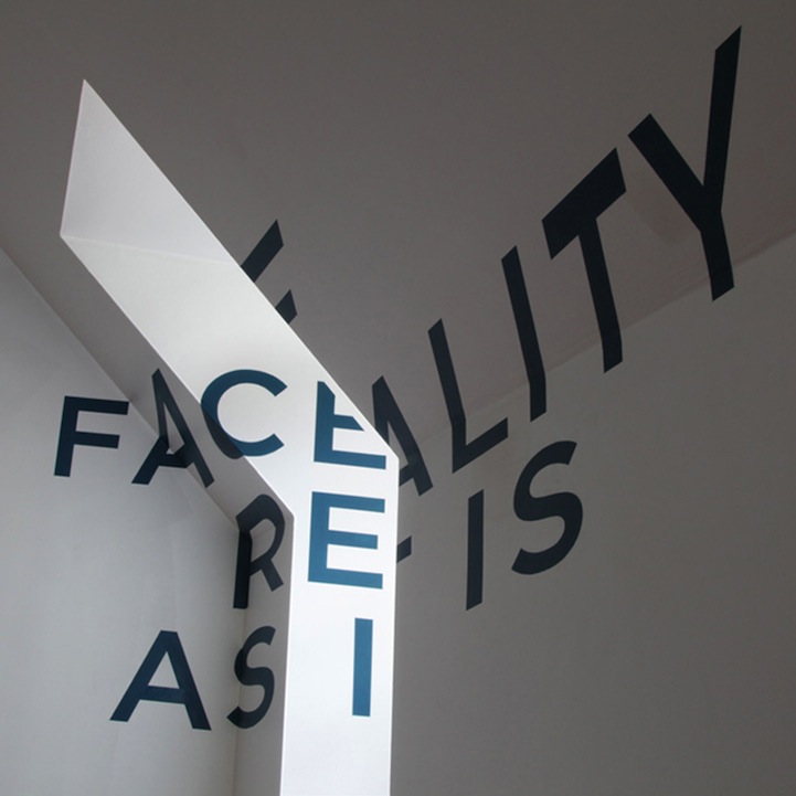
Chicago-based graphic designer Thomas Quinn created this optical illusion on the blank walls of the room above his parents' garage. Typography enthusiasts will just love the complexity of this visual delight! Using a simple sans serif font, Quinn figured out exact shapes and distortions for each letter, making a completed phrase appear perfectly aligned from only one certain point in the room. When viewers move around, they will find that the anamorphic typography actually looks stretched out and warped, and the message is broken from any other angle.
The statement–Face Reality As It Is–is a contradiction of the true reality of the distorted letters. The idea is incredibly thought-provoking and Quinn really has a knack for angles! Watch the video below to see how the letters piece together as you move to the proper perspective.