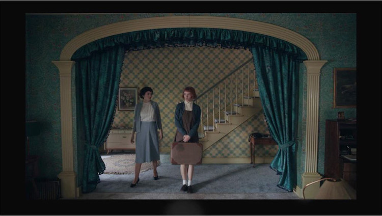
Color is a powerful tool in art. Hues evoke moods and set the tone, which is why choosing the right palette is so important for filmmakers and TV producers. In cinematography, complementary color schemes are often used to achieve striking contrasts that hold the attention of the viewer. One recent Netflix show to do this is The Queen's Gambit, created by Scott Frank and Allan Scott. Martin Kaninsky (of About Photography Blog) recently published an in-depth study on the “Brilliant Use Of Complementary Colors” in the show.
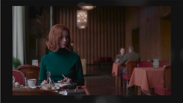
Kaninsky looks at different scenes in the series, and picks out various color palettes that stand out. “When you look at Elizabeth Harmon in the show, what is her color?,” he asks. “The color that defines her, that makes her stand out?” If you’ve seen the show, you know that Harmon’s color is red, due to her red hair. Therefore, according to color theory, scenes with her in it should be paired with green, and that’s exactly what the show’s creators did. Martin picks out moments when Harmon is dressed in green, or when she’s placed in the foreground of a green environment.
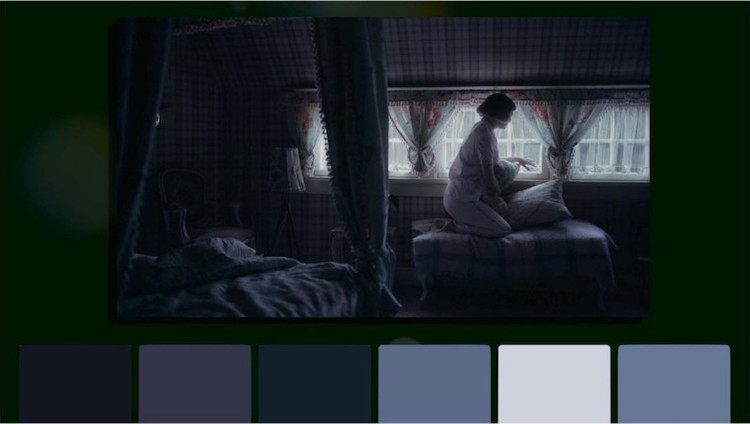
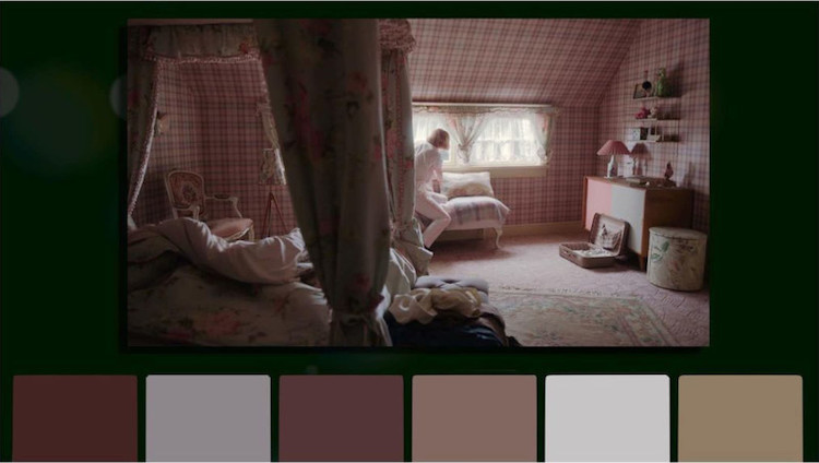
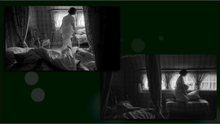
Martin also shares two stills that have monochromatic color schemes—one that evokes a somber mood (with grays and blues) and another that is more bright and cheerful (with various pink tones). He then converted both scenes to black and white, and suddenly, “the emotion is gone.”
Of course, each person interprets the scenes in their own way, but color is a powerful influencer. “I think it’s important to keep in mind that everyone’s eyes are different and that how we perceive colors is on us,” says Kaninsky. “But ultimately, when we theoretically understand how the colors work, it means we can then implement it into our photography to make our shots even better.”
If you want to hear more about what Kaninsky thinks of The Queen's Gambit, you can watch his video in full, below. He talks about the show’s use of framing and composition in this video.
Martin Kaninsky (of About Photography Blog) recently published an in-depth study on the “Brilliant Use Of Complementary Colors” in The Queen's Gambit.
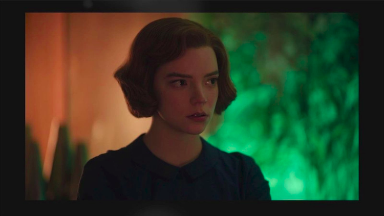
He notes that Elizabeth Harmon's defining color is red, so she's often paired with her complementary color—green.
Kaninsky also highlights two contrasting scenes with monochromatic palettes. One evokes a somber mood…
…and the other is more cheerful.
When the color is removed, the emotions are lost.
About Photography Blog: Website | Facebook | Instagram | Twitter | YouTube
h/t: [PetaPixel]
All images via about photography.
Related Articles:
Design Lover Reveals Striking Color Palettes of Beloved TV Shows, Films, and Music Videos
Cinephile’s Ongoing Project Reveals Color Palettes Found in Famous Films
Learn How Color Theory Can Push Your Creativity to the Next Level
The Color Wheel: Discover the Fascinating History Behind an Artist’s Most Powerful Tool