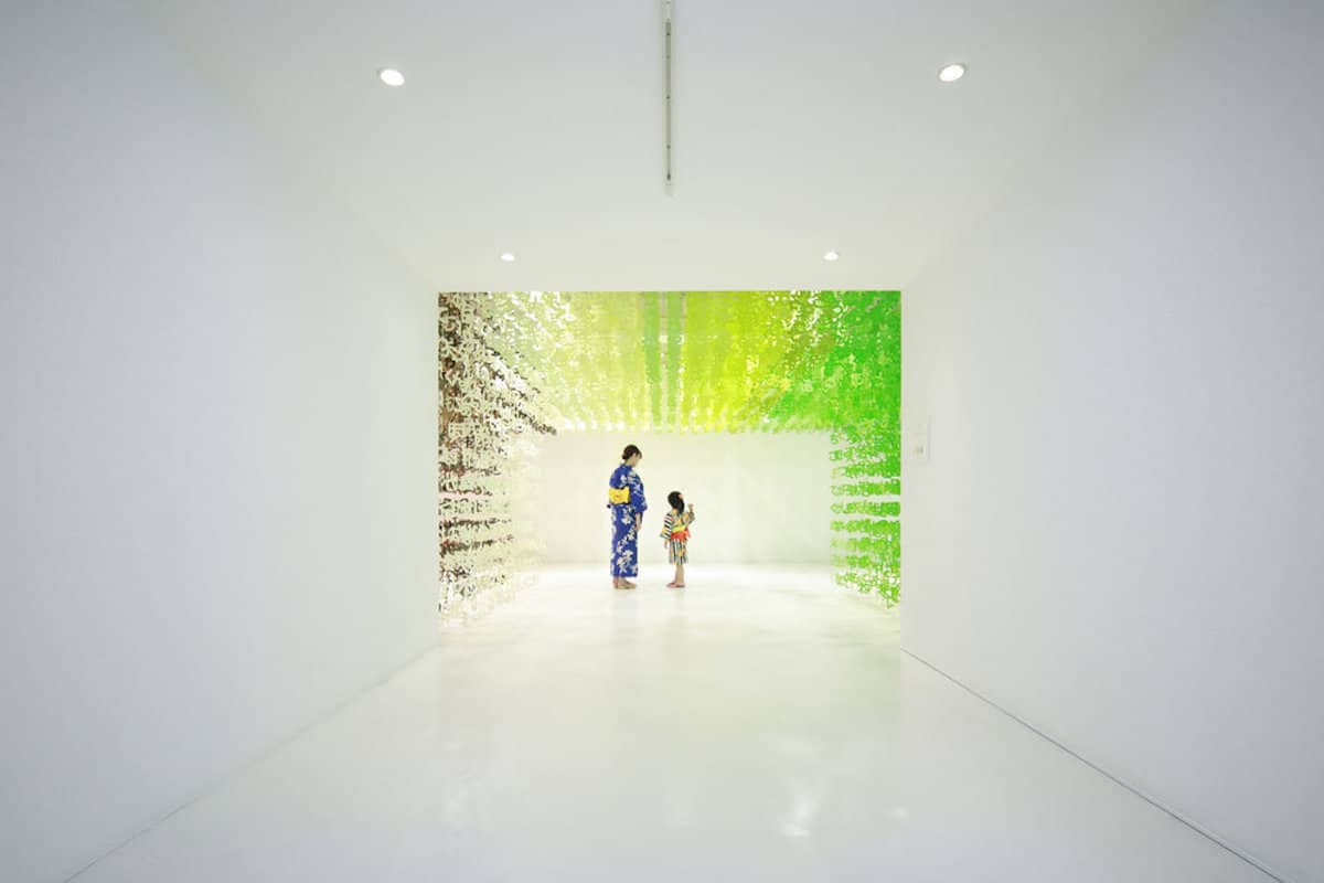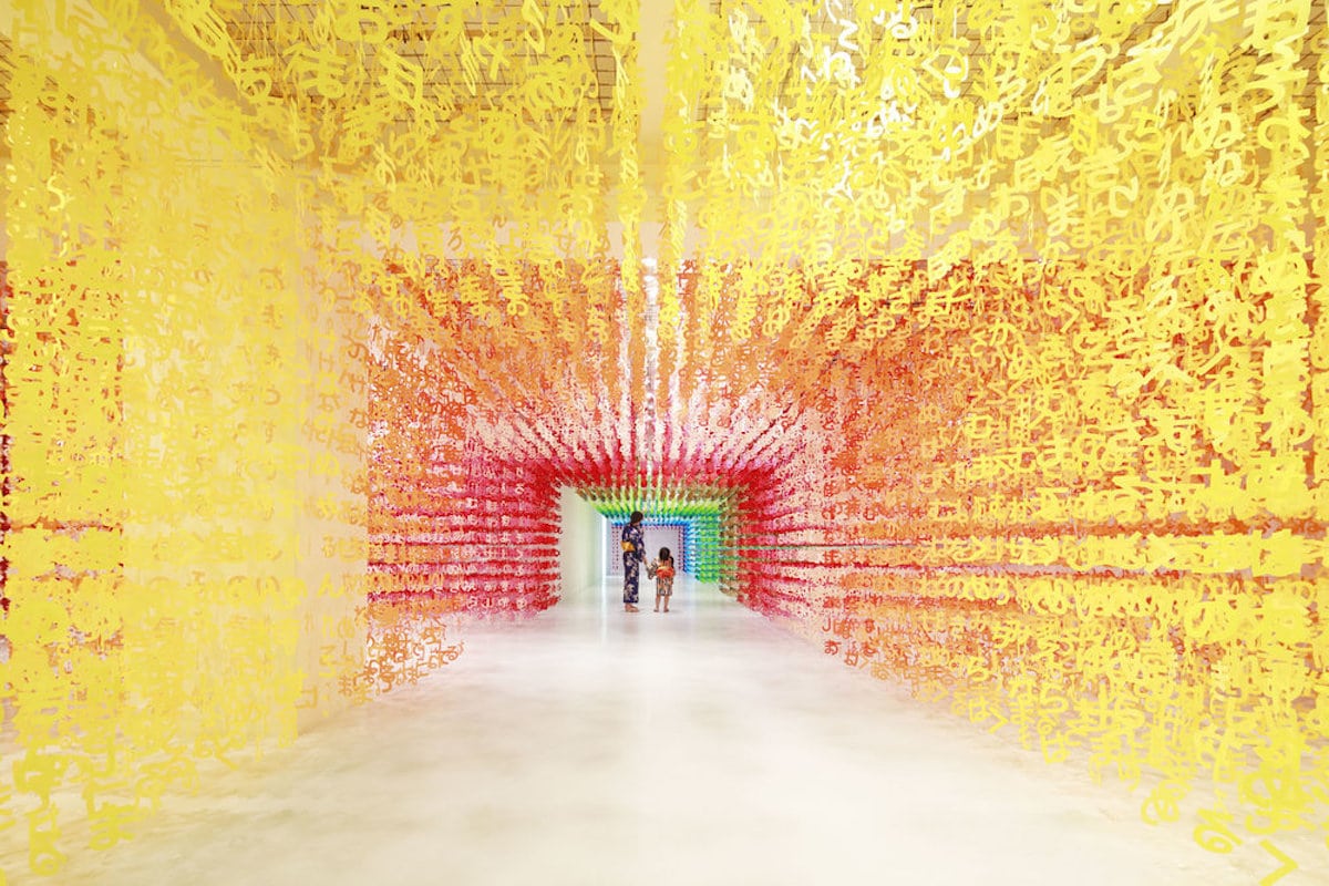
Muted is not a word in designer and architect Emmanuelle Moureaux’s vocabulary. Known for her colorful installations of text that trail from the ceiling, the immersive environments surround visitors in an array of rainbow hues. Numbers and letterforms take on an abstract quality as they dangle en masse around carefully constructed pathways. We've marveled at many of Moureaux's installations before, and her recent Universe of Words exhibition continues upon this engaging format.
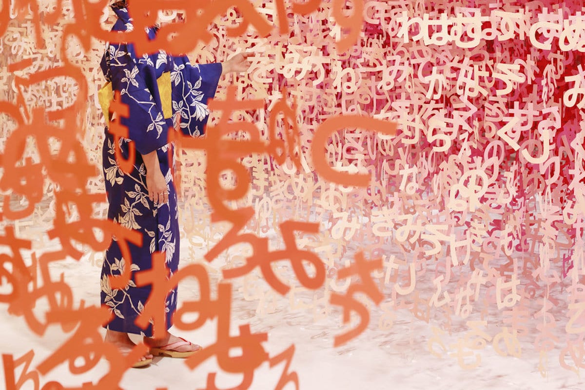
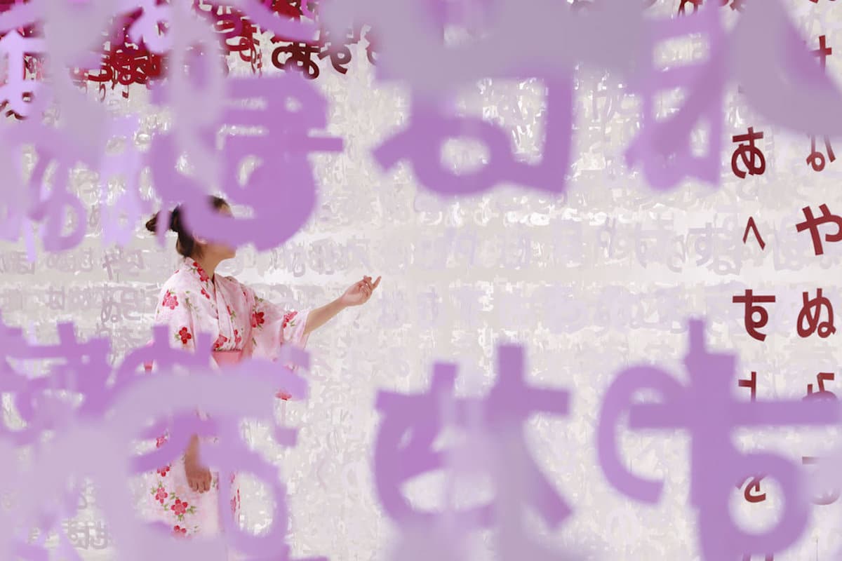
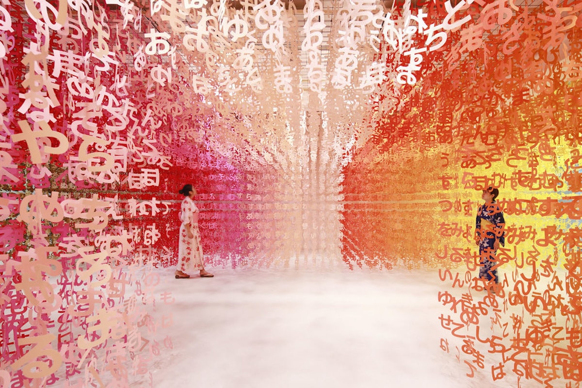
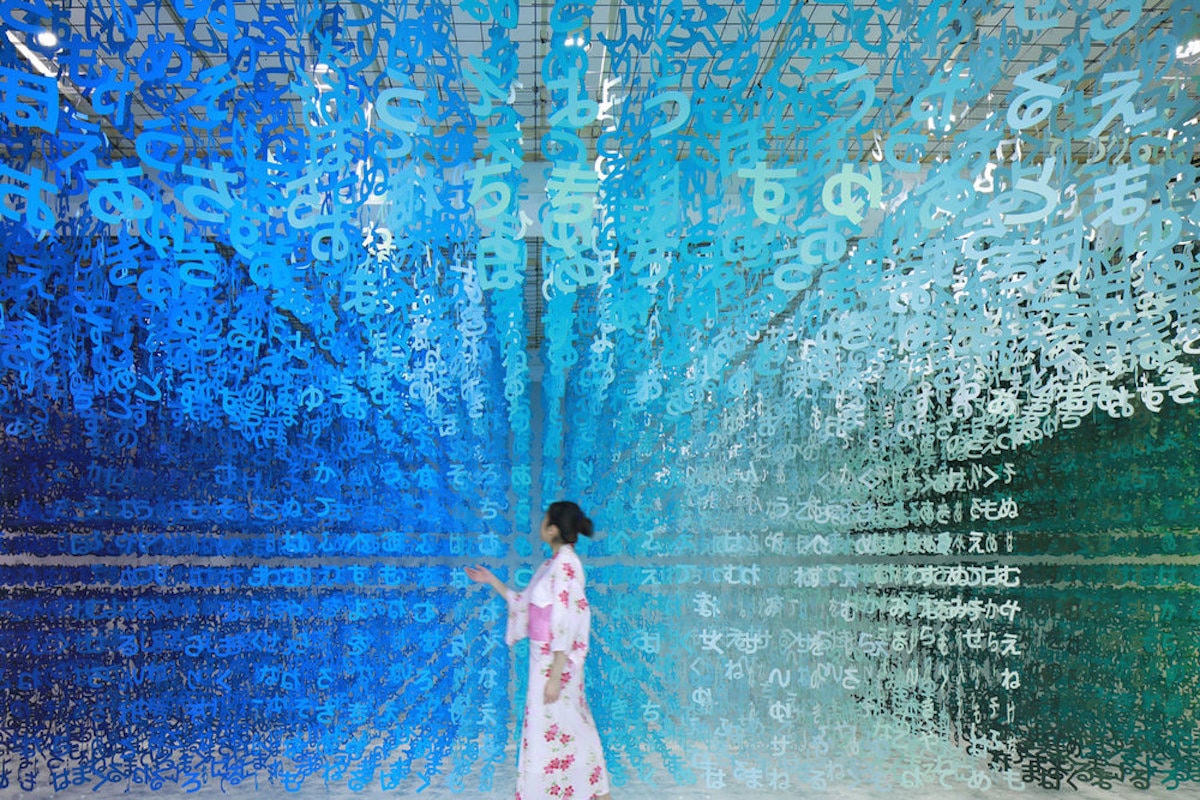
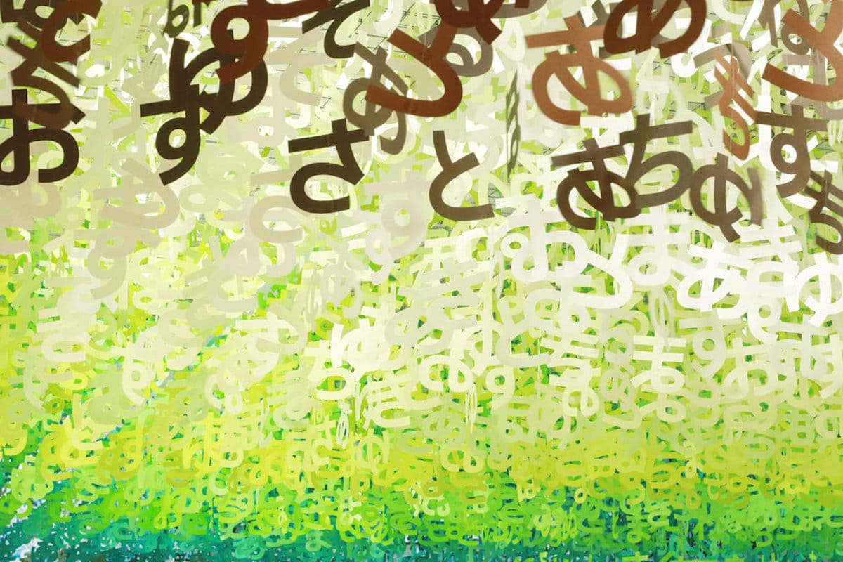
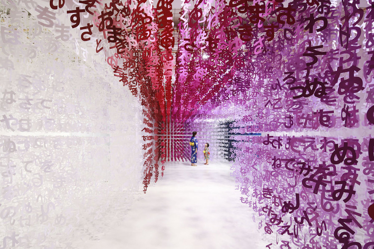
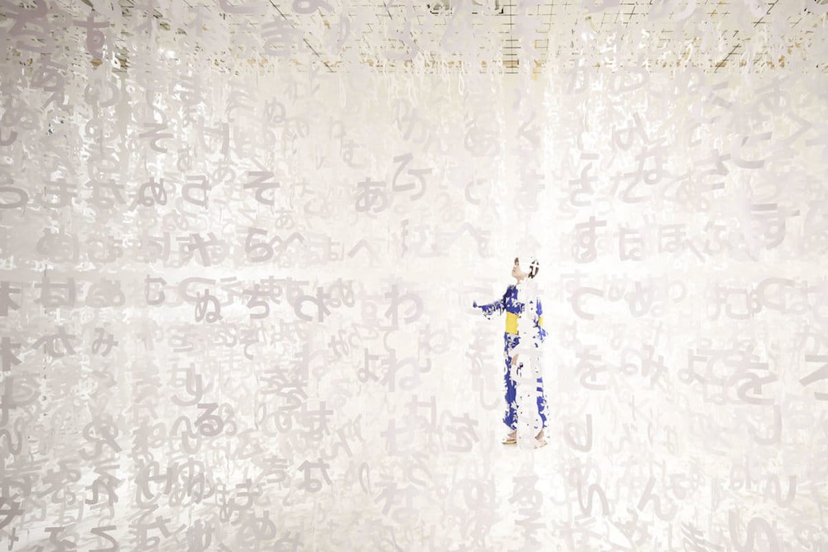
Universe of Words premiered in Tokyo right before Tanabata day—a festival celebrated on July 7 that encourages people to write their hopes and dreams on colored strips of paper and hang them on the branches of a decorated bamboo tree. Moureaux was inspired by this tradition and put her own spin on it. With the essence of the festive ritual revolving around words, she created a massive collection of symbols comprising the Japanese hiragana alphabet—the simplest written alphabet (it's learned by children) featuring 46 characters.
Moureaux composed about 140,000 hiraganas in 100 shades of colors. They were aligned in three-dimensional grids with space for viewers to wander and wonder. The atmosphere was tranquil and intended to evoke emotion—especially as visitors consider their own hopes and dreams.
Universe of Words is part of Moureaux's ongoing 100 Colors series, and the installation fits perfectly within her overall intentions for it. “I want people to breathe and immerse in 100 shades of colors, to see colors, touch colors, and feel colors with all their senses,” she tells My Modern Met. “I want people to feel color with their entire body.”
We spoke with Moureaux about Universe of Words and more. Scroll down to read our exclusive interview.
Can you walk us through the planning of what goes into immersive exhibitions like Universe of Words?
All my installations require a lot of time, approximately one year, from concept development to production. When I start a project, I first decide the number of colors I will use (Universe of Words is part of my 100 Colors series so one hundred colors). At the same time, I study the concept by writing and sketching, for usually two or three months. When the concept is decided, we create in my studio a lot of real scale models to study the best size of one module, the best distance between each module, to feel the design with all senses. Then, we make drawings for production. Everything is made by hand and is prepared prior to the setup. It means a huge time and the participation of a lot of people.
The elements in Universe of Words are made of paper. Where do you find such colorful materials, and what do you use to cut out the different letterforms?
Materials are not important to me. Only colors matter. The absolute condition in the choice of material is to be able to obtain the beauty of colors I want, by painting, dyeing, and so on. I have thousands and thousands of colors in my studio. I find my colors everywhere. It might be a beautiful blue in a page of a magazine that I will give to the paint or dye factory. It is important for me to “collect” as many colors as possible. The production techniques are secret…
You've lived in Tokyo for over 20 years. What inspired you to relocate to Japan?
When I saw the cityscape of Tokyo for the first time when I was a student, I was so impressed by the colors in the city, thousands of colors seem floating in the cityscape, as layers, as three-dimensional elements. It was as if the first time I saw colors. I was so overwhelmed that it made me decide to move to Tokyo.
How does the city inform your work?
The colors and layers I feel in Tokyo were the inspiration to my design concept of “shikiri,” which means dividing (creating) space with colors (“shikiri” is a made-up word that literally means “to divide space using colors”). “I use colors as three-dimensional elements, like layers, in order to create spaces, not as a finishing touch applied to surfaces.”
From this experience, for me, Color is a medium to create space and emotion. With colors, I try to give emotions to people. Tokyo is my inspiration and my source of energy.
Your work is known for its incredible use of color. Do you ever want to use a more muted palette?
No. “Multicolor” is my favorite color. Using a multicolor palette is essential for me in order to feel the depth, rhythm, and of course emotions. The colors I use are inspired by the bright colors I see in the cityscape of Tokyo. Vivid colors can make people smile, give energy, joy, and most importantly they make people happy.
I unveiled my first 100 Colors installations to mark the 10th anniversary of my studio in 2003. I create a space with the most beautiful 100 colors I created to express the emotion I felt from seeing colors and layers of Tokyo. In daily life, people are usually not conscious of color. Although people can distinguish millions of colors, people are living among the limited classification (name) of colors, such as yellow, orange, pink, red, green, blue, and so on. This situation is evident when people are asked to choose their favorite color, as they tend to name one color from the rainbow hue. I wanted to create an installation where people can see 100 shades of colors in one glance. You never have the opportunity to see in one space at the same time 100 colors. Also, 100 is a familiar number (100%, 100 points, etc…). I chose the most beautiful (for me) 100 shades of colors to create my own personal 100 colors palette. I want people to breathe and immerse in 100 shades of colors, to see colors, touch colors, and feel colors with all their senses. I want to people feel color with their entire body.
Have you ever struggled with feeling artistic burnout or a creative block? How did you get past it?
I would say no. Because I take the time necessary to find (the best for me) concept and design for each project. It is not easy, I need time. When I have no idea, I stop thinking and I walk in the streets of Tokyo.
What are you working on now? Anything exciting you can share with us?
An art installation Slices of Time for NOW Gallery in London starting next February, the opening of The Mass Rapid Transit “Circular Line” in Taiwan (I’ve been working on since 2011) and other super exciting projects I would love to tell you but it is always difficult to announce in advance for confidentiality reasons. I can tell you for sure that you will soon encounter 100 Colors somewhere around the world!