Animating the Mercator projection to the true size of each country in relation to all the others.
Focusing on a single country helps to see effect best.#dataviz #maps #GIS #projectionmapping #mapping pic.twitter.com/clpCiluS1z
— Neil Kaye (@neilrkaye) October 12, 2018
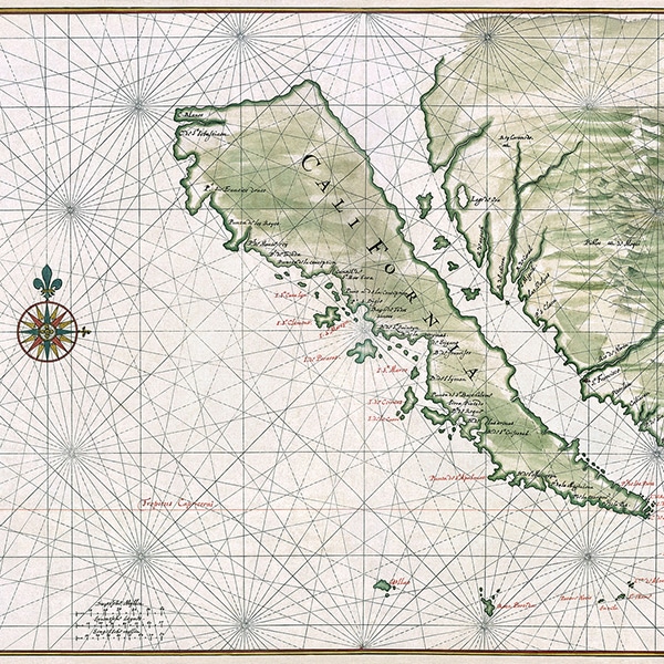
As most of us know, the world map we grew up with isn't exactly the most accurate vision of the world. Currently, the Mercator projection—which was created by Flemish cartographer Gerardus Mercator in 1569—is the standard map projection. Though we've known for quite some time that this projection significantly distorts the size of landmasses, for nearly 450 years nothing better has become the standard.
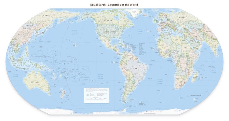
More than just a cartography error, many critics have said that the Mercator projection is a visual representation of Eurocentricity and historic colonialism, as Africa and South America appear much smaller than they actually are. But there are signs that things are starting to shift. In August 2018, a group of cartographers released the Equal Earth Projection, which is a compromise between the Mercator and other projections that keep true area size.
You know how it goes… @MtnMapper gets an awesome idea, @mappingbernie makes this great tool, @MtnMapper explores with it, I do some math magic, and a new #mapprojection is born. 🌎🌍🌏
Presenting the #EqualEarthProjection: https://t.co/FphpBj6E5a pic.twitter.com/T0vZbKbaPO— Bojan Šavrič (@BojanSavric) August 8, 2018
If you still aren't sure what all the fuss is about, climate data scientist Neil Kaye released a GIF that demonstrates the issue. The animation quite effectively shows just how enlarged certain landmasses appear in the Mercator projection, particularly as you move away from the equator. For instance, while Greenland appears to be larger than Africa, the reality is that it's 14 times smaller. In actuality, Greenland is roughly the size of Algeria.
Some schools have also been making the shift away from using the Mercator projection in the classroom. In Boston, 600 public schools received new maps that use the more accurate Galls-Peters world map. The Galls-Peters projection is also widely used in British state schools, showing that the tide is shifting when it comes to how we view the world.
The new Equal Earth Map is an attempt to create a more accurate, legible alternative to the traditional Mercator projection.
h/t: [IFL Science!]
Related Articles:
Eye-Opening “True Size Map” Shows the Real Size of Countries on a Global Scale
Fascinating Map From 1942 Features Oceans as the Main Focus of the World
Map Reveals Where Modern Countries Would Be Located If Pangea Still Existed
Interactive Map Lets You Pinpoint Your Address on Earth Millions of Years Ago