If you ever thought that your work or school notes had to be boring, then take a look at these by Amanda Wright. The London-based user experience designer opens up her sketchbook, not only sharing with us some interesting facts in an amusing way, more importantly, she also gives us a different perspective and a deeper look on how we interact with the technology that surrounds us.
User experience design is a highly multi-disciplinary field, incorporating aspects of everything from psychology and sociology to computer science and graphic design. Christian Crumlish, curator of the Yahoo! Design Pattern Library, explains that design “isn't about cosmetics, pixel-pushing, and button placement. It's holistic and it's everyone's concern, not just the realm of ‘artistic' types.”
I got in touch with Wright to ask her why chose to share her personal sketchbook notes with the world. Read that interview below after enjoying her enlightening bits of wisdom.
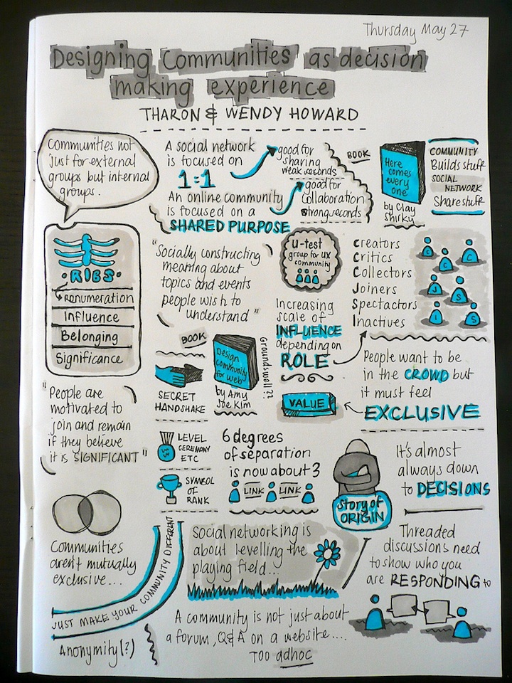
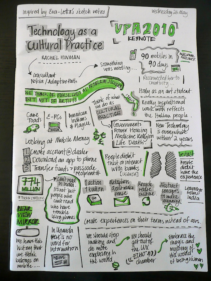
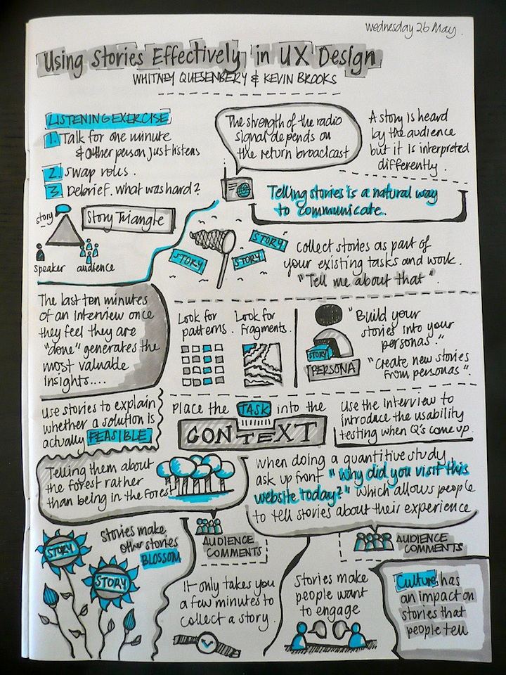
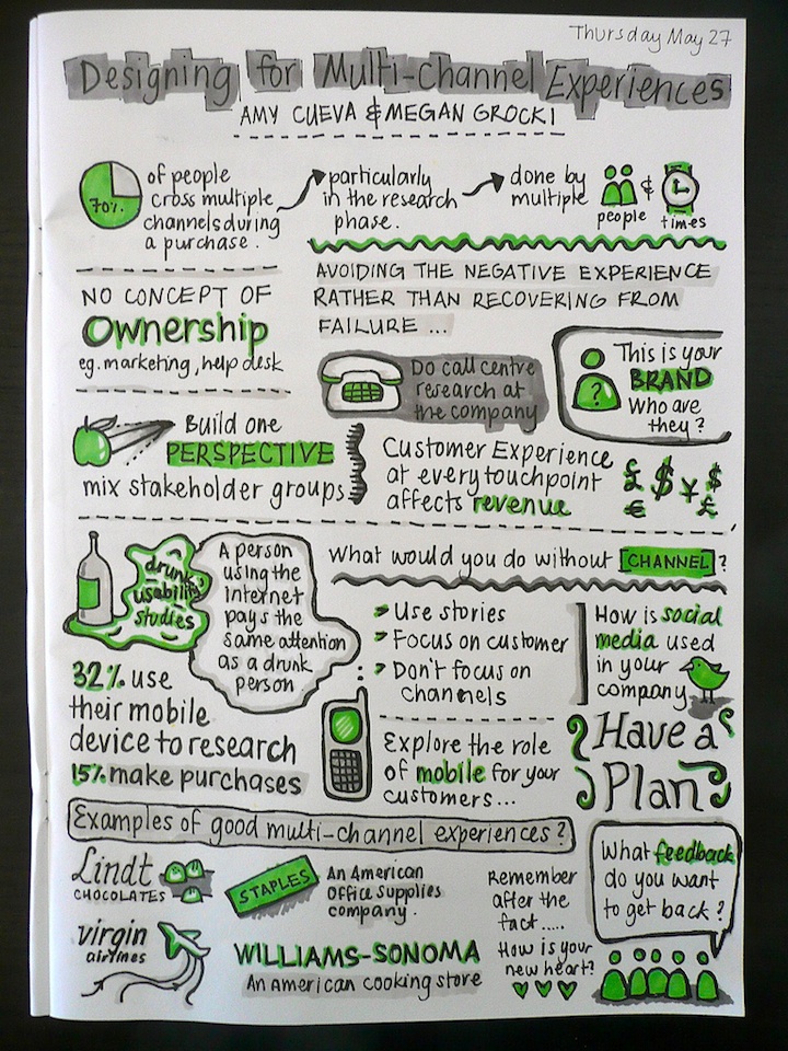
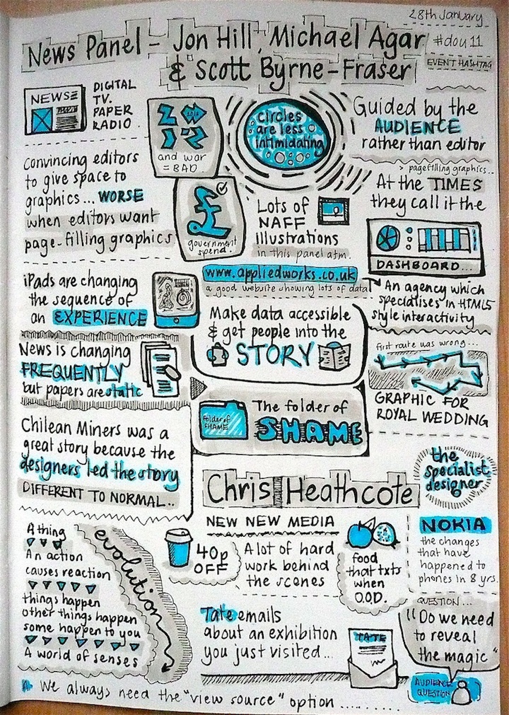
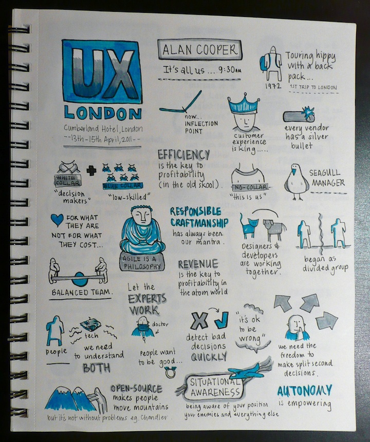
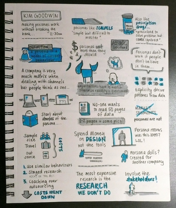


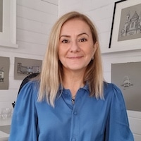
Can you please introduce yourself and give us your background.
I grew up in Perth, Australia before upping sticks to London at the tender age of 22. I came here having never left Australia, never lived out of home and not knowing a soul. I told myself I had to stick it out for at least a year but it's been almost eight now.
I live in East London with my husband (Bradley Wright) and I'm now working for a company called RMA Consulting. Prior to that I was Lead UX for Yahoo! Answers. Outside of work, I love traveling, cooking, going to restaurants, art galleries and cycling.
What's it like being a User Experience Designer and how did you come across this profession?
First off, it's hard work. There is always more to learn and absorb. It's not a 9-5 job that you leave behind when you leave the office!
Secondly, it can be frustrating as depending on the environment you are in, you still need to educate people about the value of user experience. Finally and probably the most importantly, it's incredibly rewarding. When you do a good job for your community or clients and their customers, it makes all the hard work worth it.
I came into User Experience Design in a rather roundabout way. I did a three year qualification in Graphic Design & Multimedia and then got a job at an ISP and a small agency in Perth doing web design and development work. I moved to London where I freelanced for just under a year before being hired by a company called Investis. My boss there taught me a lot about information design and after a few years there I moved onto Yahoo!. It was there that I realized there was a name for the things I'd been doing all along. Yahoo! may get a lot of flack in the press but working there changed my life – I met my husband, a lot of my closest friends are Yahoos and I call myself a User Experience Designer because of my time there.
Why did you decide to share your notes with others?
I'm always sharing stuff online, whether it's through my @cookingthisweek twitter account, uploading photos to Flickr or writing restaurant reviews, it's just what I do. The sketchnotes look way better than normal conference notes too – Less boring!
What have you learned by doing so?
That I should be more confident about my work! I'm always a bit hard on myself. It's also given myself a chance to evaluate my style – see what works and what doesn't.
What's the best comment or email you've received?
A comment from Louis Rosenfeld on my sketchnote from his UX London talk here. He's one of my UX heros – I have the Polar Bear book and every single Rosenfeld Media book! So that really made my day.
What do you hope others will get out of your notes?
Hopefully that they will be encouraged to have a go at sketchnoting themselves. Otherwise, it's nice to think that people will learn something from my sketchnotes, we can't all go to every talk or conference and this is a nice way of sharing learnings.


