Photo: Jake Hicks
The ability to expertly use color is fundamental for creatives, but what happens if you are colorblind or your color literacy is low? Freelance photographer Jake Hicks tackles this topic on his blog, focusing in on how subtle color shifts can make a big difference in the work of any artist. Hicks is also a lighting specialist and runs international training sessions on studio lighting, giving him a high level of expertise on the topic.
In the digital age, photographers spend an inordinate amount of time thinking about color, calibrating their monitors and pouring over color casts to make things “perfect.” But, as Hicks points out, color is subjective. What happens if you are a creative who is colorblind or color challenged? Not much. There are plenty of successful creatives who are either colorblind or have difficulty distinguishing color, but it doesn't hold them back.
We chatted with Hicks about his interest in the topic and why artists are so obsessed with color. After getting his thoughts on the matter, we'll dive into how he says color literacy does (and doesn't) affect creative work, as well as some tips on ways to measure your own color IQ.
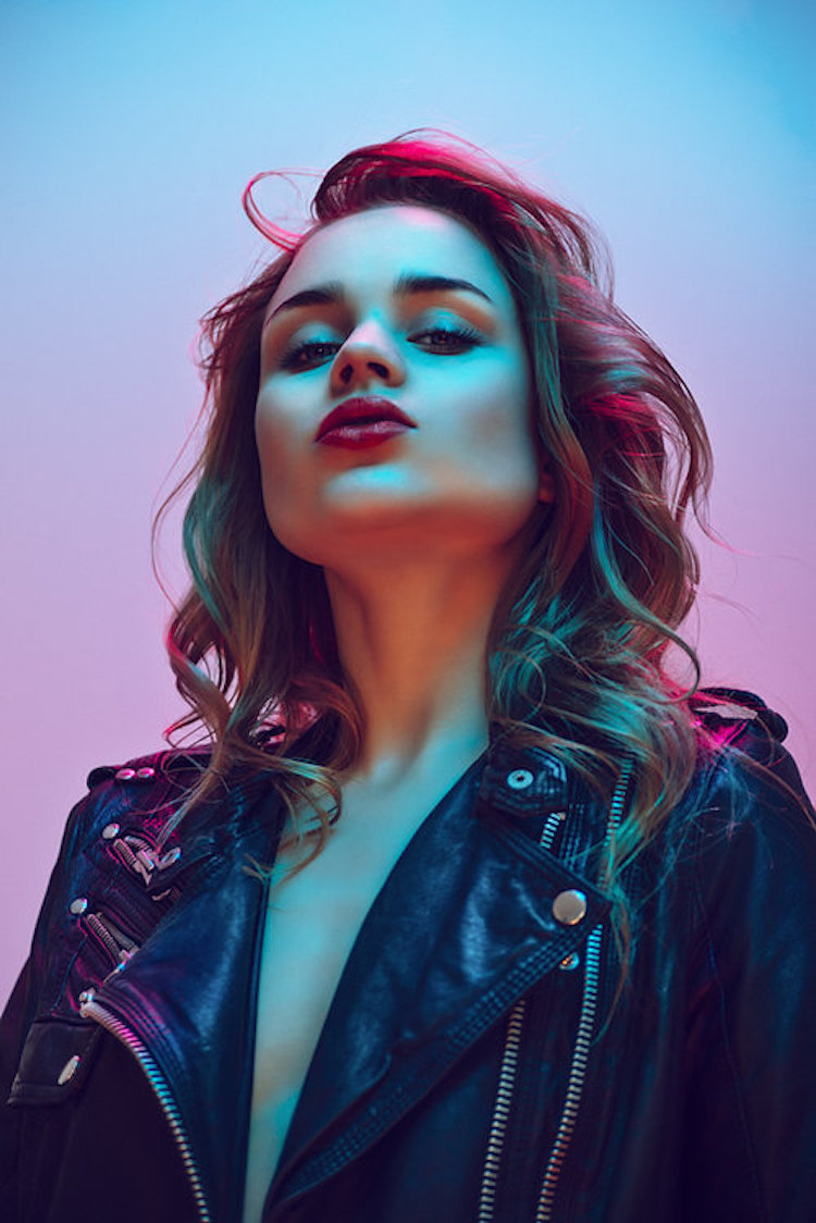
Photo: Jake Hicks
What inspired you to write about this topic?
My reason for wanting to discuss the topic of color blindness was based around some confusion I was seeing from other photographers on the subject. For a lot of photographers that shoot color work, we have to deal with color casts, white balancing issues as well as the final, and very personal color grading/color toning.
I know a lot of people struggle with this level of color work when they start out and it can seem very frustrating to think colors in a shot looks good one day, but terrible the next. I wanted to highlight that our ability to determine the subtle variance in colors is a skill that can be learned over time with experience. We are born with color blindness, we can't develop it or catch it so if you're not color blind you can, and you most certainly will be able to develop a better understanding of color with experience.
It's like a chef having a very acute awareness of flavors or a musician being able to hear very subtle changes in music, these are skills we learn and we are very rarely simply born with them.
How does color literacy inform your own work as a photographer?
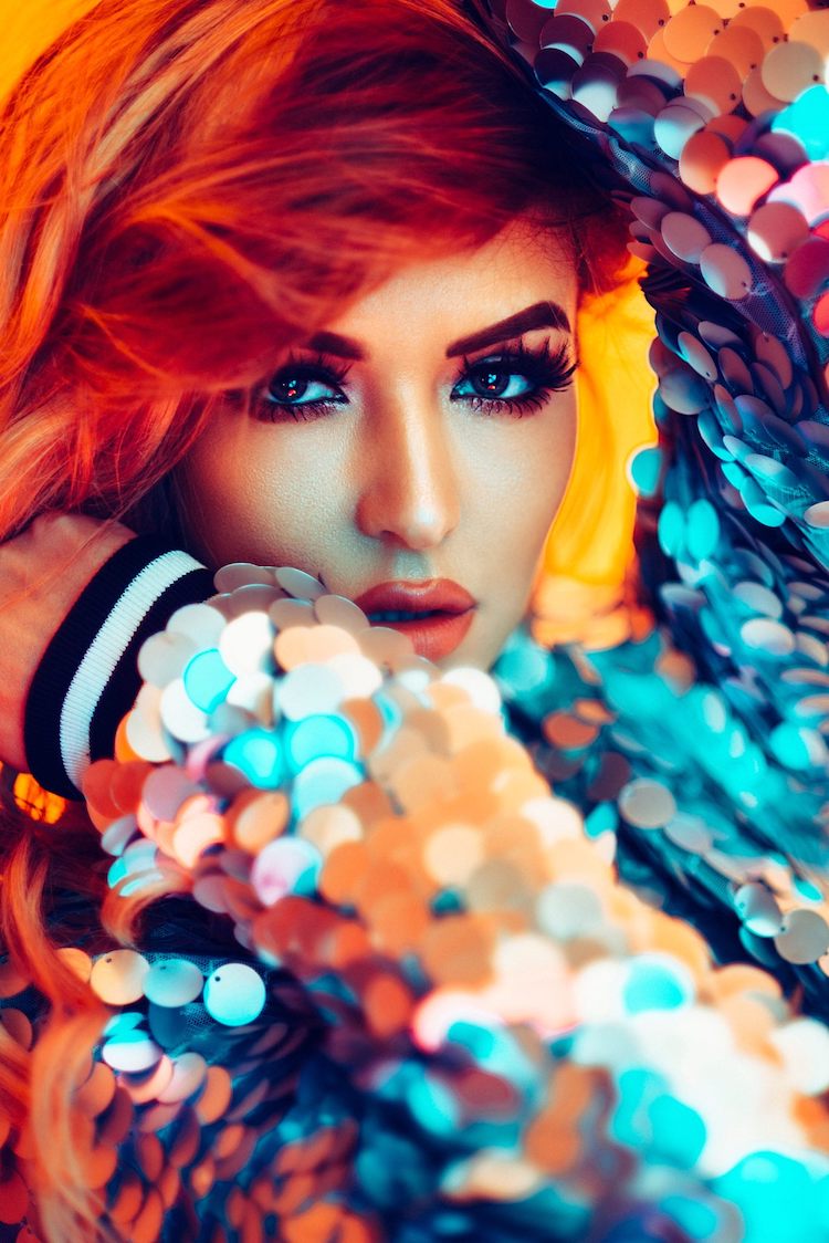
I think it's fair to say that color plays a pretty fundamental role in my style as an artist, but a lot of the time, the colors used in my photography are done by an instinct of what visually looks good to me, not what the color wheel recommends. I feel the ability the paint people in obscure colored lighting forces the viewer to dispel belief a little of what is expected in a shot.
If you look at a lot of modern superhero films, you'll see the same idea being applied with the colored lighting as well. Had the characters not been wearing silly outfits and flying about the screen, the colored lighting used in the shots would feel sorely out of place. But because the viewer is already suspending their belief thanks to the story and characters, the colors complement the setting rather than feel out of place. Japanese anime does this as well to drive impact in a scene, and it's their heavy use of color that first influenced me in my work.
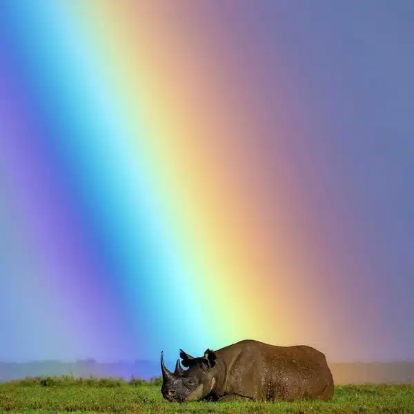
In a world where we see thousands of new images a day, getting the viewers attention is becoming harder and harder and my use of artificial colors in my lighting is one way to make somebody stop and look.
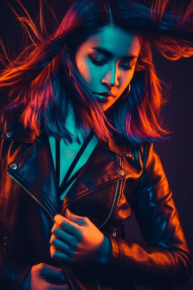
Photo: Jake Hicks
Why do you think it's important for artists not to be too hung up on their own color perceptions?
I think there are fewer things in this world that are more subjective than color. There is no way whatsoever we can fully understand what our viewers will see when they look at color in our work. Everybody sees color differently and not just at a hue level but at an emotional level too. Even if we could see exactly the same shade of red as one another, that red will have a different meaning to you as it does to me. I personally feel we need to be less hung up on what the “correct” white balance or color cast is and take back the confidence to portray the color we personally feel looks best.
There are plenty of color-blind artists now and in the past that have not worried about what is “correct” and only produced the work that they wanted to produce. If anything, it's them that has the edge, they have the ability to see the world in a different way and it always fascinates me when they share that vision unencumbered by what they think they “should” be sharing.
Here are some thoughts on color literacy by professional photography Jake Hicks.
Colorblindness is genetic, but even if you have it, it won't hold you back as a creative.
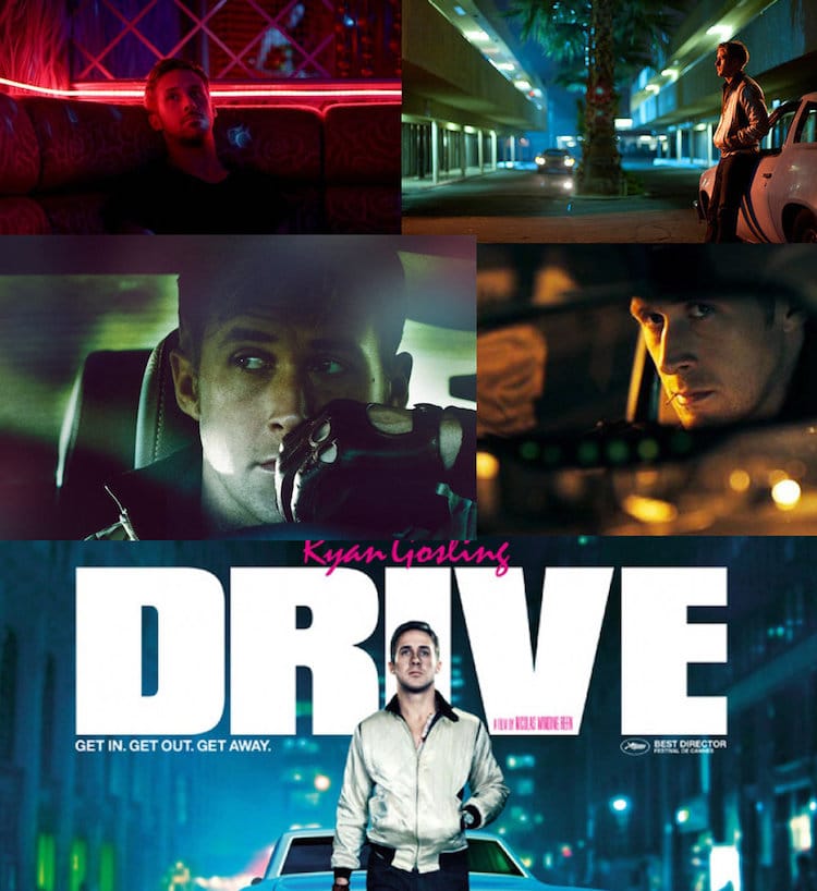
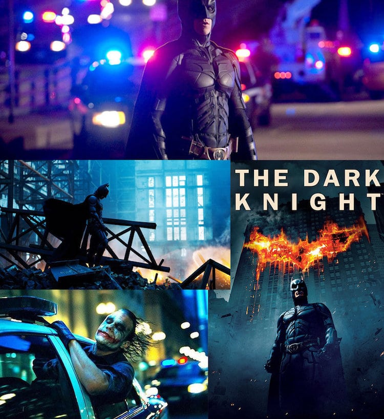
Just because someone is colorblind, it doesn't mean they can't use color creatively to great effect. Hicks points to two successful colorblind directors, Nicolas Winding Refn and Christopher Nolan, as prime examples. Both use color to set a particular mood in their films, with Hicks calling Winding Refn's Drive “one of the most visually powerful films in recent history.”
Christopher Nolan's The Dark Knight is one of the most celebrated Batman films. A big part of its impact is Nolan's ability to use incredible cinematic color to pull out different aspects of a film that mainly takes place in the darkness of night.
If you're color challenged, you can train yourself to get better over time.
Realistically, most people aren't colorblind—it's primarily a genetic disorder—but simply have some deficiencies in distinguishing subtle color differences. The good news here is that this is something that can change over time with practice. Hicks uses one of his photographs, before and after color casting, to get this point across.

Photo: Jake Hicks
“The above image may look okay to some of you and in all honesty, this would have looked perfect to me too 20 years ago,” he writes. “But experience tells me that there are a few concerning color factors present in this shot. The shadows are looking a little sickly with a slight cyan/green tinge and the highlights are a little yellow. Let’s dial in some corrections and see if we can get closer to something the looks more desirable.”

Photo: Jake Hicks
“With the color adjustments made, I’m feeling a lot happier about the overall shot and the skin tones now visually look more appealing. Some of you may actually prefer the previous version, and that’s totally fine too. More importantly though, at no point did I say I was trying to make this look accurate or perfect. I personally believe that’s a fool errand, as making it look perfectly accurate is technically impossible.”
The bigger picture is that color is a creative choice. What looks good to one photographer might not work for another. By allowing artistic license when playing with color, creatives can allow themselves to experiment and refine their skills into something that reflects their own personal vision.
Interested in your own color literacy? Here are some online tests to see if you are color challenged.
Ishihara Test
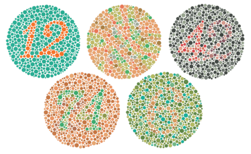
This classic test for colorblindness was first published in 1917. It tests for red-green color deficiencies by asking you to look at colored plates and read the numbers that appear.
Take the test
Farnsworth-Munsell Hue Test
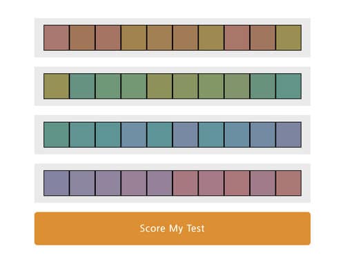
For most, this test will be far more challenging than the Ishihara. You'll be asked to arrange different hues on a color chart, which will push you to see how well you can do in distinguishing small differences between colors.
Take the test
Farnsworth-Munsell 100 Hue Test
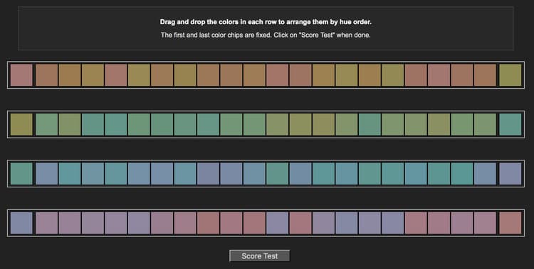
Did well with the first Farnsworth-Munsell? Take things up a notch with this advanced version, which asks you to arrange 100 hues across four color strips.
Take the test
Jake Hicks: Website | Facebook | Instagram | 500px
My Modern Met granted permission to use photos by Jake Hicks.
Related Articles:
Take This Pantone ‘Color IQ Test’ to Find Out Your Level of Color Vision
Challenging Color Test Hides Letters in Plain Sight
Learn How Color Theory Can Push Your Creativity to the Next Level

