Color is one of the seven elements of art and one of the first things we learn in school. Understanding the basic primary colors and how they blend is an activity found in most elementary school classrooms, but that’s just one piece of a much larger field known as color theory.
Used by painters, graphic designers, interior decorators, and anyone working in visual culture, color theory is an essential part of any creative’s toolkit. By understanding the principles of color and the science behind how we perceive different hues, creatives are able to mix, match, and blend a wide range of colors to please the eye and appeal to human emotions.
Scroll down to learn the basics of color theory.
History of Color Theory
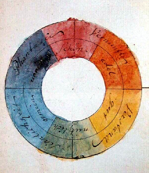
Color wheel by Johann Wolfgang von Goethe, 1809. (Photo: Luestling via Wikimedia Commons, Public domain)
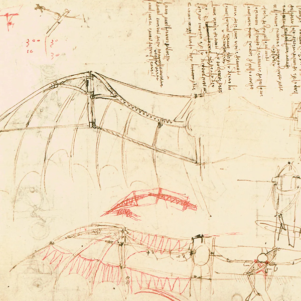
While it may seem like basic color theories have always existed, that’s not the case. Of course, colors like blue have been around since ancient times, when the Egyptians learned how to create permanent pigments from minerals. Even Leonardo da Vinci explored color principles in his extensive notebooks. However, it wasn’t until the 18th century that color theory began to formally take shape.
Initial explorations in color were from a scientific point of view. Sir Isaac Newton, in his 1704 book Opticks made a breakthrough in proving that light was made of different colors. Controversial at the time—as it was thought that pure light was colorless—his experiments became important stepping stones for color theory. He even organized an early color wheel based on the color combinations he saw when refracting light waves through a prism.
Later publications, The Theory of Colours by German poet Johann Wolfgang von Goethe and The Law of Simultaneous Color Contrast by French chemist Michel Eugene Chevreul, are considered the founding documents of color theory. Published in the early 19th century, they deal with color psychology and chromatic aberration, and they further refined the color wheel.
At that time, color theory was based on RYB primary colors, which defined red, yellow, and blue as the colors capable of mixing all hues. This is the scheme most commonly taught in grade school and is still used in mixing paints. Later scholars would switch to an RGB (red, green, blue) and CMY (cyan, magenta, yellow) models as advances in technology increased the range of synthetic pigments in photography and printers.
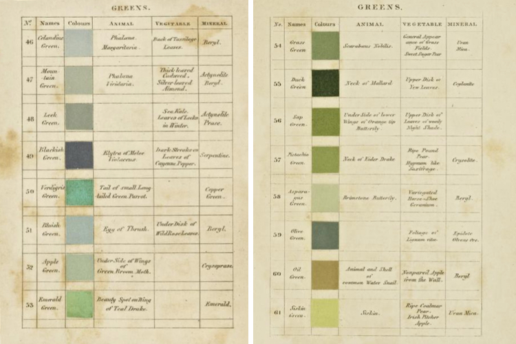
The 19th century brought about many books on color theory and how it can be applied to the visual arts. Authors often looked to nature for the hues and tones that make up the color wheel and their publications are still coveted color manuals today. For instance, Werner’s Nomenclature of Colours, which is also available online, was used by Charles Darwin as a scientific tool. First published in 1814, each color was given a poetic name like “Velvet Black” and it listed where the color is found in nature.
By 1901, when Emily Noyes Vanderpoel wrote her revolutionary color manual Color Problems she incorporated industrial items into her research. Vanderpoel looked at everything from teacups to plants and used grids to break down the colors found in each object.
Today, color theory is all around us. Let’s take a look at some of the basic terminology and principles to help you make the best color choices for your next creative projects.
Primary Colors

Primary colors are hues that can be mixed to produce a wide gamut of colors. As we’ve already learned, there are different sets of primary colors depending on what mixing model you are using. Most of us are familiar with the red, yellow, and blue (RYB) primaries, which are taught to children when they are acquiring basic art skills. These are still the primaries that most painters, artists, and interior designers use today. The RYB model is an example of a subtractive color model. Subtractive mixing is when inks, colorants, or pigments form new colors by absorbing some parts of the visible spectrum.
Cyan, magenta, and yellow (CMY) are also subtractive primaries. Typically used in color printing, traditional red and blue were substituted with magenta and cyan over time as technology advanced and these pigments allowed for a wider range of colors. CMYK is also the name for the printing process itself, with the K standing for “key ink.” This is typically a black that helps pull out artistic detail, as the black achieved by mixing the three primaries is grayer.
The last model used is the red, green, and blue (RGB) system. RGB is an additive color model, which begins with darkness and uses different colors of light mixed together to achieve white. We most commonly see this model on computer and television screens. Photographers will also be quite familiar with working with an RGB color profile when editing images to be used online and switching over to a CMYK color profile when printing.
What is a Color Wheel?
RYB Color Wheel
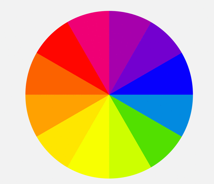
Now that we understand different types of primary colors, we can begin to understand the color wheel. As old as color theory itself, the color wheel originated with Sir Isaac Newton’s color circle published in 1665. The theory behind a color wheel is that it shows the relationship between primary, secondary, and tertiary colors, all evenly spaced in a circle.
Using the common RYB model as an example, we can see a color wheel with red, yellow, and blue spaced evenly around a circle. Corresponding secondary colors (green, purple, and orange) sit evenly between the two colors they are mixed from. So, in the case of RYB we see green between blue and yellow, purple between blue and red, and orange between yellow and red.
The circle is rounded out by tertiary colors, which are created by mixing one primary color with one secondary color. For instance, teal would be considered a tertiary color using the RYB color wheel, originating from a mix of blue (primary) and green (secondary). If you keep mixing you’ll get quaternary and then quinary colors, eventually getting into shades of grey.
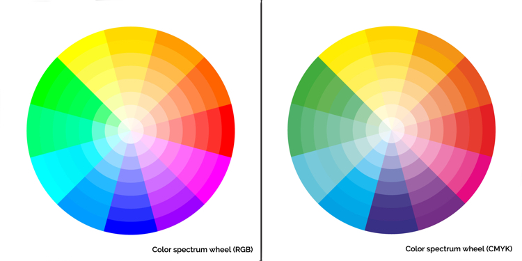
These basic color wheel principles work for CMY and RGB, just with different results. Interestingly, in CMY, red and blue become secondary colors, as opposed to their role as primary colors in RYB. Color wheels can be as simple or complex as you’d like and, over the course of history, many scholars created beautiful color wheels to show the full range of hues found in the world.
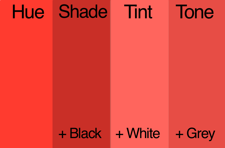
Some color wheels will also go into detail about variations on the pure color, or chroma. Moving toward a white center they may show different tints of the pure color. A tint is achieved by the addition of white. Or, they may focus on demonstrating different shades, which are achieved by adding black to the pure color. You may even see some that display different tones, which is when grey is added to the pure color. Tints, shades, and tones are helpful depending on the color effect you are looking for. For instance, tones tend to be more subtle.
Warm Colors vs Cool Colors
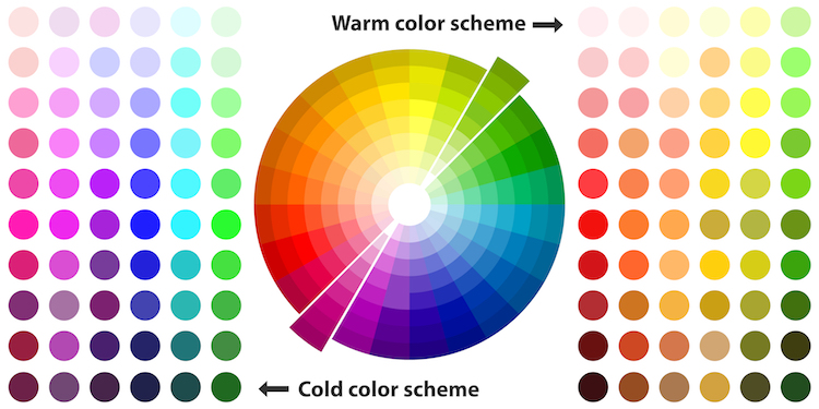
Draw a line down the middle of any color wheel and you’ll separate warm and cool colors. Color theory has assigned psychological differences to warm and cool colors. Warm colors, which include red and yellow hues, as well as more tans and browns, are said to “advance” in art. Associated with sunset and daylight, they are often perceived as inviting and stimulating. Cool colors, which include blue-green to blue-violet are said to “recede” in art. Cool colors, like light blues, have links to overcast, wintery days and are considered calming and relaxing.
Cool and warm are also relative, meaning you can have a cool red and warm red depending on what side of the pure color they sit next to. For instance, reds with more orange to them will be considered warm, while reds with more purple and blue undertones will fall into the cool category.
Color Harmony
Once you have a handle on the basic primary color models and how the color wheel is organized, it’s time to see how you can use color theory to your advantage. Those adept at color theory will have an easier time selecting color palettes for their projects and more easily achieve the results they desire. So whether you are picking out a piece of art for your home, painting your walls, or creating a new website, understanding how to create a successful color scheme is a must.
Complementary
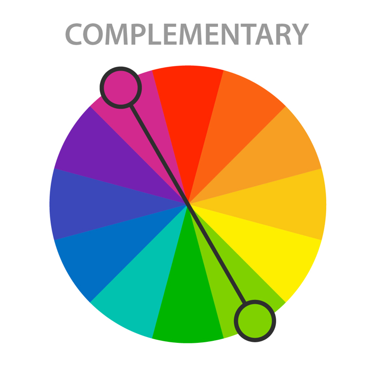
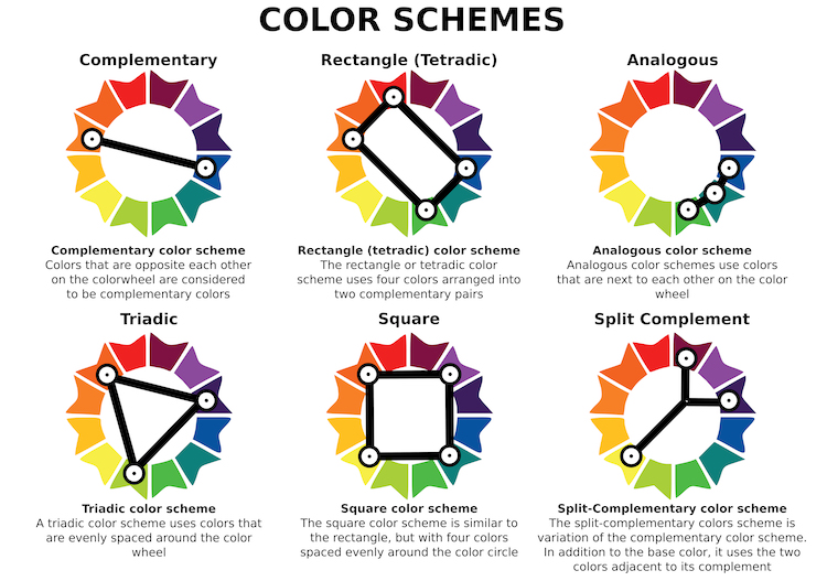
Complementary colors are two colors that sit directly across from each other on the color wheel. Red and green, for instance, are complementary colors. A color scheme based on complementary colors will be quite vibrant, as the two colors contrast against one another. The stark contrast can make it difficult to work with on a large scale; but, used in small doses, it’s a great way to pull attention to a particular area.
Analogous
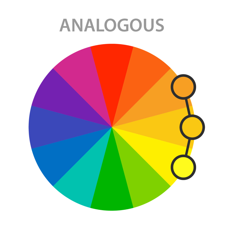
Analogous colors sit directly next to one another on the color wheel and can be very effective in creating a calm, serene feeling. Analogous color schemes can often be found in nature and when used, typically one color dominates. The second color supports the dominant color, while the third is used primarily as an accent. The colors are already harmonious, so you'll want to be sure there is enough contrast to make your design pop.
Triadic

While not the easiest color scheme to use, if done right it can yield great results. Draw a triangle on the wheel and you'll hit on three colors equally spaced apart. For instance, purple, orange, and green (the secondary colors). Triadic colors are quite vibrant and rich, so to use a triadic color scheme effectively, you’ll want to choose one dominant color and use the other two as accents.
Split-Complementary
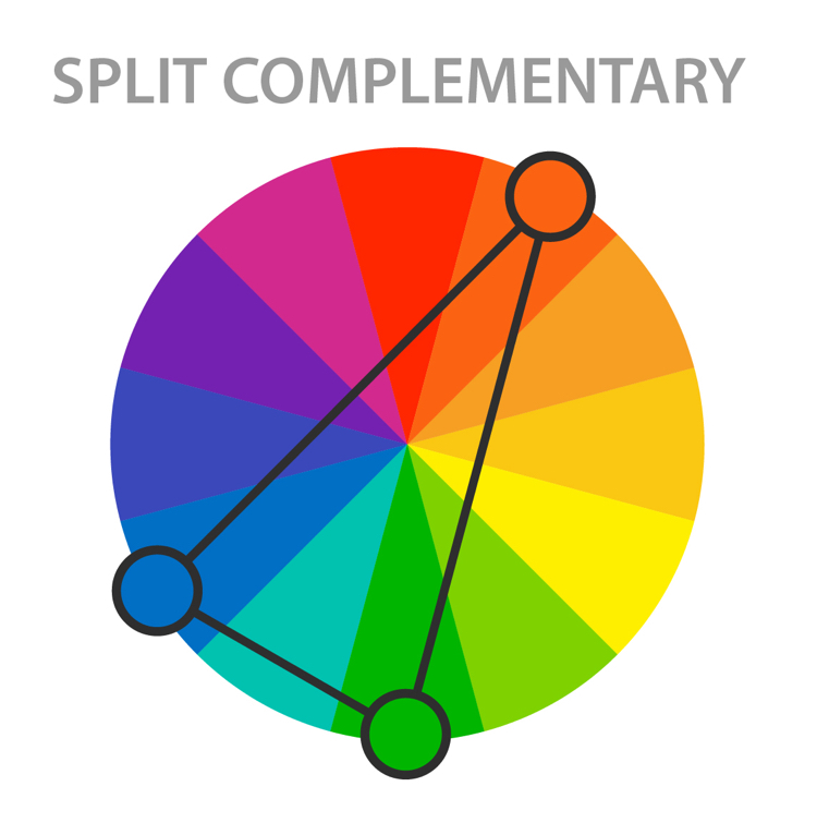
This variation on a complementary color scheme is often used because it’s a little less jarring. Instead of drawing a straight line across the wheel, a split-complementary color scheme uses one base color and two additional colors that are adjacent to the base color’s complement. So, if red-orange (vermillion) is the base color, the other two colors in the scheme would be blue and green. The results are still vibrant, but as the contrast isn’t so strong it’s easier for beginners to work with.
Tetradic

This rectangular color scheme uses four colors broken into two complementary pairs. This rich color scheme can be tricky to manage but allows for a lot of variety. It works best if one color is dominant or if the colors are subdued. By using all colors equally, the overall design may appear unbalanced. Another characteristic to consider is the balance between warm and cool colors.
Square

The square color scheme also uses four colors, but this time they are all spaced evenly around the wheel. Similarly to tetradic colors, this palette works best if one color dominates and the others are accents. Otherwise, it can look sloppy. Attention to warm and cool colors is also a must here.
Achromatic

Often used to create a clean, minimalist look, an achromatic color scheme exclusively uses black, white, and shades of grey. Designers will often throw in an accent color to create interest or break up the neutral design.
Monochromatic

A monochromatic color scheme takes one hue and creates a design based on different tints, tones, and shares of the hue. This color scheme allows for cohesion and relies on contrasting tones to attract attention or create focus.
Books on Color Theory
Frequently Asked Questions
What is color theory in simple terms?
Color theory is the science of how we perceive different hues and the creative way in which artists mix, match, and blend a wide range of colors to please the eye.
What are the 7 basic color schemes?
The seven basic color schemes are complementary, analogous, triadic, split-complementary, tetradic, square, achromatic, and monochromatic.
This article has been edited and updated.
Related Articles:
Top 5 Free Color Palette Generators to Make Color Selection a Breeze
33 Art History Terms to Help You Skillfully Describe a Work of Art
Design Lover Reveals Striking Color Palettes of Beloved TV Shows, Films, and Music Videos
20 Best Watercolor Paint Sets Both Beginners and Professional Artists Will Love