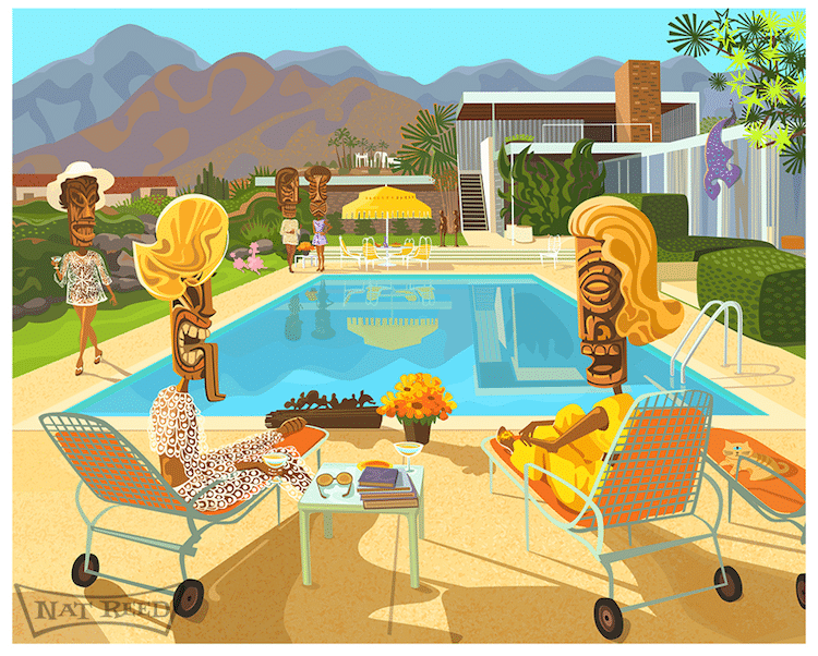
“Thiasus of the Atom Mull it Over by a Pond”
Artist Nat Reed creates retro-inspired illustrations with a surreal twist. Inspired by the mid-century modern aesthetic, he has taken this iconic post-war design period—particularly its architecture and industrial design—and interpreted it through what he calls “Familiar Modern.” But Reed is not interested in simply regurgitating the past. Instead, he uses its motifs as a way to explore how the lives of “tiki-human hybrids” and two-legged pink poodles interact with futuristic buildings influenced by the Atomic Age (also known as Googie).
Reed’s colorful illustrations are stylized with bold shapes and vibrant color, with details that offer a peek into individualized interiors that speak to the personality of their inhabitants. This idea is influenced by Reed’s coming-of-age in southern California, and how the places he experienced stick with him today. “When I grew up, there were many more individually owned restaurants dotting streets and highways,” he tells My Modern Met, “competitively playing on themes in unique ways that could stamp a person’s consciousness for their whole lives.”
Reed held many non-creative jobs, including several government positions, before becoming a full-time artist. While many might feel discouraged, for Reed, they proved invaluable. Working as a letter carrier in the city of Fullerton, California, for instance, allowed him to covertly research its incredible architecture on a daily basis. It's a great reminder that even if you aren’t yet on your desired career path, other jobs can provide unexpected opportunities to help get you there.
We had the pleasure of speaking to Reed about his work, including more about his family of beachcombers and where his art is headed today. Scroll down to read our exclusive interview.
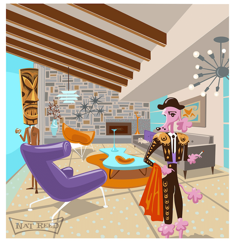
“Gilded Longings in the Atomic Age”
You worked non-creative jobs prior to working full-time as an artist. What kind of jobs did you have?
I had several government jobs. The first was a maintenance job at the Orange County sanitation district (sewer plant). I applied there for a summer job after taking a tour of the plant with a class. The plant was built in the early sixties and I was absolutely enamored with the control center. The circular glass front, UFO-like observation structure was straight out of a Japanese Godzilla movie. There were classic space-age dials, meters, and screens set in a beautiful Jetsony control console that matched the curve of the building. I was completely in love with it and for a very brief time studied wastewater engineering so that I might work in the control center…that didn't last long.
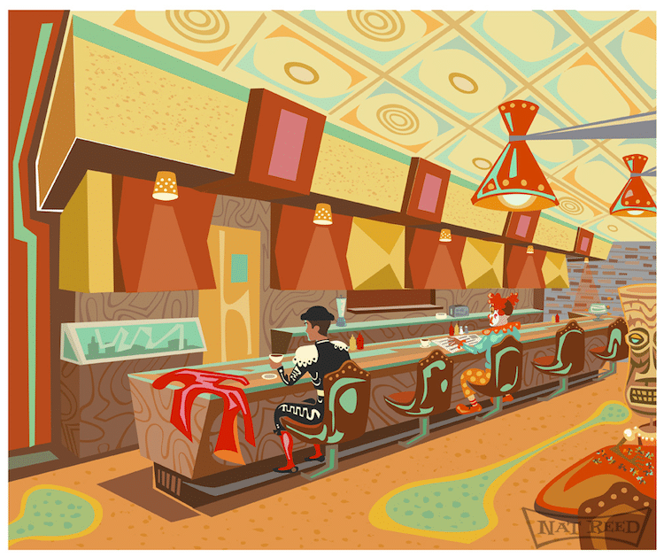
“La Villa Basque”
How have these positions influenced your art making?
The job that I worked at the longest before taking up full-time as an artist was as a letter carrier for the post office in the city of Fullerton, California. It was very informative to an already strong interest in post-war architecture and design. Fullerton was a city that saw a lot of post-war development and walking daily among these houses and buildings gave me such a great opportunity to meditate on their design and details. At the time there were still quite a lot of houses—little changed from their fifties and sixties original incarnations and commercial buildings that maintained their integrity in their doorknobs, mail slots, paneling, light sconces, breeze block, signage, etc. Being a shy person by nature, averse to attracting attention to myself by loitering around houses and buildings, it was great to be practically unnoticed in my daily secret inspections of the structure’s aesthetic qualities.
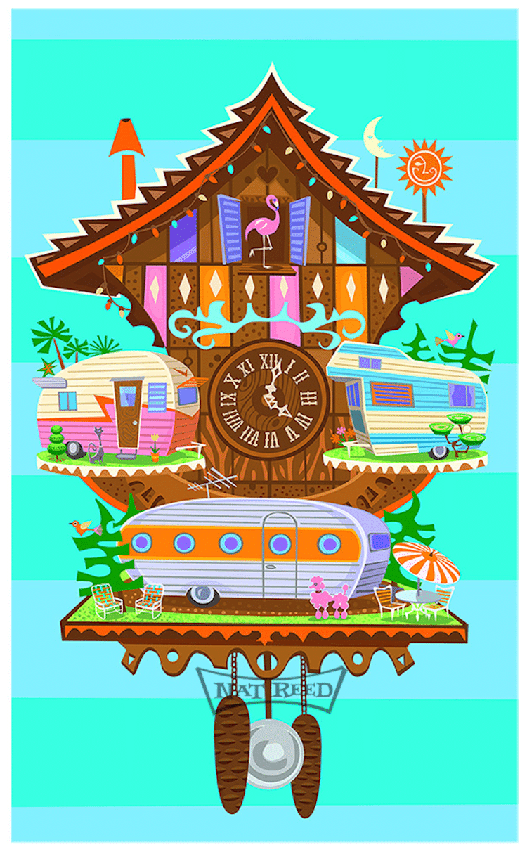
“Cuckoo for Caravans”
You grew up in a family of creatives. What did they teach you about being an artist?
Ha! They taught me almost nothing formally. The influence came more from the valuing of creativity and originality and the making of interesting things. Everybody was always creating something and the tools to do that were around and if they weren't you made them.
Do you feel like you've followed in their footsteps or forged your own path?
I think I've followed the ethos of my family, in the way I perceived it. My mother’s family came out to California from Oklahoma in the thirties and knocked around until they hit on beachcombing, which led to my grandfather, Eli Hedley, having a magical career as a tropical decorator and tiki carver in the first heyday of Tiki culture. It was all without a plan, propelled by a passion for the unusual and beautiful as it was encountered. That's the sort of organic journey I've been on with my art. It's been a pretty unconscious progression that brought me to this body of work. My father was born to Italian immigrants before the Depression and became a commercial artist, but his real passion was sailing and boats. When I was seven, he packed the whole family off to Denmark where we moved aboard an 87′ cargo sailing ship that he bought. It was a year that my sisters and I had to learn to entertain ourselves with no TV or even school. We got very good at conjuring up fantasy worlds to amuse us.
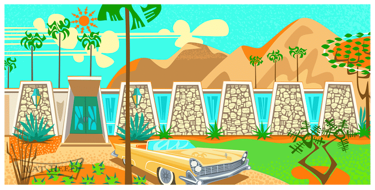
“Levitt Schawrtz House”
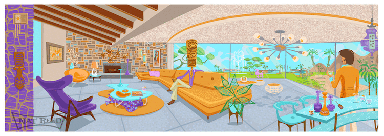
“The Bachelor”
How would you describe the idea of “Familiar Modern?”
I came up with that idea when I realized that most every physical artifact, mostly architecture, I was referencing was appealing in part because it sparked fond and familiar associations to times and places.
It occurred to me that it's not just the optimistic MCM [mid-century modern] style in itself that is so appealing but also its evolved connections to specific places and recollections. You see less and less of that of now because of hyper conglomeration among retail service businesses, particularly in food. When I grew up there were many more individually owned restaurants dotting streets and highways, competitively playing on themes in unique ways that could stamp a person’s consciousness for their whole lives. That's hard to come by these days when a corporate office somewhere is manufacturing the look and feel of a retail business to be spread across the entire country or world. That's only familiar in the way of vague background noise.
How does Googie influence your art?
The attitude of Googie has a strong influence on my work. I'm most often trying to tap into that sort of goofy, un-ironic, optimism for the “space age” future.
What about Googie is interesting to you?
The sweeping exaggeration of dramatic design elements that you see in Googie and Populux, can lend a cinematic sense to a composition.
There's also the democratization of modernist design aspect of Googie that I think is an interesting subtext to play on.
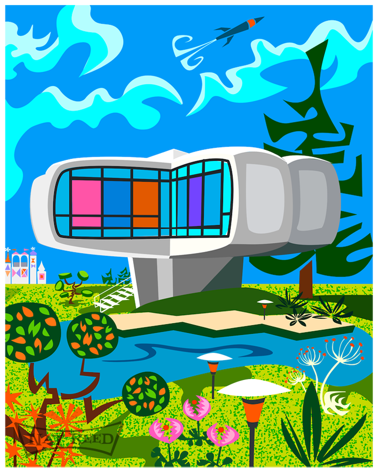
“Utopian II”
What's your process like to create your images?
Usually, I'm referencing real architecture. I usually work with multiple pictures of a building—interior or exterior—and from these, start to resolve what is the most dynamic gesture(s) I can play on and exaggerate. At that point, the scene I'm creating has already bubbled up somewhere in my head. The other decision is whether or not to inhabit a scene with any sort of characters, which is always just instinctive. I start with a concept sketch but draw the piece digitally. The largest part of my work is prints. The pigment inks in this process have really bright hues but I crank up the density to make the pieces super rich and poppy. All the printing is done in my studio and is a big part of how I get the results that I do in the finished pieces.
Your work touches on nostalgia but is also a bit surreal—particularly with the additions of the figures wearing tiki heads. What is the significance of adding these type of elements to your images?
Yes, the handling of nostalgia in my work is far from pure. I don't want to make postcards of the past. It's interesting that you ask about “figures wearing tiki heads” because that's not the way I think of them, rather I think of them as tiki-human hybrids who are simulacrums of people, implying that, while you can speculate about their participation in a scene there is also a mysterious, foggy part of them that can't exactly be read through regular social assumptions. It's a space for fantasy and the surreal. When I started doing this work, I was right away attracted to revisiting the pastiches of the exotic from post-war commercial art—bullfighters, poodles, tikis etc. In my mind these re-imagined, or maybe regurgitated, figures, become symbols of an aspect of post-war culture. Adding pastiche on top of pastiche is one of my favorite things. I'm extremely attracted to the work of Lari Pittman who does it so brilliantly.

“Malibu Modern”
You have a gallery of your work in Palm Springs. What is it like running that and creating artwork?
It's been a lot of work and really gratifying. I think that most artists would prefer to control the presentation. It's the icing on the cake, to create the environment for my framed environments. It's also informative to have so much contact with viewers of the work and hear what's speaking to them in the work. It's also interesting when people read a piece completely differently from that way in which I was seeing it.
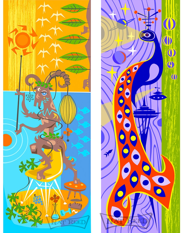
Left: “The Tropic Of Cancer And Other Ports O F Call On The Dilatory Voyage Of A Vagabond Heart”
Right: “Giant Authoritarian Peacock From Outerspace”
What's on the horizon for you? Anything exciting you can tell us about?
My answer to that is evolving now. I was diagnosed, this year, with ALS. It's been a psychological and physical struggle to continue on what I had seen as the trajectory in my work.
I now see time in a more compressed and urgent way. In the gallery, there's some tension between somewhat commercially considered pieces and those that I approach as more thoughtful dives.
I want to focus more on the pieces in the latter category and create more connective tissue between pieces. I was already heading down that path, to some degree, carrying through ideas in series like the Split Screen Series that I am continuing and will be rolling out more of in the coming season. I'm also planning to revisit a series I started some years ago that I call Inverted Needle Points, paintings on perforated masonite or “pegboard.”
Their intent is to co-opt conventional ideas of home embellishments with cheap, quasi-architectural, manufactured materials associated with post-war development and more identified with utility than beauty.
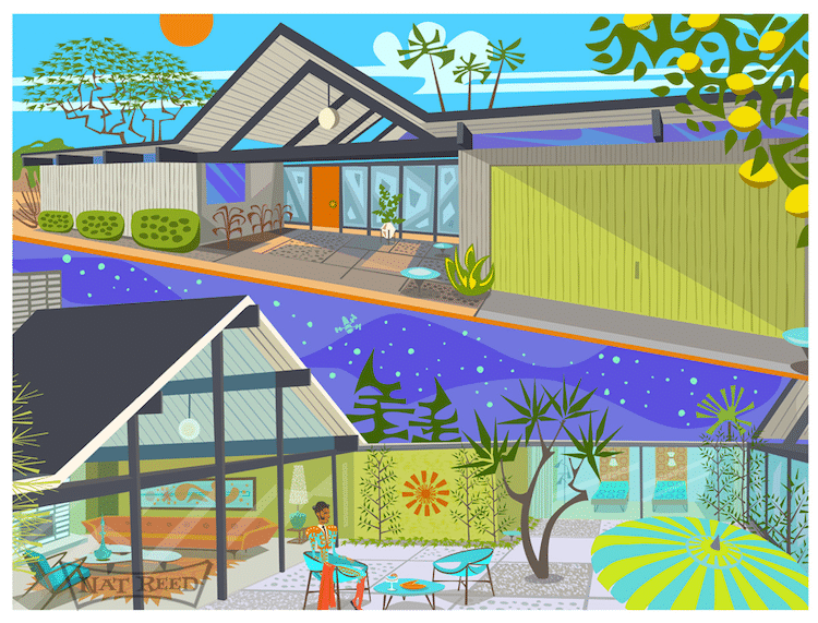
“Valley Studies, Eichler # 1”
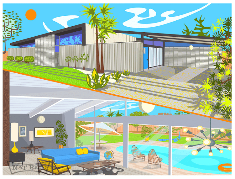
“Valley Studies, Krisel”
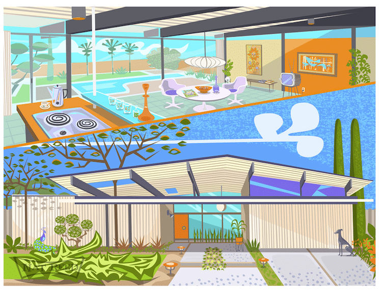
“Valley Studies, Eichler # 2”
My Modern Met granted permission to feature photos by Nat Reed.
Related Articles:
20 Magnificent Mid-Century Modern Interiors
Mid-Century Modern Homes That Shaped the Future of Architecture Design

