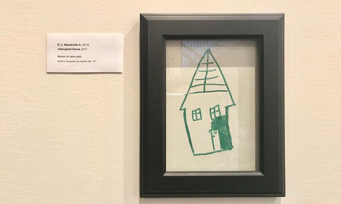
November 19, 2017
Textured Oil Paintings Reflect Romantic Memories in Rich and Exciting Bursts of Color
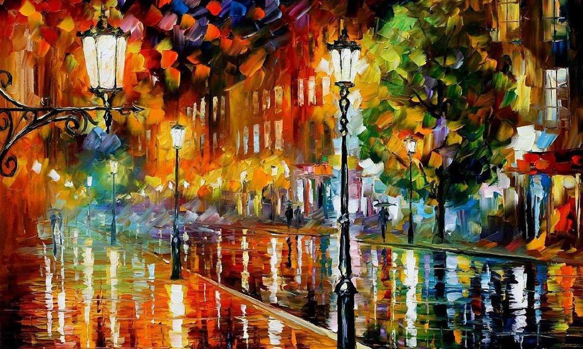
Contemporary impressionist painter Leonid Afremov creates bright and cheerful artwork with a palette knife and oil paints. Focusing primarily on land and seascapes, he forms distinctive pieces with bold knife cuts and colour contrasts that convey a range of jubilant emotions. Afremov is recognized as a self-representing artist, operating exclusively online, with few exhibitions and very little outside involvement from promoters and galleries.