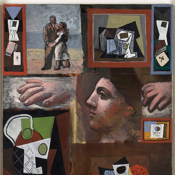
There’s more to painting than simply applying pigment to canvas. Mixing colors is just as important as the technique or style of your work. Choosing the right hues can make a huge impact in conveying the emotion of a painting; it goes hand-in-hand with the subject matter. Consider, for instance, Picasso’s paintings from his Blue Period. Would they have been as poignant without the use of blue tones?
It’s important to learn how to mix colors when you first begin your painting practice. In doing so, your work will have rich, multifaceted hues that are truly an expression of yourself and your subject. Many of us have the urge to just use colors from the paint tube, but those hues can be oversaturated, flat, or just plain unnatural looking. Knowing how to craft your colors will produce prettier hues—plus, you'll save a lot of money in pigment because you're not having to buy every tube of paint in the color you want to use.
Get Acquainted with the Color Basics
Before you can be a master at mixing color, you’ve got to know the basics of color theory.
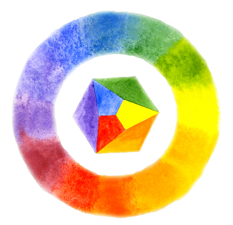
Image: Watercolor color wheel from Shiz-z-zofreniya / Shutterstock.com
Primary colors
In grade school art class, you probably learned about primary colors. This is a group of three colors—red, yellow, and blue—from which all other colors can be created by mixing. So if you were to limit your palette to just a few hues, you’d definitely want the primary colors because you could theoretically mix any color you were missing.
Secondary colors
Beyond the very basic hues are secondary colors. These are achieved by mixing two primaries: red and blue produces purple; yellow and blue make green; while yellow and red yields orange.
Tertiary colors
Maybe you can see where this is going, but as the name implies, tertiary colors are made by combining primary and secondary colors. There are six tertiary colors: red-orange, yellow-orange, yellow-green, blue-green, blue-violet, and red-violet. These colors can have a lot of variance in them, and you can tweak them to your liking. A yellow-orange could appear more yellow and less orange, for instance.
Primary, secondary, and tertiary colors all apart of the color wheel.
Colors are all about relationships; a single hue can look drastically different when matched in various ways. When pairing and mixing colors, remember to take their placement into account. Will it be by itself or next to its complement? Is the surrounding hue lighter or darker? Knowing these things can help inform your decisions on what you paint and where. The color wheel can you help you make these decisions.
Colors that are opposite one another on the color wheel are complementary colors. Red and green, blue and orange, and purple and yellow all represent these special pairings. When placed side-by-side, they make the other appear brighter.
A color wheel is a powerful tool for creating eye-pleasing hue combinations. You know that any complementary colors will look good together, but there are other ways of viewing the wheel to build complex relationships. Here are a few other examples of combinations you can glean from the color wheel.
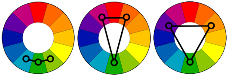
Color schemes from left to right: analogous, split-complementary, and triadic
Image: Tiger Color
Analogous: The analogous arrangement features three colors that are next to each other on the color wheel. Because of their proximity, they are generally a harmonious combination.
Split-complementary: The split-complementary color scheme is similar to the complementary arrangement. To make it, you select a hue and find its complement (directly across on the color wheel). Instead of using that complement, however, you will use the colors on either side of it. This arrangement has the contrast of complementary colors but is more nuanced.
Triadic: This color scheme is made by selecting colors that are evenly spaced around the color wheel. The results are often vibrant no matter what colors you select.

