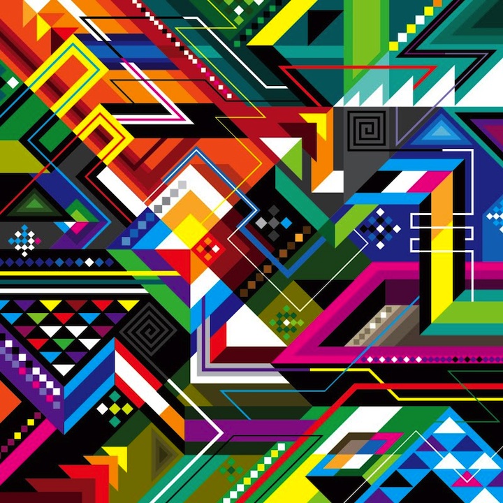
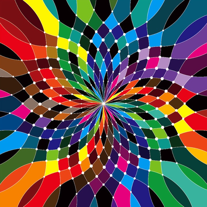
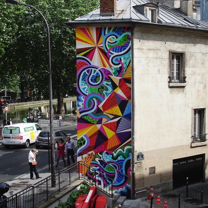
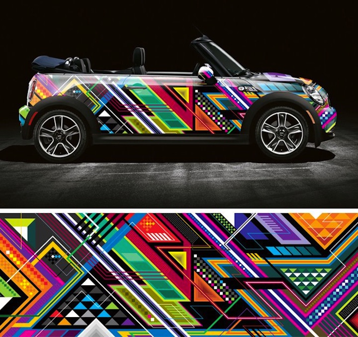
Stare at one of Matt Moore's psychedelic illustrations and it's almost guaranteed that your mind will enter another dimension (Inception-style, if you get my drift). As founder of his own design and illustration studio MWM Graphics, Moore creates colorful, digital illustrations that are not only bursting with color, their abstract nature makes you feel as though you're looking through a crazy cool kaleidoscope. He invites the viewer to get lost in his optical illusions, the only catch is…once you enter his fantastically funky world there's no turning back.
Moore coined the term “Vectorfunk” to describe his signature style. He tells us what that means and more in our rare interview with him below.
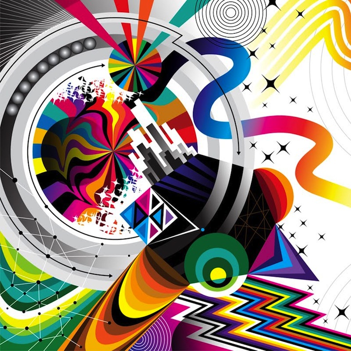
Can you please describe your signature “Vectorfunk” style of illustration? ?
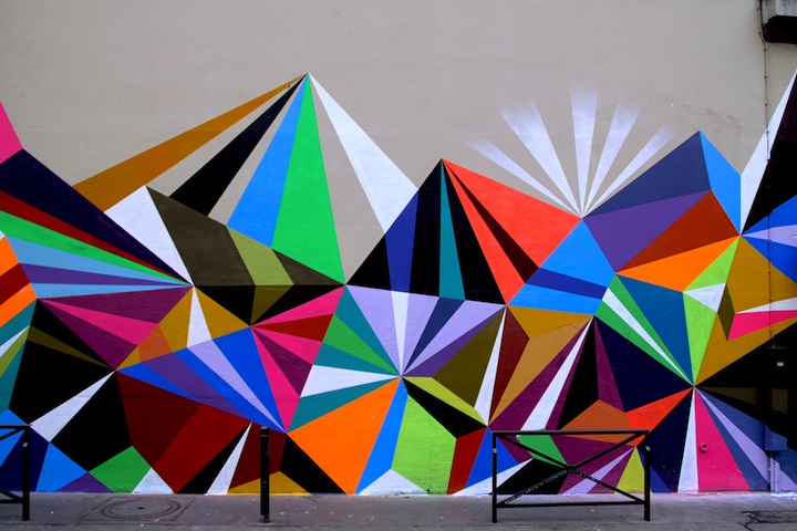
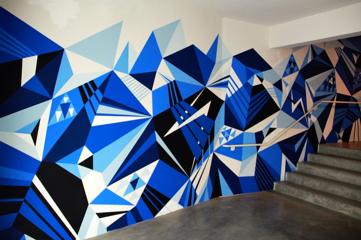
Vectorfunk is the name I gave to the abstract digital artwork that I create using Adobe Illustrator. Vector graphics are created by arranging points to create form, as opposed to raster graphics that are made up of pixels. Many years ago while I was in school learning graphic design I immersed myself in this method of rendering images. The work that I do in this style is inspired by abstract geometry, optical illusions, and freeform compositions. Most of my Vectorfunk work celebrates vibrant colors and unique color combinations. My goal is always to grab the viewer and ask them to fall into the design following a line through the piece, or trying to evaluate what is in front and what's behind. Colorful abstract mazes of form and color.
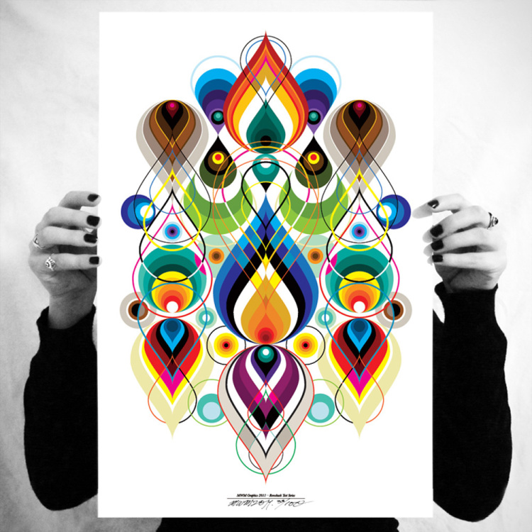

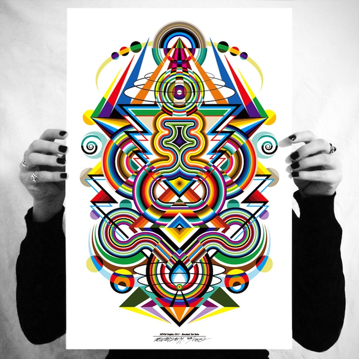
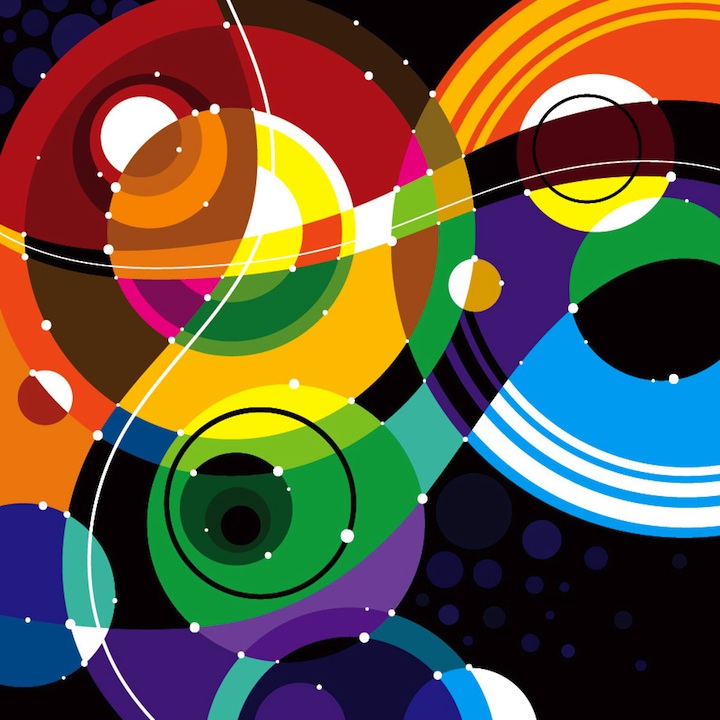
What was your creative process like behind the Rorschach Series? ?
The Rorschach Series was a lot of fun to work on. Symmetry is an interesting area of design to explore, and I had been meaning to do a series like this for years. I decided to do three of them in the same color palette and the same level of detail across the set, but with each poster I strive to have a different vibe and visual language. I worked on all three simultaneously. First, I built the foundations and set up parameters on the types of shapes and flow for each. Then, I jumped from one to the next adding layers of details that complimented the existing forms. In the end they are a very cohesive set, but each has its own personality.
What was your ultimate goal in creating this series??
I've always been fascinated by Rorschach Ink Blot Tests and the psychology behind them. They are used to evaluate people's feelings in an indirect way. The answers people give when asked “What do you see?” are an indication of what is on their mind subconsciously. As an abstract artist, this stuff is really interesting to me. With lots of my work I intentionally avoid representational subject matter. The magic happens when people look at my work and tell me what it reminds them of, or what they see, or how it makes them feel. I decided to take a different role as the creator of abstract images and make this series that directly asks the viewer to define them.
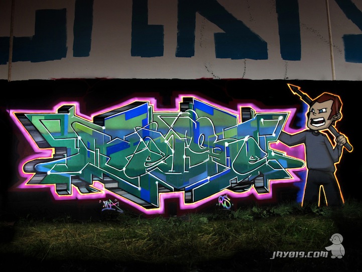
How has your style evolved over the years from hand-drawn to graffiti to digital vector art??
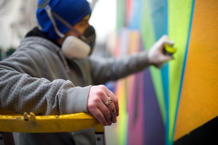
Over the years, I have translated the ideas and approaches from my other endeavors like canvas painting, graffiti, and hand-drawn illustration to vectors. It is really satisfying to explore at a fast pace digitally. There are so many options for doing alternate versions and mini-tests with each piece without risking ruining them, as would be the case with a big mistake on traditional canvas painting.
My vocabulary has grown and my work has become more intricate and refined. The really exciting part for me is taking these discoveries in one discipline and cross-pollinating to another. For example, a wild color combo I discover in a vector design might find its way into a mural painting. Or a layering technique with watercolors might inspire a new way to build a graphic composition. Bouncing from one realm to the next has been the best way for me to continue growing, trying new things, and evolving my style.
What's been your favorite corporate brand to work with and why??
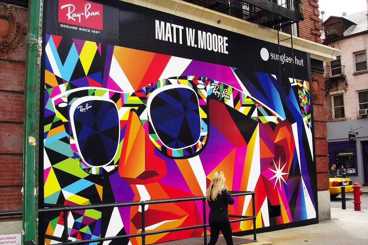
It's really tough to pick a favorite. I've been blessed with many amazing collaboration opportunities with brands I love and support. The Ray Ban project I did was a blast. They're such an iconic brand with a solid history of celebrating the arts. It was an honor to collaborate with them on the Wayfarer Artist Series shades and ‘Never Hide' print campaign. And my favorite part of the project was going to NYC for the launch party of the sunglasses in Herald Square and painting a big mural on the window of Sunglass Hut as people waited in line to buy the glasses. Lots of fun.
Who's leading today's art movement??
It's a really exciting time to be an artist. It would take me all day to list all of the folks I look up to, but I can do a little short list of people I think are really making moves and doing unique and memorable work. Designers: Alex Trochut, Mago, Sagmeister. Artists: Doze Green, Maya Hayuk, Mike Giant. Graffiti: Jurne, Roids, Horfe. The list could go on and on, but this is a good start to find out about the cats that I get excited to see new work from.
Finally, what are your future plans? What can we expect to see from you in the future?
2011 will be an exciting year. I've been shifting my focus more towards functional design and interactive sculpture. I'll be painting lots of mega-murals here in the states and abroad. I have two residency/exhibitions, one in Cincinnati in April at Yes Gallery, and I will return to Paris for another show at Since Gallery in September. My focus remains on evolving the ideas I've been exploring in my artwork and design, and always trying new things and learning new disciplines. As long as I make new discoveries everyday I am a happy and inspired.
Thanks so much for the in-depth interview, Matt. Love your work!
Make sure to check out more of Matt's mind-blowing masterpieces on his website.