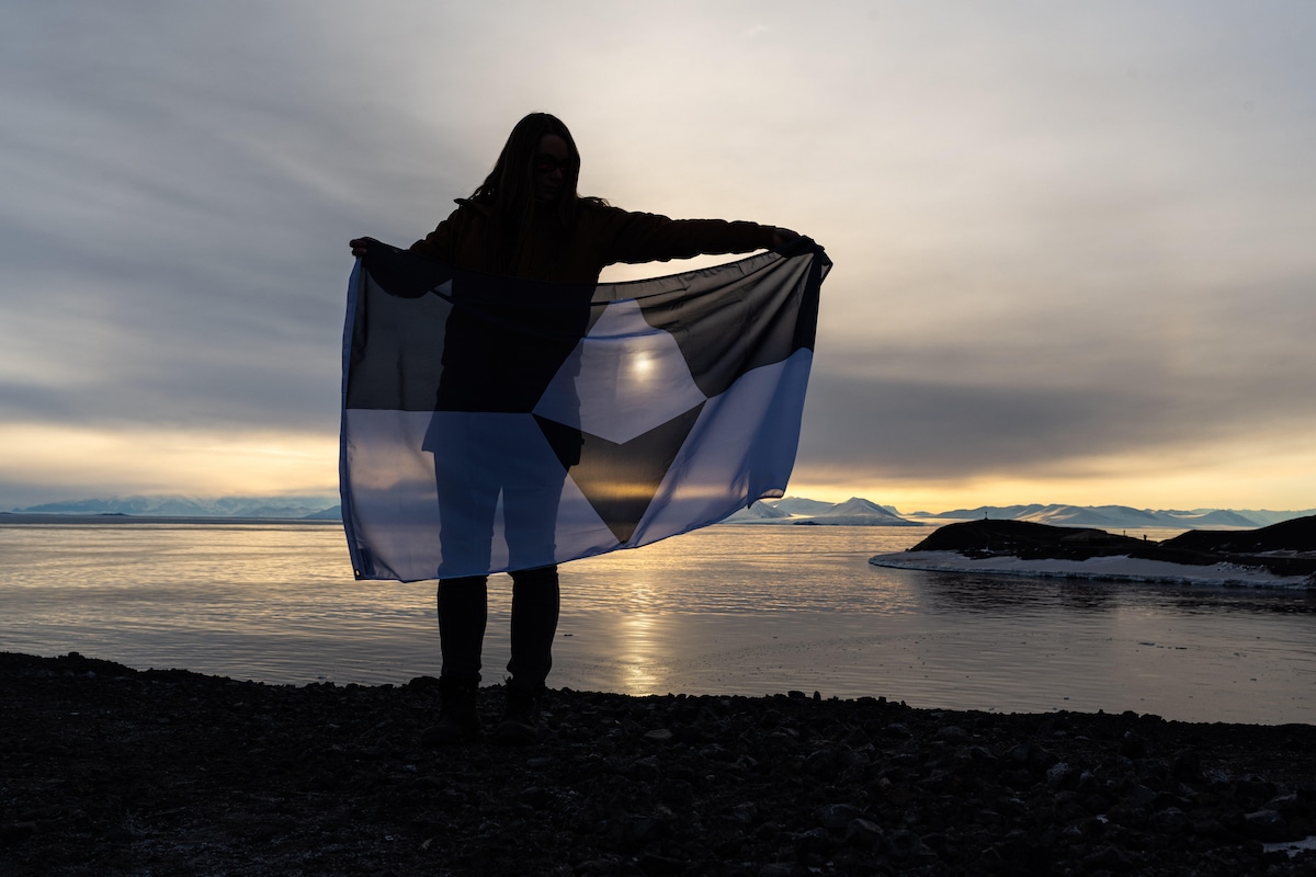
Amy Helkenn holds True South on Ross Island, Antarctica with the historic Vince's Cross and Discovery Hut in the background. (Photo: Stephen Allinger)
Flags are powerful forms of design. They help people feel connected to their identity and to their beliefs. They also help to articulate what makes a place so special. Though Antarctica is certainly a special place, it had no official flag to represent it for all these years. American Journalist Evan Townsend has worked to change that with a project called True South. Townsend and his team have designed an official flag for Antarctica that they hope will help raise awareness for the continent and its uncertain future.
The design for True South is focused on an icy white peak representing the mountains and icebergs of Antarctica. It is mirrored on a compass arrow that together creates a diamond shape in blue and white. The two horizontal strips on the flag represent the long days and nights on the frigid continent. Altogether, the design represents “the hope that Antarctica will continue to be a place of peace and discovery for generations to come.”
Antarctica is regulated by a treaty that allows it to be used by scientists and researchers from all over the world. The new flag helps to unite everyone in a mission of conservation. Townsend has watched people take on the flag and use it to express their connection to the continent.
We had the opportunity to talk with Townsend about his work on True South and what motivated him to give Antarctica a voice through graphic design. Townsend tells us about the moment he realized the power of flags, the impact True South has had on people, and how important this content is for the world. Scroll down to read My Modern Met's exclusive interview.

The design for True South, Antarctica's first flag
Was there a specific moment that motivated you to design the flag?
I was working in Antarctica during the winter of 2018 when I first thought of the flag. I had brought a pride flag down with me, so a few of us working at the station decided to take a photo with it. The photo wound up going viral and I started getting messages from people around the world telling me how much it meant to them to see the flag there. It was this amazing experience of being in one of the most isolated places on the planet and still feeling connected to people.
That got me thinking about how powerful symbols can be for bringing visibility to a cause and a community. A symbol like that could help bring awareness to the vulnerability of Antarctica, but there wasn’t one that many of us in the Antarctic community felt like we could really connect to. So that’s when I sat down to make True South.
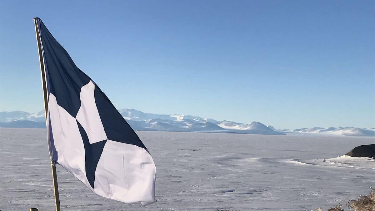
True South flying over the Ross Ice Shelf at McMurdo Station, December 2020
What is one thing you wish people understood about Antarctica?
Antarctica is this really distant, isolated place, so it’s easy to think it doesn’t have much relevance to the rest of the world. But it’s home to 90% of the world’s ice and parts of it are warming at rates several times faster than the global average. Even the smallest changes in Antarctica could mean drastic changes for the rest of the world. The reverse is true as well. Whether they’re aware of it or not, everyone plays a role in the stewardship of Antarctica.
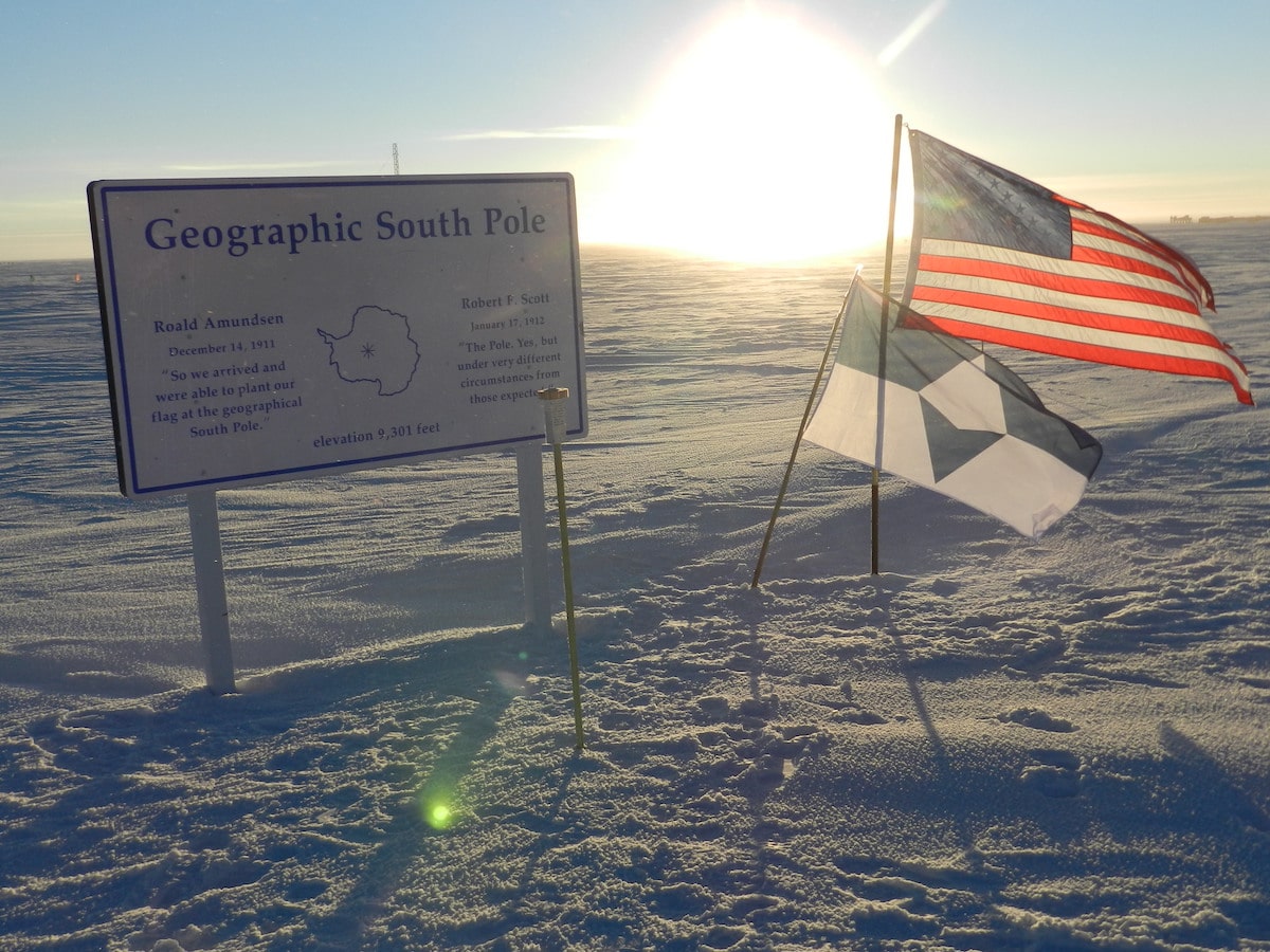
True South and the American flag at the Geographic South Pole during the annual sunset. (Photo: Lisa Minelli)
(continued) Antarctica is one of the places most susceptible to the global climate crisis, but it’s also a place with no permanent population. So a big challenge for Antarctic conservation is getting people to care about a place they’ve never been and will likely never go to. By sparking conversations like this one, I think the flag’s been able to expose new people to Antarctica or get people thinking about Antarctica in new ways.
But the flag is also about building connections among people who already care about Antarctica. People in the Antarctic community live all over the world and speak lots of different languages, but now we have a way to show the values and experiences we share.
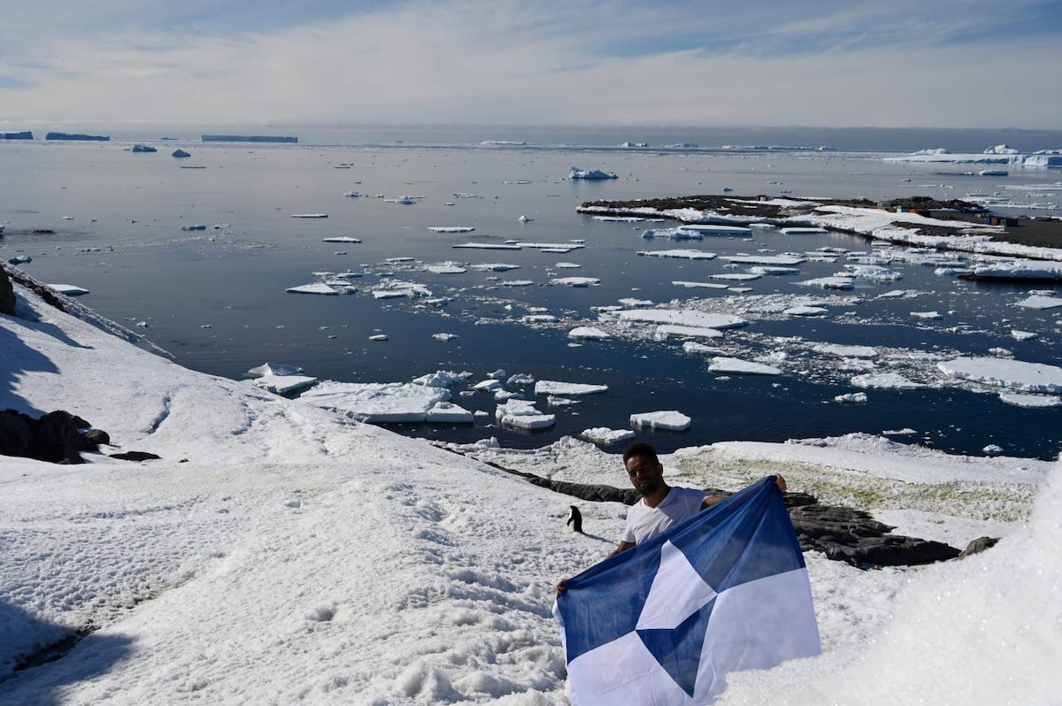
True South near Adélie Land (Photo: Wenceslas Marie Sainte)
How did the weather conditions in Antarctica change the design of the flag?
Visibility was a big consideration in the design. Antarctica has extremely long nights and days. (At the South Pole they last six months each.) You also get these white-outs where there’s so much driving snow you can only see a few feet in front of you. So I avoided small details and instead went with large color blocks with strong contrast that could be clearly visible in a variety of conditions.
Antarctica is also the windiest continent. I opted for a slightly longer flag than typical so it can stay outside longer without the central emblem becoming frayed.
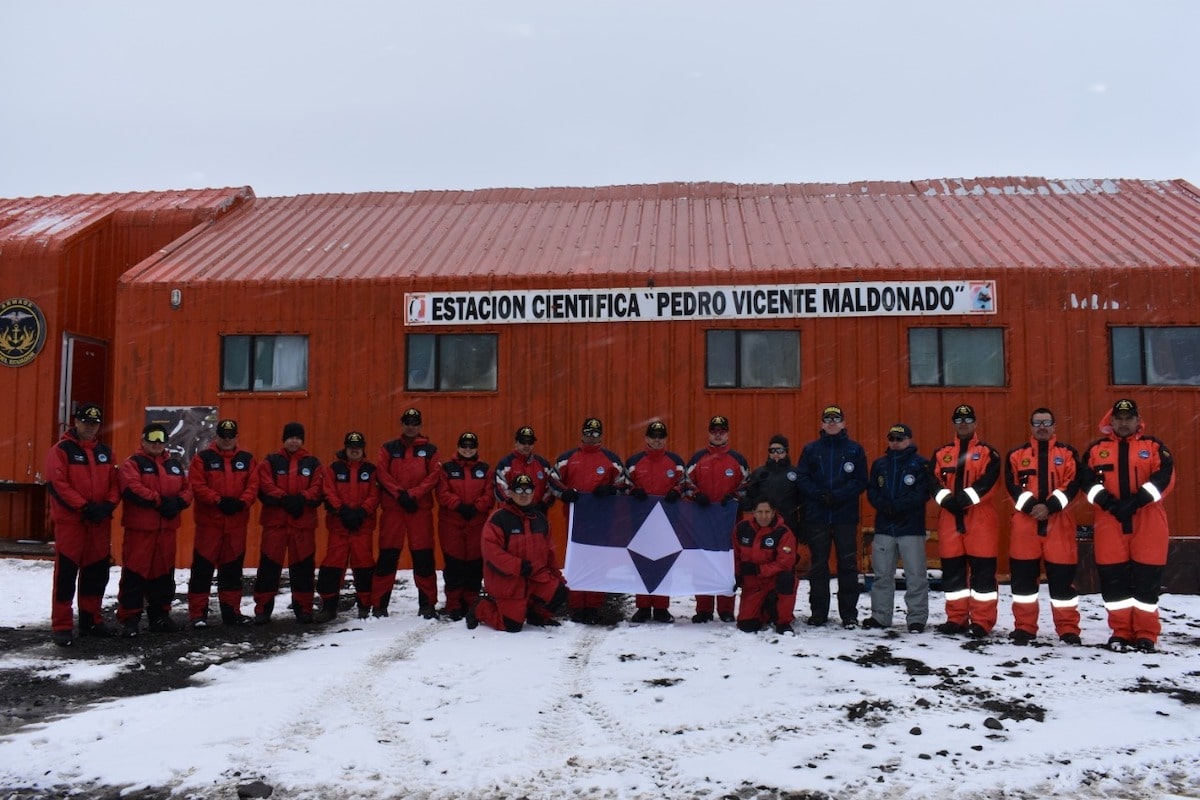
Members of Ecuador and Colombia's National Antarctic Programs with True South at Maldonado Base, Antarctica
Who is this flag for?
It’s really for anyone who cares about Antarctica. I don’t think you have to have been down there to be a part of the discussion, or to be a part of the solution. One of my hopes for this flag is that it will be a sort of invitation for more people to join the Antarctic community.

Members of Ecuador and Colombia's National Antarctic Programs with True South and their national flags at Maldonado Base, Antarctica
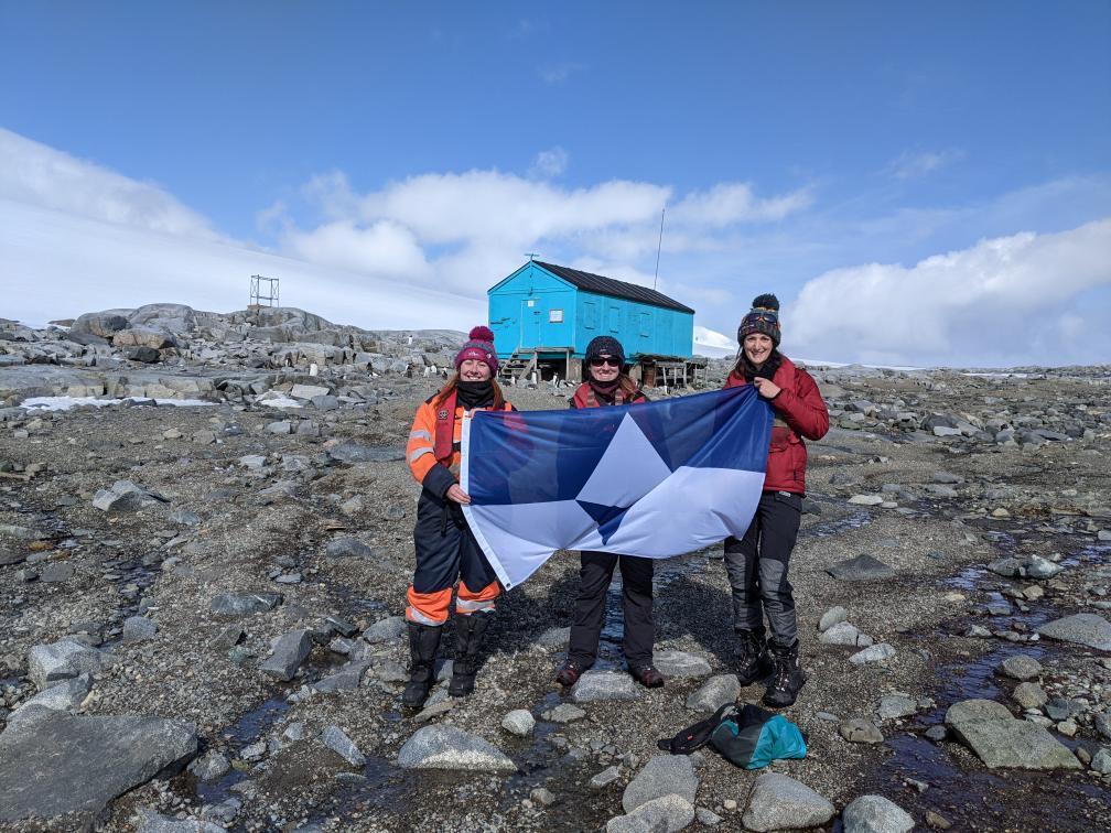
Alex Dodds, Mandy Little, and Vicki Foster hold True South at Damoy Point, Antarctica
What is next for True South?
I don’t know, which is actually really exciting. The best flags get their power from the people that fly them, and that was always the goal with True South. There was some work to get this project off the ground last year, but since then people have been really embracing it and flying it in their own way. It’s been amazing to see the places it pops up and hear from people about what it means to them. So I’ll definitely continue working with the flag, but I think it’s at a point now where I can take a few steps back and let the community it represents be the ones who are driving it.

Alexey Golubev, an employee of the Russian Arctic and Antarctic Research Institute (AARI/RAE) holding True South at Vostok Station


