October 1, 2025
Student Transforms Amusing World Facts into Colorful Map Infographics
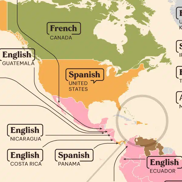
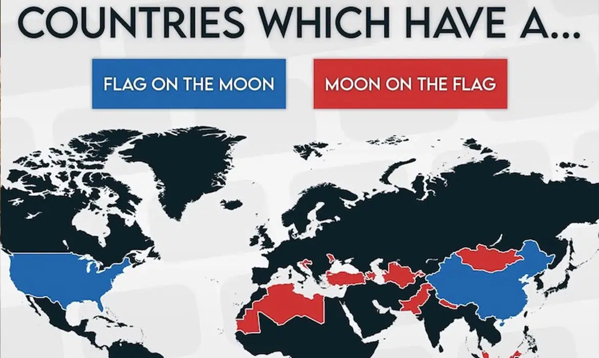
Us humans may all be part of the same species, but life looks completely different depending on where you are in the world. For instance, did you know TikTok isn’t available in Russia? Or that alligators are found only in two places on Earth: the southeastern United States and China? These are the kinds of facts brought to life by Georgi Pamyatnih through his Amazing Maps series.