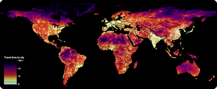
Our world is rapidly urbanizing, with a little over half the world's population living in an urban setting as of 2015. It's a rapid rise from the mid-20th century, when only 30% of the world called a city their home. And, interestingly, even those who don't live directly within a bustling city find urban areas readily accessible, according to a new study published in Nature by the University of Oxford’s Malaria Atlas Project.
The research shows that in 2015, 80.7% of all people live within an hour of a city. Combine those two numbers and it's a striking look at migratory patterns around the globe. Researchers, which also included participants from Google, the Joint Research Centre of the European Union, and the University of Twente, pulled together a map of travel time to urban centers using Google Earth Engine and information from Open Street Map. This gave them unparalleled information about human movement and how this connects to socioeconomic factors like education, income level, and health status.
“Cities concentrate activities that promote and sustain human wellbeing including banking, education, employment, and healthcare services. Identifying populations that have poor access to urban centers provides an important data source for enacting and assessing progress on the Sustainable Development Goals outlined by the United Nations,” the Malaria Atlas Project wrote in a statement. In some areas, like sub-Saharan Africa, access to the city is also a large indicator of wealth, with only 50% of people living in low-income areas residing within an hour of the city. This is in stark contrast to people living in high-income areas, as 90.7% of these individuals can reach the city in less than an hour.
However, researchers are also quick to point out that accessibility between urban and rural areas isn't always positive. “Increasing the ease with which humans can access remote areas also increases the likelihood that wilderness areas will be degraded,” they noted.
Explore an interactive version of the map by selecting the Human Population surface layer in the Malaria Atlas Project Explorer.
h/t: [Boing Boing]
Related Articles:
Ingeniously Redesigned World Map Looks Unusual, But Is Highly Accurate
Eye-Opening Map Reveals the Most Peaceful Countries in the World
Places Around the World Where Three Time Zones Meet in the Same Spot
Interactive Map Shows Where on Earth You’d Be If You Dug Straight Through the Ground