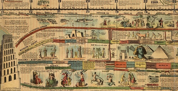
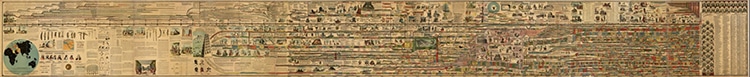
The march of world history, “Adams' Synchronological Chart of Universal History” by Sebastian C. Adams and published by Colby & Co. Publishers, NY, 1881. (Photo: David Rumsey Map Collection)
World history is ultimately one long story, a timeline of events rising and swelling, marching along in each country and community around the globe. But exactly how this story is told can vary based on one's contemporary perspective. For Sebastian C. Adams, this perspective was that of a white, 19th-century Christian man who wore many hats over his lifetime. A minister, writer, schoolteacher, clerk, and politician over the years, he created a 22-foot-long timeline full of the twisted, colorful histories that the author viewed as part of his Chronological Chart of Ancient, Modern and Biblical History.
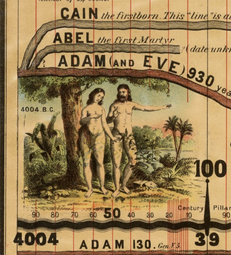
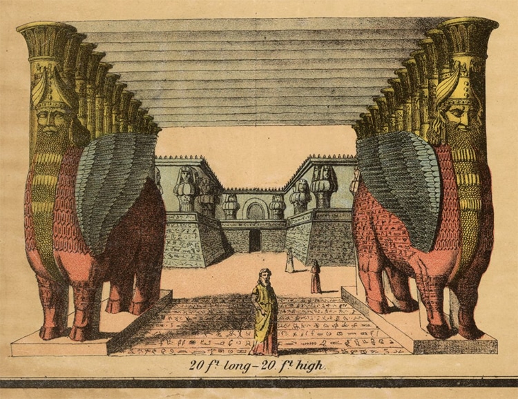
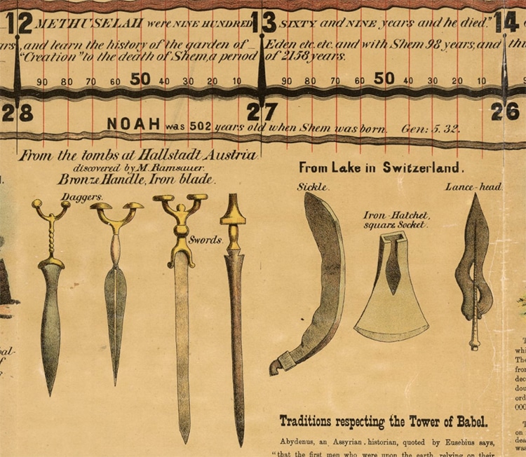
These histories, illustrated by John Alsop Paine, start at the Biblical beginning with Adam and Eve. Their descendants spin out in spindly strands from their parents, traveling down the timeline with their remarkable ages noted. Stone age tools appear, as do the busts of ancient philosophers. The Stone Age becomes the Iron Age, and Assyrian lamassu rise from the sands.
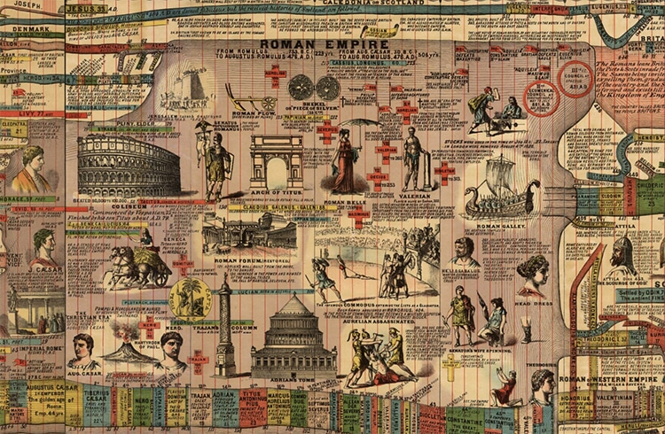
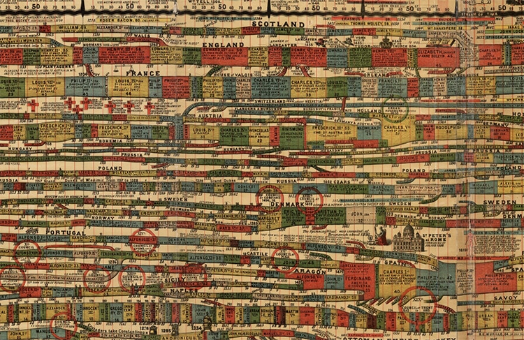
The ancient world evolves and develops into civilization before our very eyes, as we then follow the trajectories of Greece, Egypt, and Babylon. The Roman Empire is enshrined in purple, before the rainbow hues of many European countries form stringy veins stretching many more feet into modernity. Terminating in 1883, the timeline finishes with portraits of the American presidents and European sovereigns, as well as a list of “eminent men not elsewhere mentioned on the chart.”
The scroll, being designed by an educator and minister, is both an innovative teaching tool and a reflection of its time. It is heavily Eurocentric, with these countries taking up a majority of the map and a Christian cosmology defining its beginning. The lands of the Near East feature heavily in this Biblical beginning, and they are capably illustrated by Paine, who taught in Istanbul and pursued archeological digs in the region.
The map was printed several times, and various copies are extant, including a copy at the Smithsonian National Museum of American History. That copy is presented on a scroll so that the unwieldy timeline can be easily perused. Other booklet formats were also used, and the timeline was popular in schools. While not used today, it is a fascinating insight into one historical perspective on the eras that came before.
Luckily, Adams' timeline can still be examined closely thanks to a zoomable version available online at the David Rumsey Map Collection.
This 22-foot scroll visually depicts world history as described by educator and minister Sebastian C. Adams in 1881.
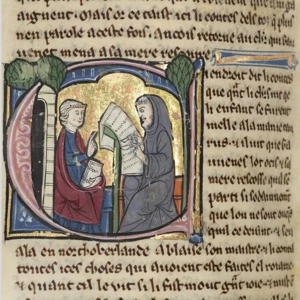
It moves from the Biblical creation story…
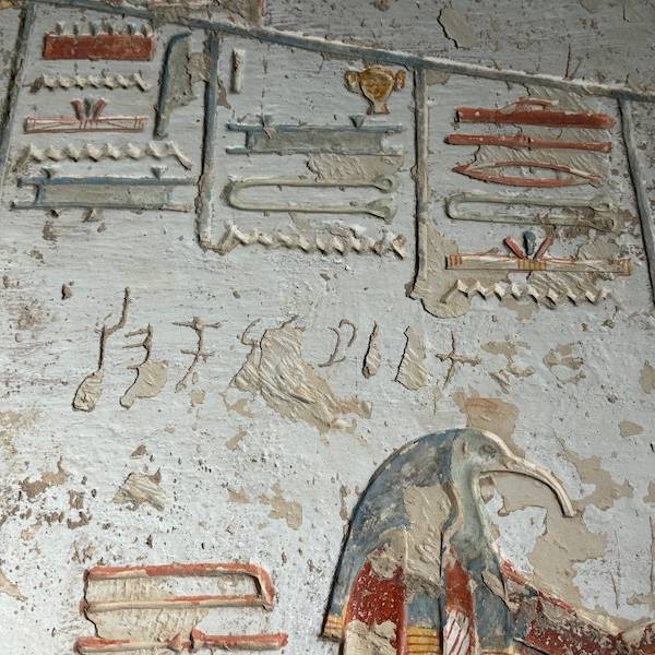
…through the development of ancient civilizations.
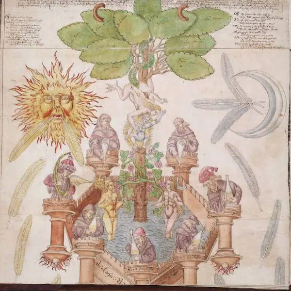
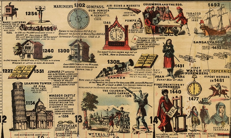
And it even shows technological developments.
The visual timeline, which is largely Eurocentric, traces the individual development of countries up through the 19th century.
h/t: [Open Culture, National Museum of American History]
Related Articles:
This 19th-Century Atlas Has Raised Maps for Blind Readers
Explore Five Volumes of the History of Cartography for Free Online
19th-Century ‘Ribbon Maps’ Let You Put the Entire Mississippi River in Your Pocket
Explore the World Through Medieval Eyes on a Map Called the ‘Hereford Mappa Mundi’