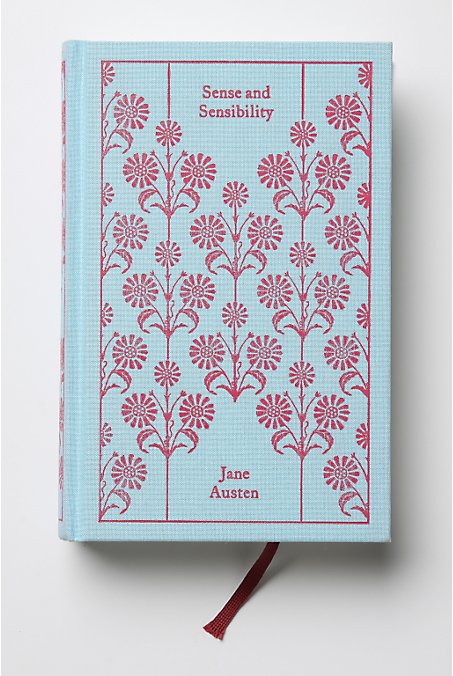
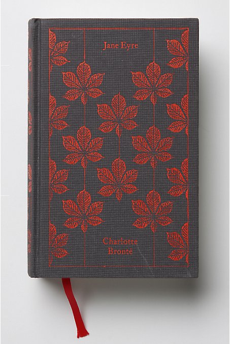
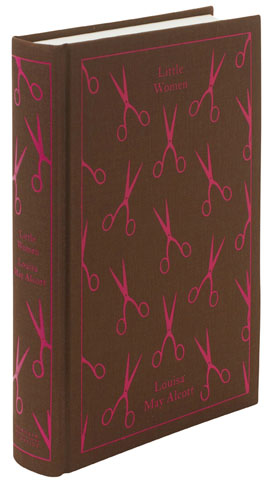
While I first learned about Coralie Bickford-Smith's penguin cloth-bound classic series through Design*Sponge in October of 2009, I didn't feel compelled to write about it till I saw it pop up again on Very Short List this morning. As they're now selling these beautifully bound books at Anthropologie, I had a chance to really take a look at them and appreciate the careful design approach behind each. Coralie Bickford-Smith “decided early on to use patterns that all conform to the same grid.” She believed it was “the best way to impose a recognizable style that could work across a series of ten or more books, while allowing the covers to convey something of the character of the individual titles.” “One of the great things about designing for the classics is that the material is so rich and full of possibilities – it's not about finding the one and only perfect signifier for a book, but one that works within the context of this series, and perhaps which takes a slightly new angle on a familiar work. I read the books and discussed them with one of out picture researchers, Isabelle De Cat, then we created mood boards full of ideas, and narrowed it down from there. Some of the final patterns are more literal than others. The peacock feather on Dorian Grey, for example, plays on the book's themes of vanity and the superficial, whereas the leaf motif on Jane Eyre refers directly to the lightning-blasted chestnut tree, a concrete element in the text that serves as a potent symbol of the book's central relationship.” So not only did Coralie make a connection between the text and the pattern, she made the books look like a cohesive series. Brilliant!