The end of the year brings a time of reflection and a look towards the future. Anticipating the next 365 days offers a symbol of hope that this coming year will be even better than the last. Pantone makes this practice an annual tradition—with a colorful twist, of course. Each year, they select a single Pantone Color of the Year that's intended as a “reflection of what’s needed in our world today.” For 2017, they had a bright leafy green as their pick; the tastemakers just announced their selection for 2018’s hue, and it’s a bold departure from last year.
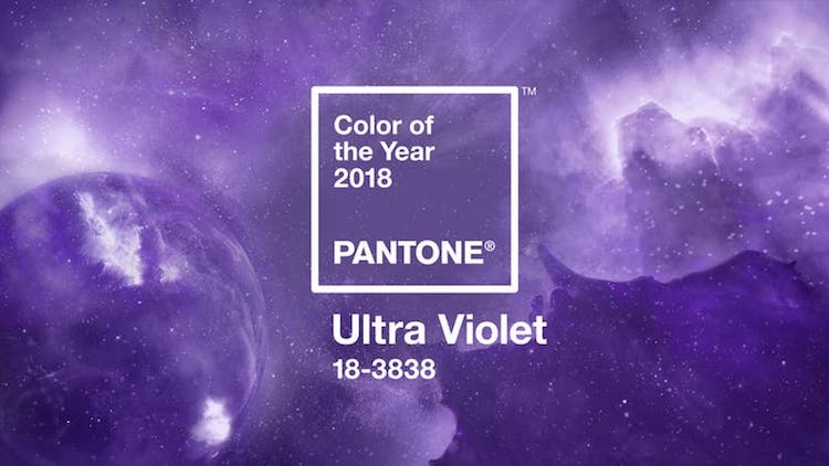
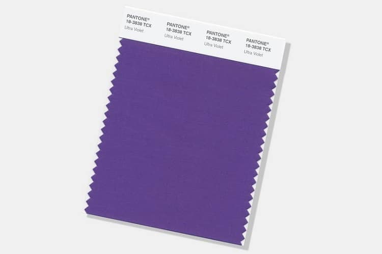
So drum roll, please: the Pantone Color of the Year 2018 is Ultra Violet! The blue-based purple is meant to evoke a “creative inspiration” that represents the era in which we live—one that requires innovation and imagination. “From exploring new technologies and the greater galaxy,” Leatrice Eiseman, the Executive Director of the Pantone Color Institute, explains, “to artistic expression and spiritual reflection, intuitive Ultra Violet lights the way to what is yet to come.”
The pick doesn’t come as a complete shock, though. Earlier this year, Pantone released Love Symbol #2, a custom color that honors the late music legend, Prince. It's a deep hue that’s a poignant nod to his signature Yamaha piano and film, Purple Rain. Pantone even gives a nod to Prince in their announcement of Ultra Violet. “Enigmatic purples have also long been symbolic of counterculture, unconventionality, and artistic brilliance,” Pantone says. “Musical icons Prince, David Bowie, and Jimi Hendrix brought shades of Ultra Violet to the forefront of western pop culture as personal expressions of individuality.”
Drum roll, please! The Pantone Color of the Year 2018 is Ultra Violet.
Pantone: Website | Facebook | Instagram
All images via Pantone.
Related Articles:
Hunger-Inducing Pantone Swatches in the Form of Food
Artist Creates Delicious Smoothie Blends to Match Pantone Color Swatches
Designers’ Must-Have App Matches Colors in the Real World with Their Exact Pantone Swatches
Designer Pairs Small Colorful Objects with Their Matching Pantone Swatches