With its vast collections of images, photo filters, free icon and shape elements, and fonts, Canva allows users around the globe to create sleek graphics and presentations through its online app—no design degree required. The company's Senior Graphic Designer, Poppie Pack, shares a variety of savvy tips for those new to the platform, but her insights provide valuable inspiration for external creative projects, too.
Case in point: Pack has compiled a set of 20 different color palettes based on jaw-dropping environmental photos of nature scenes and city streets, ranging from the bright and tropical to the mellow and moody. With each one, she offers an explanation of the symbolism in the striking tones. For example, the soothing shades of a subdued sundown might lend themselves nicely to health- and wellbeing-oriented design ventures, while bright and cheerful yellows incite an uplifting response.
You can browse the palettes below and see the rest in Pack's Canva blogpost. They might spark an idea for a new project, become the basis for a brand identity, or even encourage you to get outside and see what natural hues you can use as a muse.
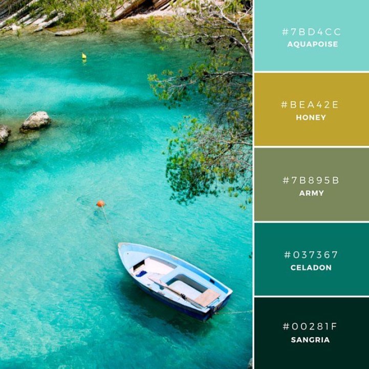
Above, Aqua Army: “The yellow tones in the swatches Honey and Army create contrast against the cooler bases of the other colors. This is a contemporary combination suited for products associated with a aquatic or water based beverages.”
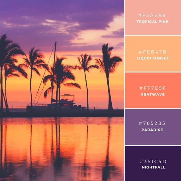 Tropical Punch: “Purple traditionally represents individuality, and orange is associated with adventure and enthusiasm. This combination is not only visually vibrant but also evokes a similar emotion from the audience.”
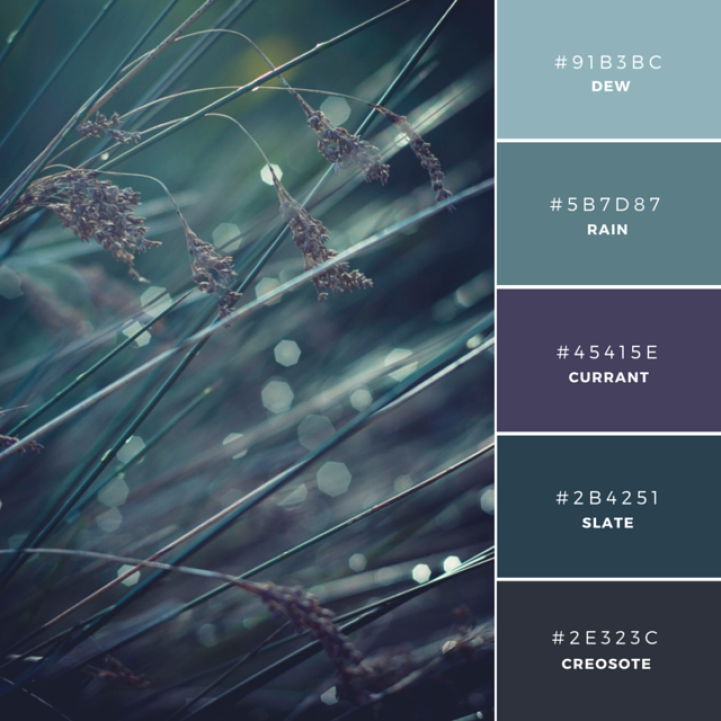 Morning Mist: “Dense hues form a strong, masculine combination and the easy transition from swatch to swatch creates a calming effect. These colors are Analogous which means they sit near each other in the color wheel. The rich and dark tones would be well suited to the industrial or building industry.”?
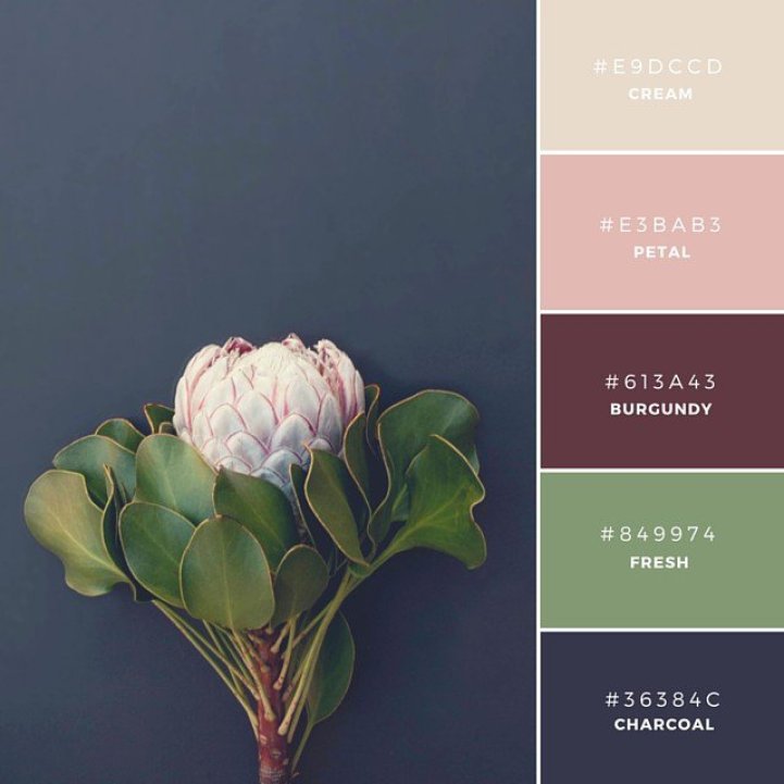
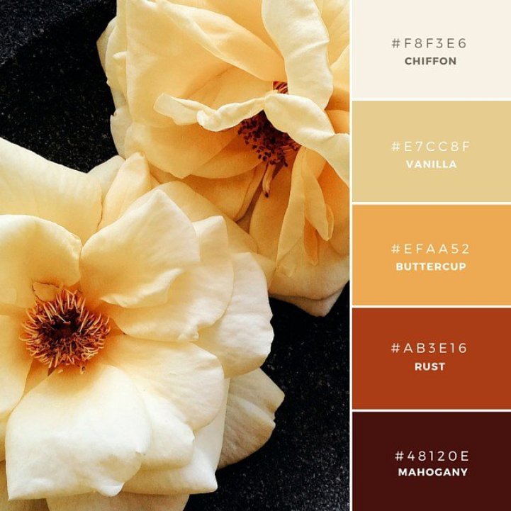
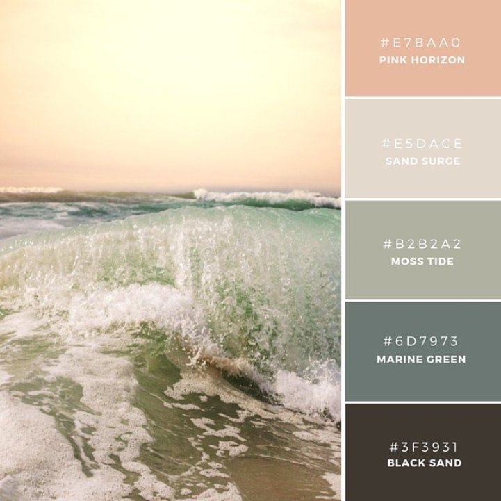 Vintage Sundown: “These are subdued tones drawn from a warm sundown. This feminine palette is soothing and soft and would be well fitted to the health and wellbeing industry.”
 Fall Collection: “This palette has a traditional or antique tone to it. This is a great combination to represent a product that is a little more refined or mature.”
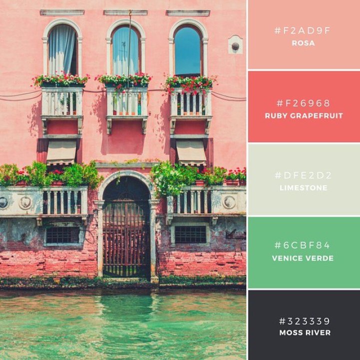 Very Venice: “Made up of warm and fruity tones, this palette is a contemporary choice. All colors contrast well against one another to make for easy text on background application. A zesty combination to portray fruit and vegetables.”
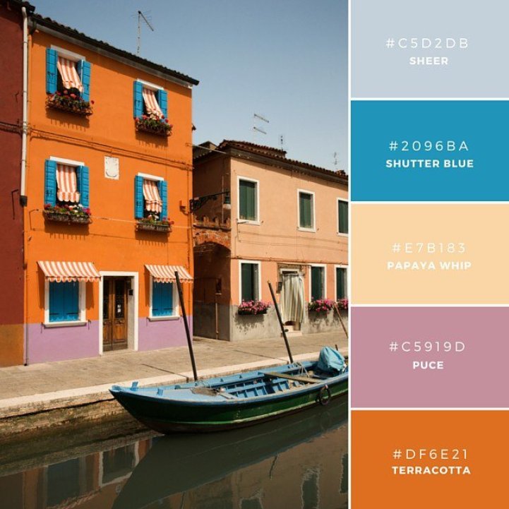 Rich and Adventurous: “This unique combination is rich. Because orange represents activity, and blue is associated with water, it is a palette that could be easily used to represent adventure or sports goods.”
 Warm Antique: “Monochrome combinations are when different shades of one hue are used. The base color, often the darkest is applied with different amounts of brightness. This combination of brown shades is best used to symbolize an organic trade or untouched brand.”
 Marigold Mix: “Yellow is a traditionally considered a happy hue. It has an empowering effect and creates optimism, however also causes agitation as it’s a fast moving color. Use this palette for an uplifting response from your consumers.”
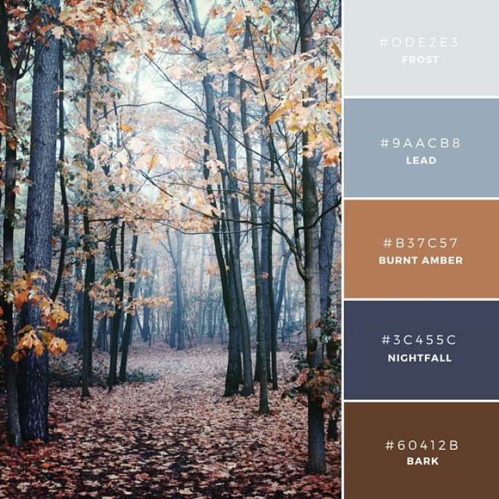 Nordic Woods: “This is a rustic combination of brown and blue based tones. When teamed together they make a masculine palette perfect for a brand aimed at a sophisticated male audience.”
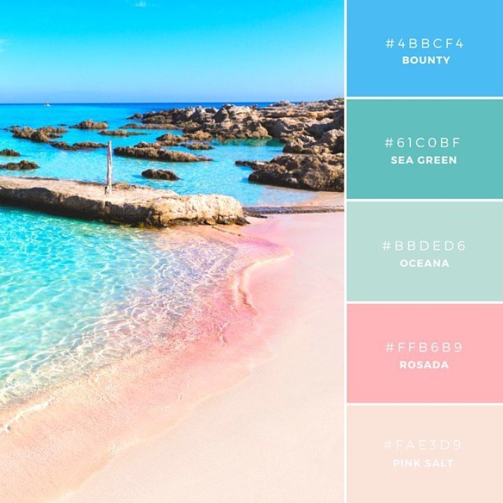 Balearic Beauty: “Pastels represent femininity and have association with springtime. This powdery palette has tones reminiscent of candy floss, therefore a lovely combination for anything related to sweets or floristry.”
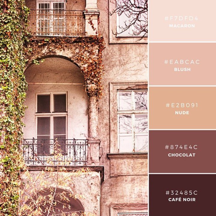
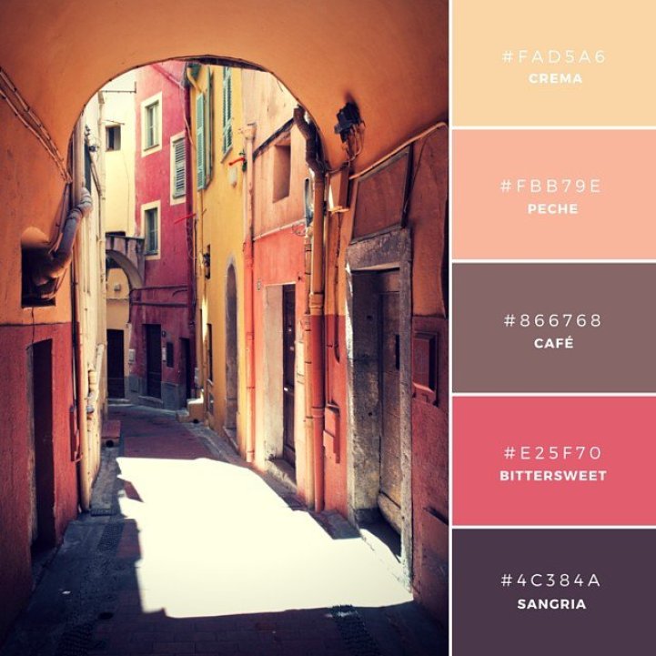 Siesta Hour: “This is a warm and rosy palette made up of a mix of fruity neutral tones and darker more intense colors. Warm and inviting, this combination is well suited to a brand in the food and wine industry.”
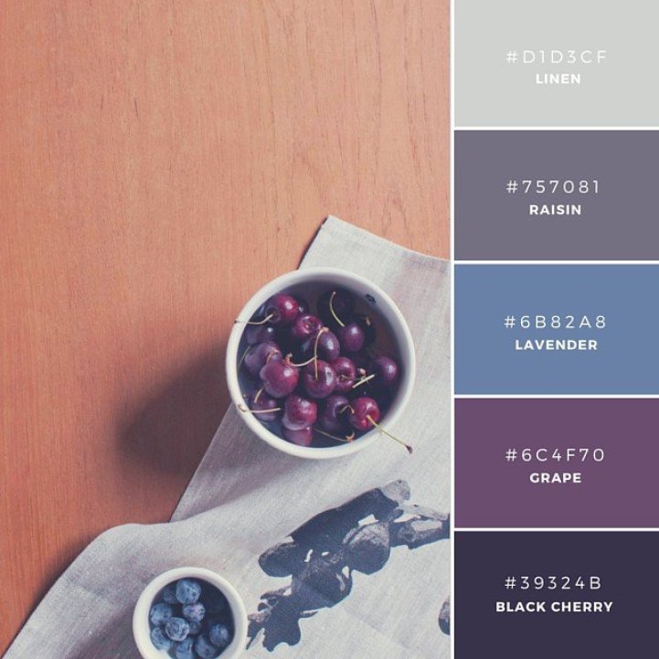 Afternoon Delights: “Usually blue based colors create a cold mood. This palette has been combined with two warmer tones (linen and raisin) to take the edge off. A modern combination for an interior or homewares brand.”
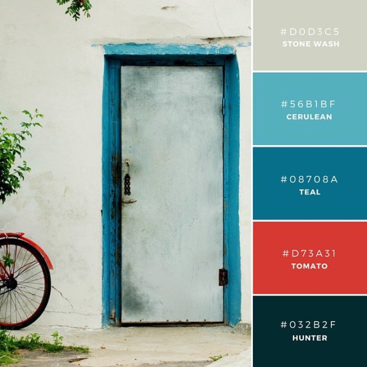 Greek Salad: “These are solid hues that offset well against one another and create impact. The inclusion of a strong rich tone (tomato) from an opposing side of the color wheel.”
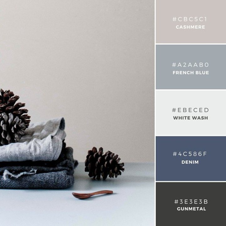 French Connection: “This tonal combination is a blue based gradient of colors. The Gunmetal and Cashmere swatches contain a hint of warmness which offsets against the coolness of the blues nicely. The combination of the two tones means that it’s gender-neutral. Great to use for wedding stationery or invitations.”
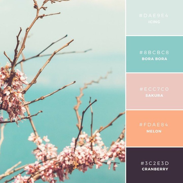 Serene Sakura: “This clever creation combines cool and warm tones that are fresh and contemporary. A modern mix, this palette makes a great user interface combination. The application of coral tones is warming and inviting, providing a nice transition from the cooler tones.”
Poppie Pack: Twitter | Instagram
via [DesignTAXI]
All images via Poppie Pack/Canva.