When you imagine a world map, what do you see? Most likely, you picture the Mercator Projection, a rendering rooted in the 16th century. While this visual remains the most widely-used and universally accepted view, its proportions and overall orientation are not accurate. To remedy this, contemporary cartographers and designers alike have created new maps of the world, from an origami-inspired plan to a “true size” version. Though popular today, this phenomenon is not entirely new, as made apparent by the Spilhaus Projection.
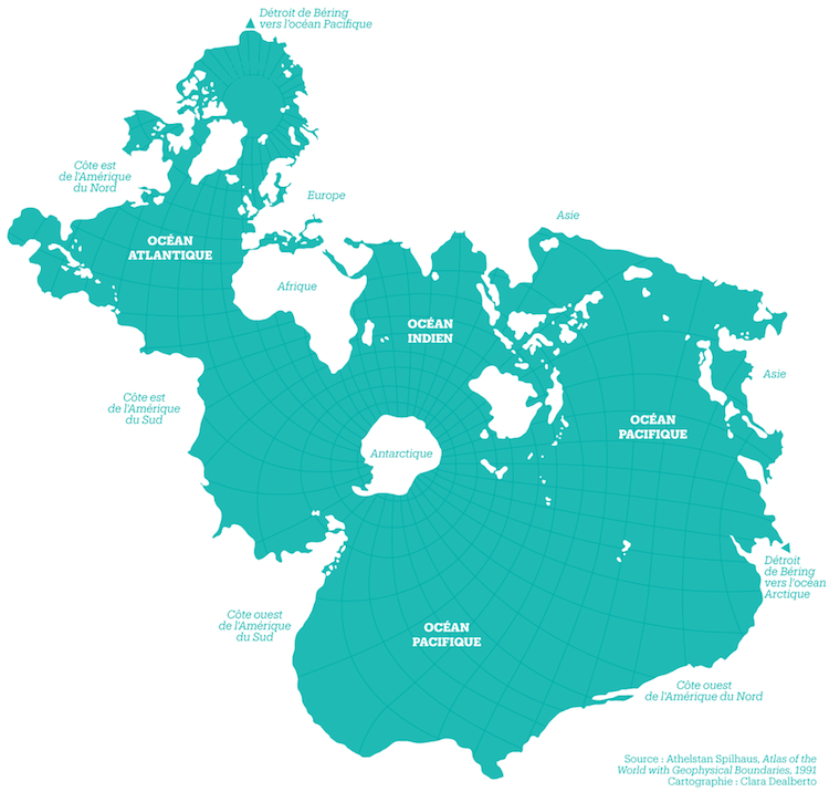
This unique map was drafted in 1942 by South African-American geophysicist, oceanographer, inventor, and urban designer Athelstan Spilhaus. It ingeniously places the oceans in the center, resulting in a view that visually unites the bodies of water and transforms the landmasses into negative space. This approach results in an eye-catching map that, for once, takes the cartographical emphasis off of countries.
“It's both awesome and totally confusing,” map-centric website Le Cartographe explains. “The deformation is such that the American and Asian continents are completely torn apart. Europe, Africa, and South-East Asia, on the other hand, maintain a coherent form. This projection is rarely used and it is a shame!”
While this design may make you dizzy at first glance, it comes equipped with built-in tools to help you understand its orientation. Namely, the projection includes two triangles that denote the Bering Strait, a channel located between Russia and the United States. By mentally matching up these small symbols, you can imagine the map as a sphere, making this seemingly strange design easier to grasp—and perhaps altering your previously-held perceptions of the world.
h/t: [Open Culture]
Related Articles:
Incredible Online Archive Lets You Download Hundreds of Ancient Maps for Free
Interactive Map Explores the Literal Meanings of 190 Global City Names
Global Warming Map Shows What Happens When the Earth Gets 4 Degrees Warmer
Map Reveals Where Modern Countries Would Be Located If Pangea Still Existed