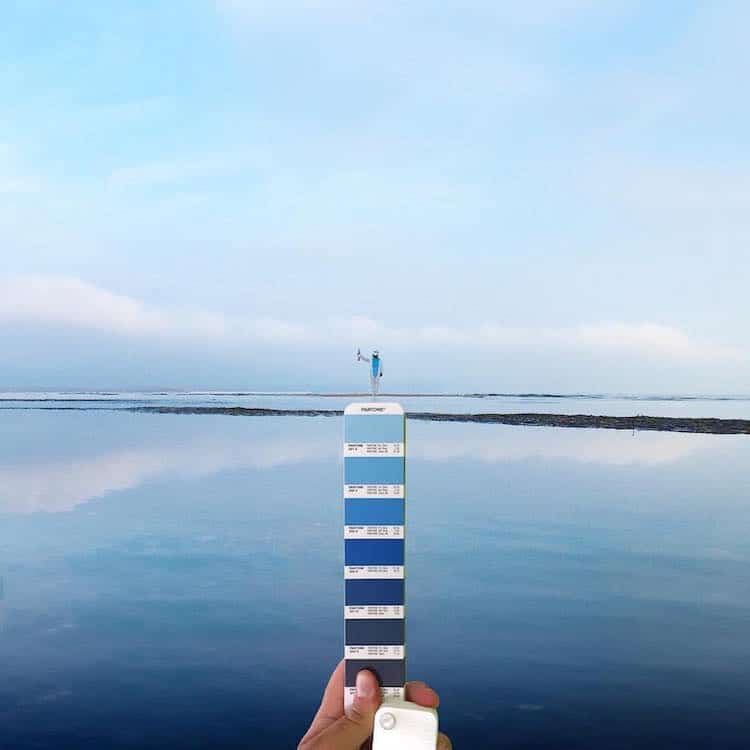
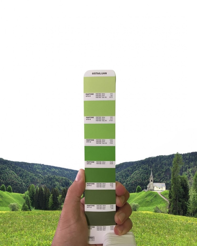
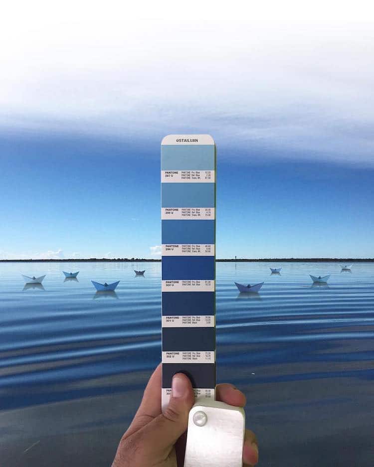
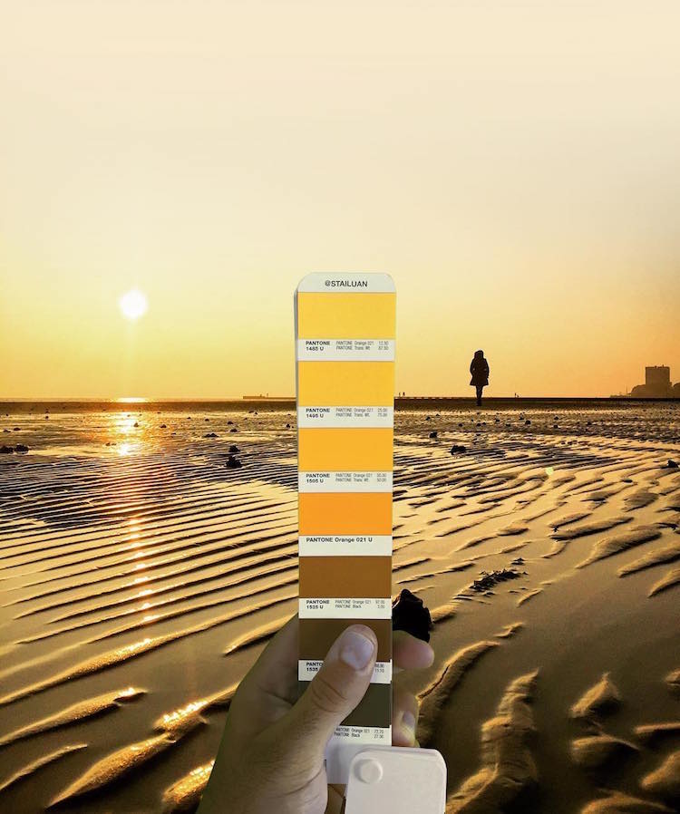
It's no secret that designers love playing with Pantone swatches. From tiny objects to tasty treats, contemporary creatives have introduced and embraced a Technicolor trend of matching color samples with everyday items. Italian graphic designer Andrea Antoni has put his own spin on the Pantone practice by photographing swatches he has perfectly paired with landscapes.
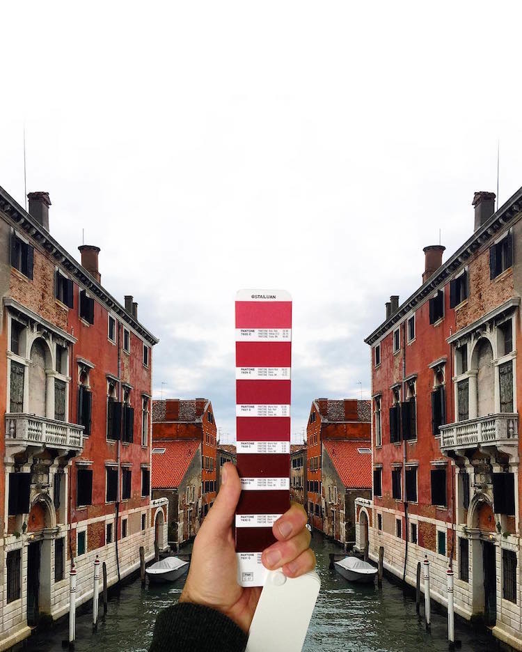
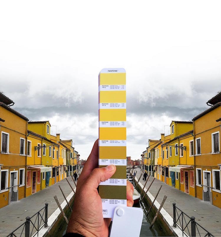
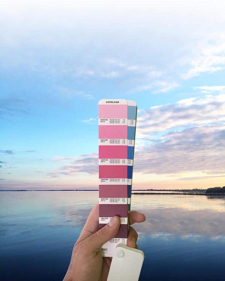
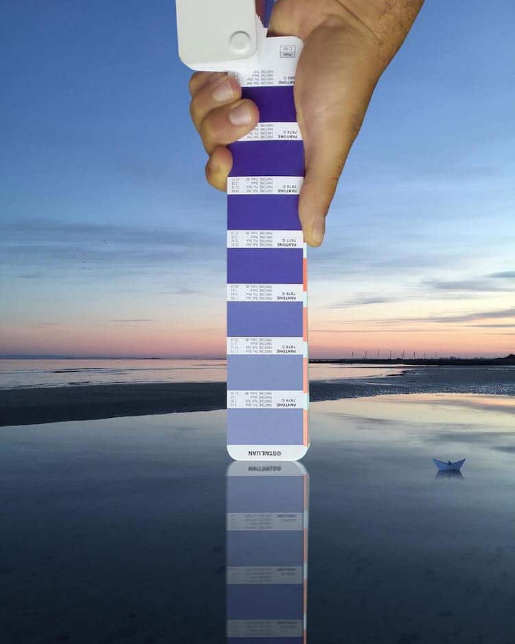
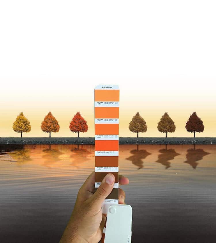
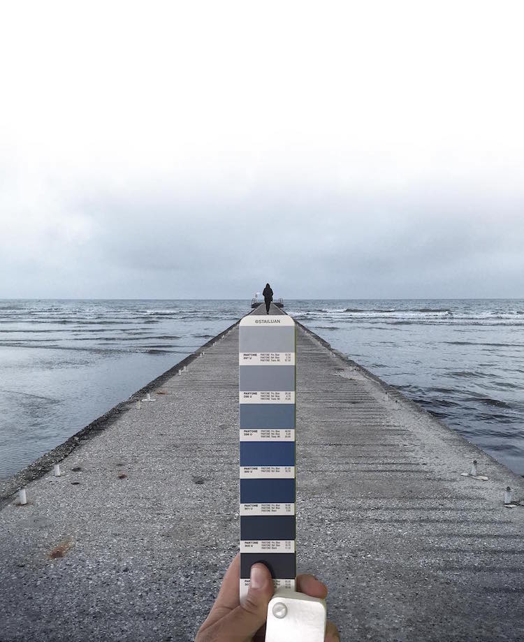
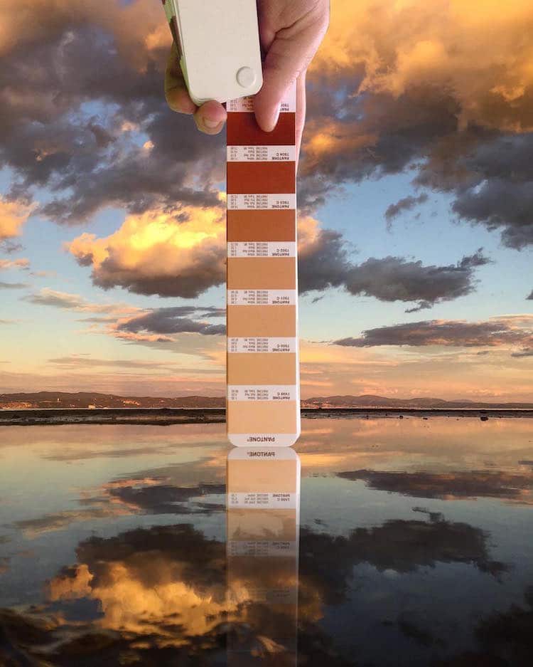
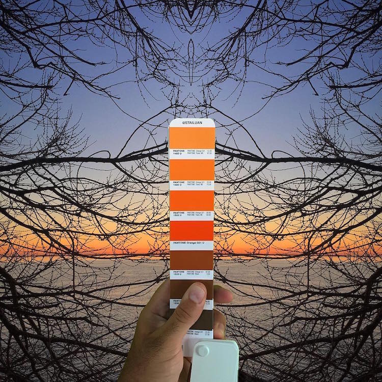
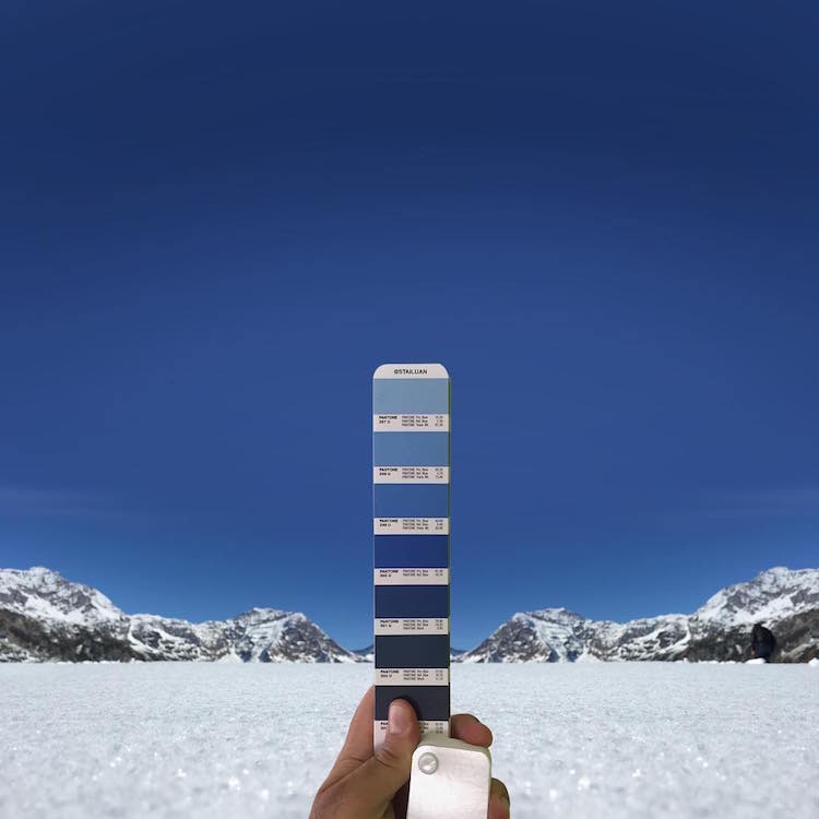
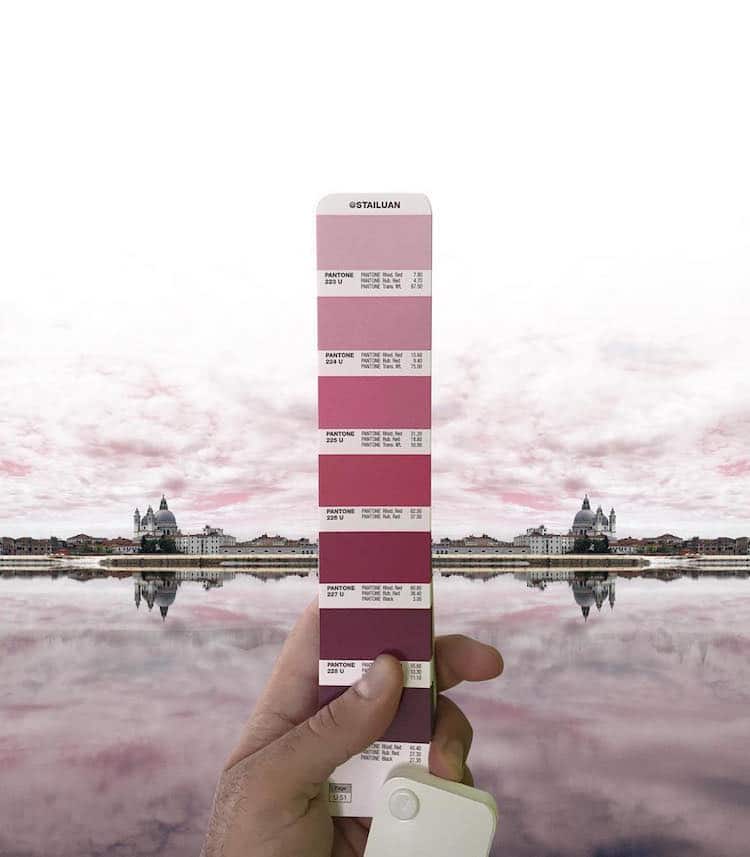
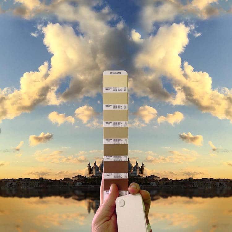
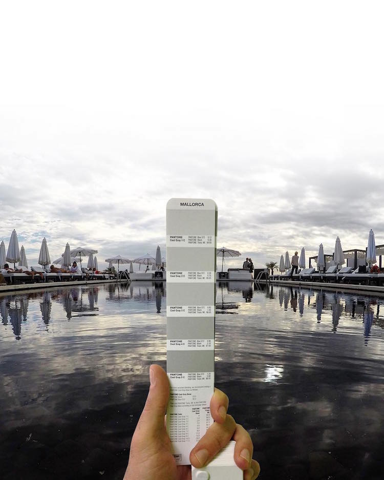
In each Pantone landscape study, the artist holds up a page from a Pantone fan deck. Set against a real-life backdrop of buildings or a scene of nature, the colors on the swatch set are clearly represented in the background. An orange gradient is reflected in a sunset, shades of purple are evident in a seascape, and a collection of cool, blue tones pop from a wintertime depiction of a bare tree. While undeniably beautiful, the collection of tonal studies is much more than picture-perfect color pairings for Antoni. Each photograph is also intended to evoke the artist's emotional response or attachment to the selected scene. “The images reflect the way I see the world, or the memory I have of some places,” the designer told Creators. “Some show the sensations that these places evoke in me.”
This focus on memory has also influenced his artistic approach to the craft, as he often edits the images in order to both achieve his desired aesthetics and to metaphorically represent the power of impression. “While it is definitely these same places in the pictures, it is also not them; colors have changed, buildings are cut out and presented in different ways. The result is a world that is unreal from one point of view, but extremely true from another. That’s the place of memory; real and recreated at the same time.”
You can see all of Antoni's Pantone-themed pieces—as well as other artistic and nature-inspired images—on his polychromatic Instagram.
Each Pantone match photographed by Andrea Antoni showcases the graphic designer's eye for color.
Andrea Antoni: Website | Instagram | Facebook
h/t: [Design Taxi]