July 20, 2021
Eye-Opening “True Size Map” Shows the Real Size of Countries on a Global Scale
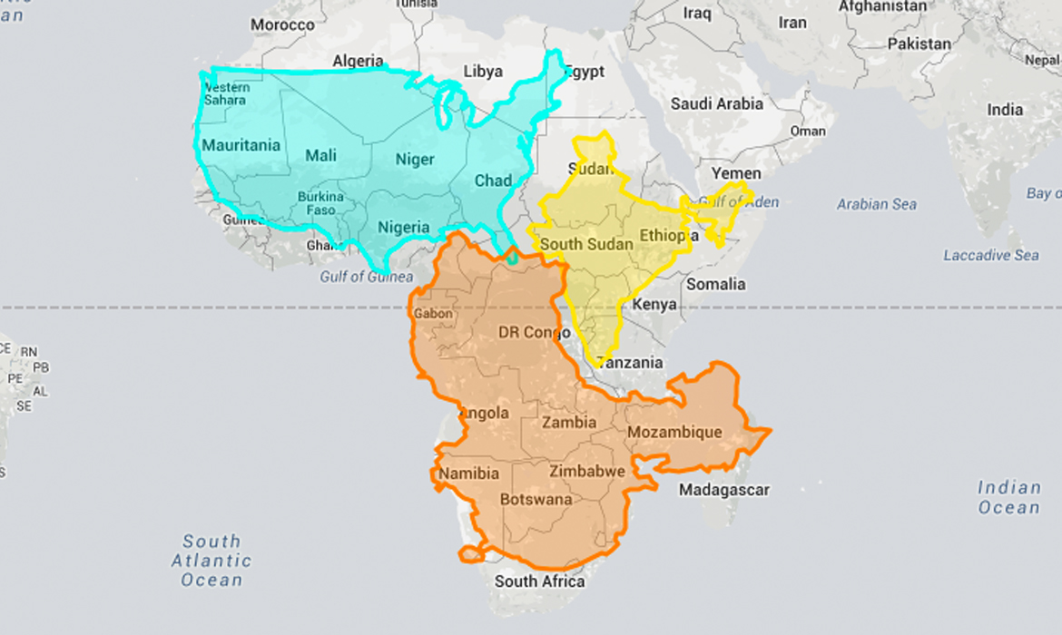
When you picture a 2D representation of our world, what do you see? Chances are, you’re probably thinking of the Mercator map—a standard type of projection that’s been around since the late 16th century. Although it's useful for navigational purposes, the map is also misleading because the relative sizes of countries are inaccurately conveyed. Some places, such as Greenland, look huge on this type of chart, but in actuality are much smaller.