Have you ever wondered just how true-to-life the world's many metro maps actually are? If so, you're in luck! Recently, Reddit users have started to create animations that compare stylized subway maps with accurate geographical representations. Now, this transit-inspired trend has taken off, with several cities starring as its subjects.
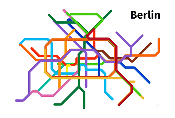
The phenomenon began when vinnivinnivinni, a contributor on the Data is Beautiful subreddit, created and shared a unique map based on Berlin. Rendered as an animated gif, the image shows the well-known, line drawing-like map as it morphs into a more realistic portrayal of the city's subway system. To create her moving masterpiece, vinnivinnivinni used data from Google Maps, Wikipedia, and the official subway map of Berlin.
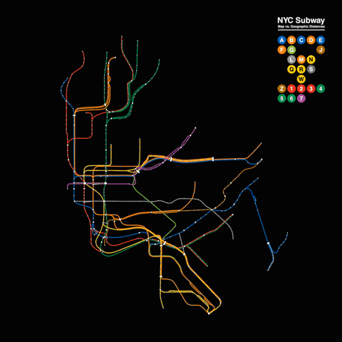
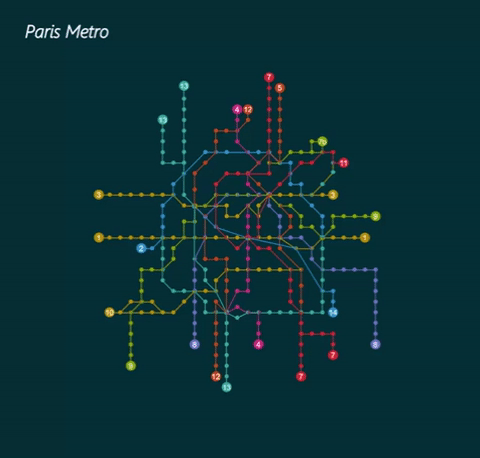
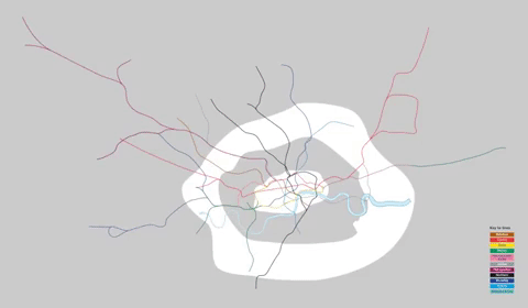
Other users on the Data is Beautiful board were so impressed and inspired by vinnivinnivinni's work that many opted to create their own animated studies. Thanks to these ambitious animators, most major cities around the world now have their own moving maps. The London Underground, the Paris Metro, and the New York Subway are just a few systems whose iconic, illustrated maps have been realistically reimagined as mesmerizing gifs.
If you're interested in exploring more creative projects rooted in figures and statistics, stop by Data is Beautiful on Reddit.
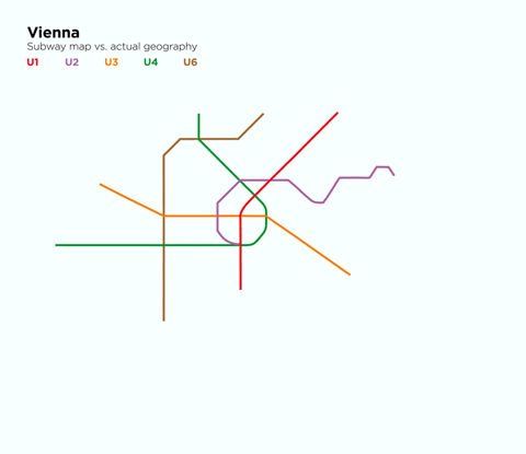
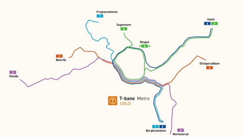
In a series of animated subway maps, well-known transit maps from cities around the world are cleverly compared to their real-life geography.
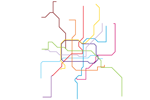
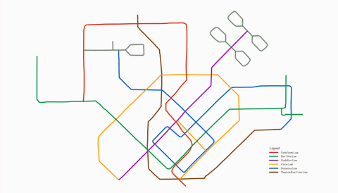
Berlin
Paris
London
Vienna
Oslo
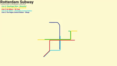
Rotterdam
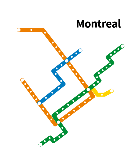
Montreal
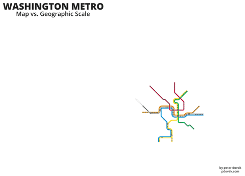
Washington DC
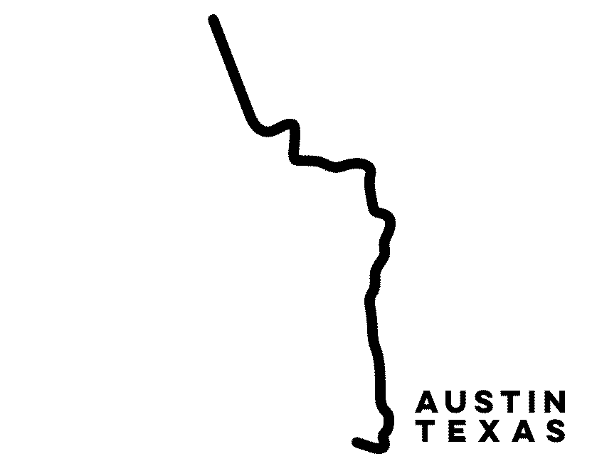
Austin
Shanghai
Singapore
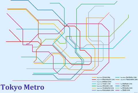
Tokyo
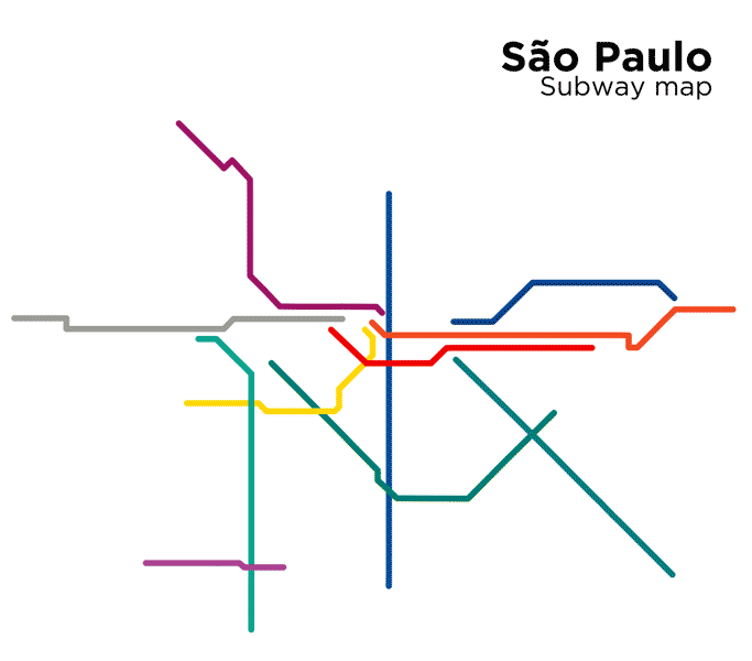
São Paulo
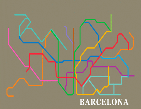
Barcelona
h/t: [Colossal, Twisted Sifter]
Related Articles:
Redesigned Metro Maps Offer Consistency Around the World
Minimalist “Mini Metros” Simplify Worldwide Public Transit Maps
Ingeniously Redesigned World Map Looks Unusual, But Is Highly Accurate