Stock Photos from Akira Kaelyn/Shutterstock
This post may contain affiliate links. If you make a purchase, My Modern Met may earn an affiliate commission. Please read our disclosure for more info.
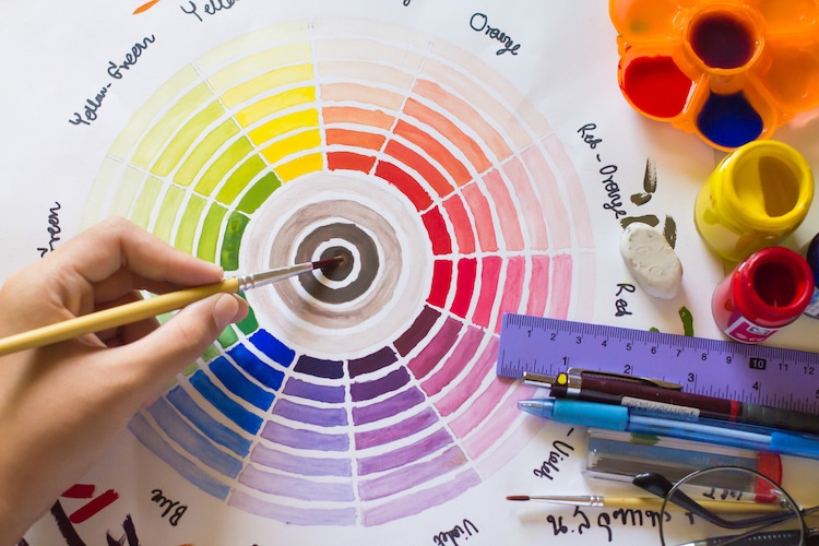
We often take color selection for granted. After all, how easy is it to choose a hue from the color picker in Photoshop? Although we might think nothing of it now, mankind didn’t always have the color wheel at its fingertips.
It was the exploration by some of the world’s great thinkers and scientific advancement that lead to its development. And as you’ll see, during its many iterations, the color wheel was not only a wheel, but a sphere, triangle, and more. These are some of the most notable color creations; throughout history, other people have assembled their own “reshuffling of the rainbow.”
Scroll down to learn more about the color wheel and its history.
What is a Color Wheel?
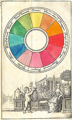
Color Circle from 1708, based on the primary colors blue, red, and yellow (Photo: Wikimedia Commons, Public domain)
A color wheel is a tool that shows the relationship between primary, secondary, and tertiary colors, which are all evenly spaced inside a circle.
In an RYB color wheel, for instance, red, yellow, and blue are the primary colors. They are arranged evenly in different parts of the circle. Corresponding secondary colors green, purple, and orange are then placed between the primary colors they are mixed from. So, orange sits between red and yellow, green fills the space between yellow and blue, and purple is located between blue and red. Tertiary colors are created by mixing one primary color with one secondary color. For example, teal is a tertiary color created from primary blue and secondary green. The color wheel can continue into quaternary and quinary colors in the same way, until eventually reaching shades of gray.
Color Harmony
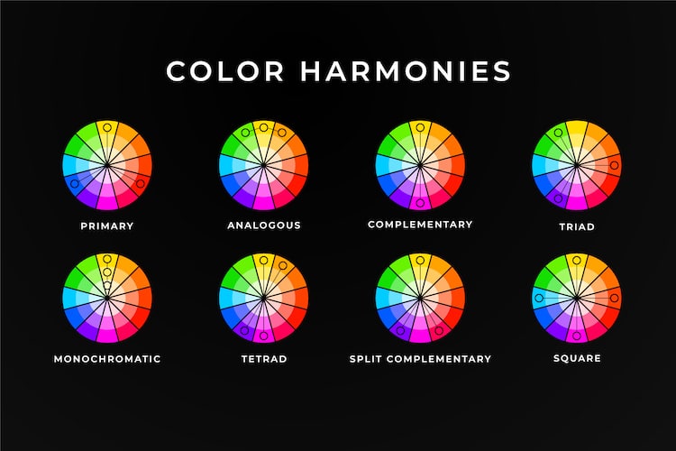
The color wheel is a practical tool for artists and designers. It can help you select a color palette and be used as a guide on how to mix colors to achieve a certain shade.
- Complementary colors are two colors that sit directly across from each other on the color wheel. Red and green, for instance, are complementary colors. A color scheme based on complementary colors will be quite vibrant, as the two colors contrast against one another. The stark contrast can make it difficult to work with on a large scale; but, used in small doses, it’s a great way to pull attention to a particular area.
- Analogous color schemes can often be found in nature and when used, typically one color dominates. The second color supports the dominant color, while the third is used primarily as an accent. The colors are already harmonious, so you'll want to be sure there is enough contrast to make your design pop. Analogous colors sit directly next to one another on the color wheel and can be very effective in creating a calm, serene feeling.
- Triadic color schemes are not easy to use, but if done right they can yield great results. Draw a triangle on the wheel and you'll hit on three colors equally spaced apart. For instance, purple, orange, and green (the secondary colors). Triadic colors are quite vibrant and rich, so to use them effectively you’ll want to choose one dominant color and use the other two as accents.
- Split-complementary color schemes use one base color and two additional colors that are adjacent to the base color’s complement. So, if red-orange (vermillion) is the base color, the other two colors in the scheme would be blue and green. The results are still vibrant, but as the contrast isn’t so strong it’s easier for beginners to work with.
- Tetradic color schemes use four colors broken into two complementary pairs. This rich color scheme can be tricky to manage but allows for a lot of variety. It works best if one color is dominant or if the colors are subdued. By using all colors equally, the overall design may appear unbalanced. Another characteristic to consider is the balance between warm and cool colors.
- Square color schemes also use four colors, but they are all spaced evenly around the wheel. Similarly to tetradic colors, this palette works best if one color dominates and the others are accents. Otherwise, it can look sloppy. Attention to warm and cool colors is also a must here.
- Achromatic color schemes exclusively use black, white, and shades of grey. Designers will often throw in an accent color to create interest or break up the neutral design.
- Monochromatic color schemes take one hue and create a design based on different tints, tones, and shares of the hue. This color scheme allows for cohesion and relies on contrasting tones to attract attention or create focus.
History of the Color Wheel
The first color palettes were created 40,000 years ago by ancient people who created cave paintings. They produced pigment from what was around them—in this case, dirt, clay, or charcoal with a binder of spit or animal fat. These rudimentary palettes were limited in their hues and included earth pigments of red, yellow, and brown, as well as black from charcoal and burnt bones, and white from grounded calcite.
As artists continued to experiment with color, they evolved the pigments created by those before them. The color blue, for instance, was founded by the Egyptians when they figured out a process for producing permanent pigments from multiple minerals. With these new hues did not come a formal color theory, however. Color theory (not the color wheel) was first referenced during the Renaissance. Leone Battista Alberti is thought to have written it and laid the groundwork for the evolution of the color wheel.
First Drawn Color Wheel
Aron Sigfrid Forsius [Public domain]
Through Forsius' studies, he concluded that colors could be arranged in a special order. His system used five main colors sandwiched between white and black. They were: red, yellow, green, blue, and gray. Each was graded as being closer to white or to black.
Sir Isaac Newton and Opticks
Sir Isaac Newton is perhaps best known for his work on universal gravitation and the laws of motion. But he applied the same scientific approach to color, too. He conducted experiments to study the relationship between colors; his most famous test used a prism. In a dark room, Newton placed a prism in front of a beam of light and created a spectrum of hues from red to purple. This proved that white light was composed of many colors.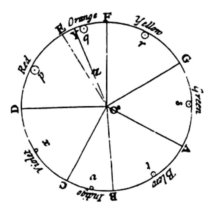
Newton detailed his findings in his 1704 book titled Opticks and created an early color wheel based on the combinations he witnessed through his prism experiment. He made a crucial decision in his work, and that was to connect the violet end of the spectrum and with the red end—essentially creating the first iteration of the color wheel that we know and love.
Johann Wolfgang von Goethe's Own Theory of Color
Johann Wolfgang von Goethe designed his own color wheel in 1810 which was a rebuttal of Newton's color spectrum theory. To him, darkness was not an absence of light, but rather it was its own force that played an active role in creating hues. When light struck dark, he theorized, their collision produced observable bits of color.
Tobias Mayer and His Color Triangle
Newton’s color wheel was used by future theorists, as it was a demonstration of how colors can blend to produce other colors. Some well-known iterations that followed his discovery weren’t wheels at all. The work of Tobias Mayer, completed in the late 18th century, was a color system that arranged hues in a triangle. He placed the primary colors—red, yellow, and blue—at either point on the shape. The rest of the triangle was filled in with progressive hexagonal-shaped gradients of the three colors. Mayer created 12 gradations between any two colors, which he believed was the maximum degree of variance that the human eye could distinguish.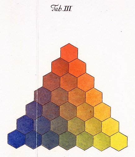
After Mayer’s color triangle was introduced, physicist Georg Christian Lichtenberg pared down the 12 colors to seven gradations per side.
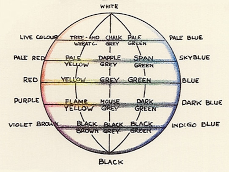
Philip Otto Runge Imagines a Color Sphere
Another notable color wheel was a color sphere created by painter Philip Otto Runge in 1807. His model combined Mayer’s three primary colors (or “pure” as they were known) plus black and white and spread them over a three-dimensional globe that was complete with cross-sectioning.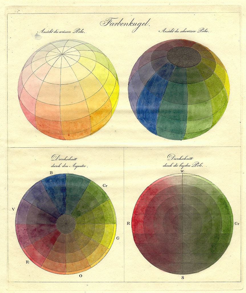
Albert Henry Munsell and His 20th-Century Model
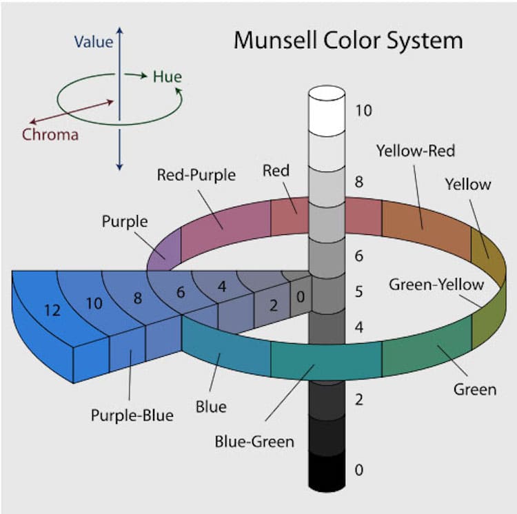
Albert Henry Munsell brought the color wheel into the 20th century by constructing a color system that combined three-dimensionality with references to Newton’s theory. His model featured a three-dimensional cylinder that was graded from white to black with a ring that showed hues as well as an intersecting chroma that showed the possible combinations of them all.
Learning Color Theory
All of these iterations of the color wheel offer a different understanding of hues, and they highlight the exploration of the field throughout hundreds of years. As a creative person, it’s important that you understand how colors interact with and influence one another. (It will help you in your color mixing!)
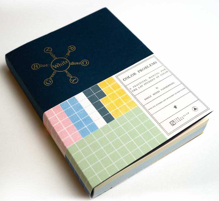
If you’re interested in learning more, pick up a copy of Color Problems by Emily Noyes Vanderpoel. The artist, scholar, and historian created her seminal text in 1903 in an attempt to make color theory available to everyone. She succeeded, and the text has recently been republished in collaboration with The Circadian Press and Sacred Bones.
More Books on Color Theory
Online Classes on Color Theory
Prefer the online class setting? Richard Mehl teaches a color theory class through CreativeLive. Blake Rudis also has a course on color theory, but gears his class towards photographers.
Frequently Asked Questions
What is a color wheel?
A color wheel is a tool invented by Isaac Newton, which shows the relationship between primary, secondary, and tertiary colors by placing them evenly in a circle.
What are monochromatic color schemes?
A monochromatic color scheme takes one hue and creates a design based on different tints, tones, and shades of the hue. This color scheme allows for cohesion and relies on contrasting tones to attract attention or create focus.
What do analogous colors mean?
Analogous colors sit directly next to one another on the color wheel and can be very effective in creating a calm, serene feeling. Analogous color schemes can often be found in nature; and when used, typically one color dominates. The second color supports the dominant color, while the third is used primarily as an accent. The colors are already harmonious, so you'll want to be sure there is enough contrast to make your design pop.
This article has been edited and updated.
Related Articles:
Learn How Color Theory Can Push Your Creativity to the Next Level
Victorian-Era Color Theory Manual Reissued for the First Time in 115 Years
Curious About Color Mixing? Here Are the Basics You Need to Know
Top 5 Free Color Palette Generators to Make Color Selection a Breeze


