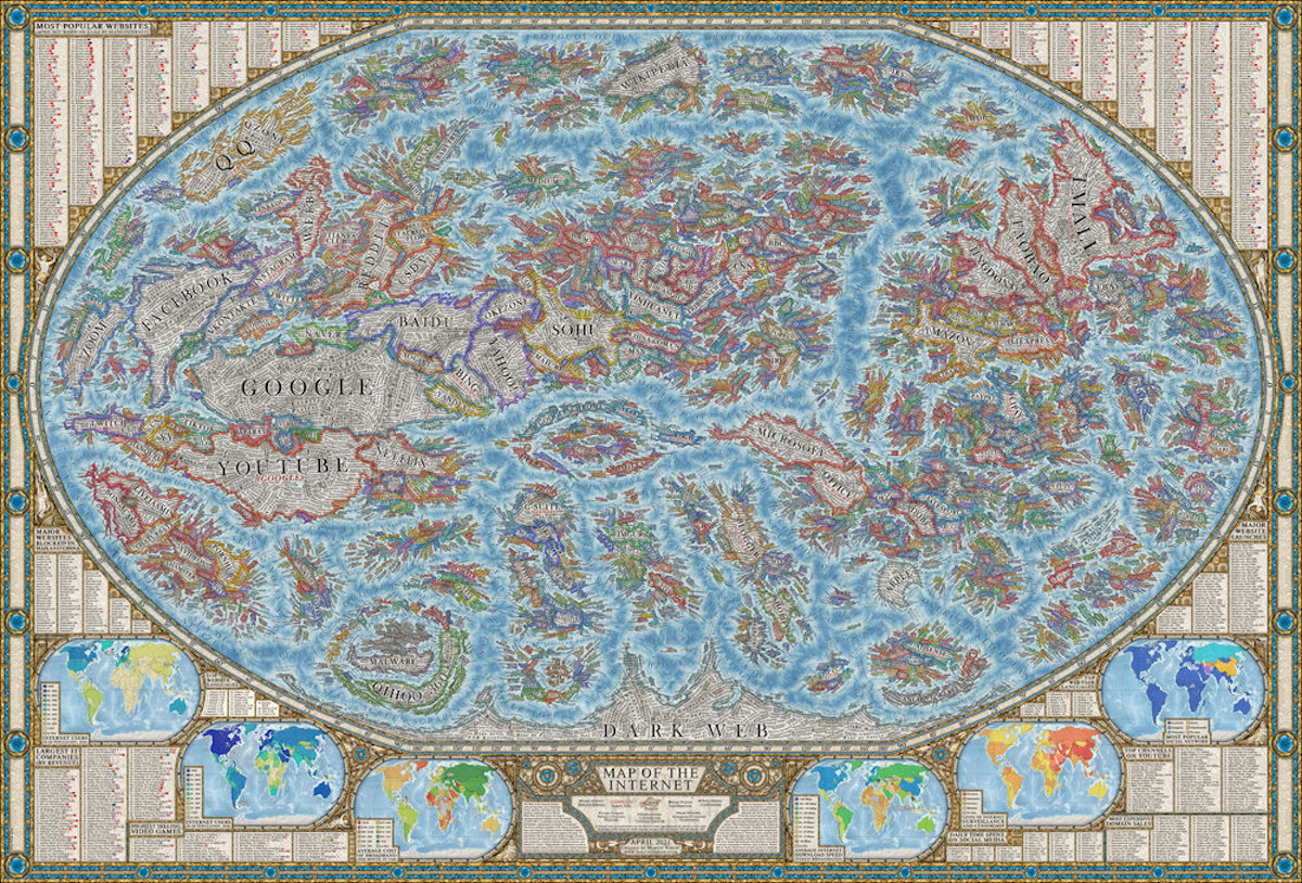
View the full-resolution version of the map.
This post may contain affiliate links. If you make a purchase, My Modern Met may earn an affiliate commission. Please read our disclosure for more info.
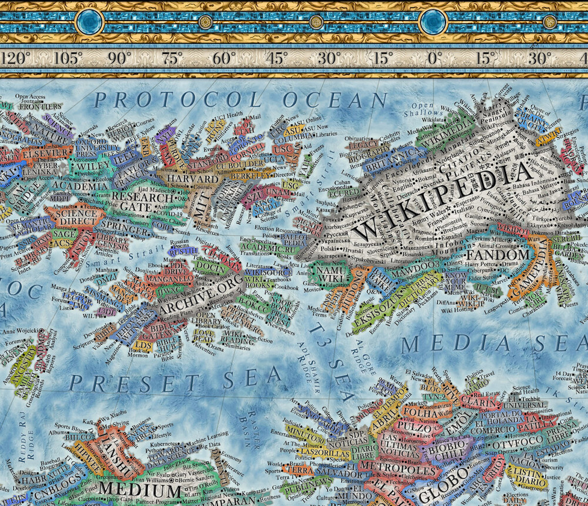
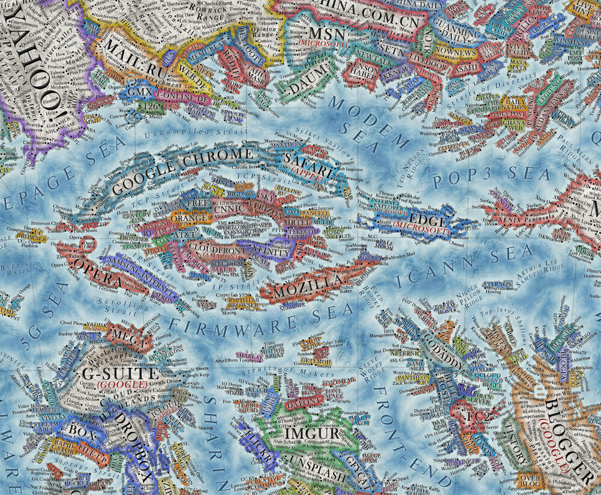
The internet is a vast place. Many of us exist in our own communities, and we might not have any idea of what’s just beyond our self-imposed digital borders. But, what is happening outside of our favorite forums and blogs? To find that out, you might need a map. Martin Vargic of Halcyon Maps has created a fascinating Map of the Internet 2021—an update to his 2014 version—which details a full vintage-style spread of the internet. It depicts the most popular social networks and largest sites according to an Alexa analysis of the world’s top 500 websites.
From giants like Google and YouTube to more niche (but still popular) like Forbes and Tumblr, Vargic plots these virtual places on a map and surrounds them with related websites or services. It’s easy to get lost in looking at all the sites that make up the world. And for Vargic, that was part of the point in creating it.
“Overall, I hope the map of the internet will give people a better overview of the internet as a whole and allow them to explore it from a brand new angle, bringing more order and condensing the sheer complexity and chaos of the world wide web into a more manageable, though still comprehensive package,” he explains to My Modern Met. “Many people could discover new useful and interesting sites or software they have never heard of, as I certainly did while making the map, and most importantly, provide a long, deep, intriguing, and pleasurable viewing experience.”
We continued to chat with Vargic about his extensive Map of the Internet 2021—scroll down for our exclusive interview. And if you’d like to hang this map on your wall, high-quality poster prints are available in medium and large sizes on Zazzle.
What first inspired you to create a map of the internet?
The inspiration for my first Map of the Internet came from an xkcd comic “the map of online communities,” which portrayed many of the largest and popular online communities, forums, and blogs as countries on a map. I really liked the concept, and in 2014, decided to make it on a much larger scale and portray all aspects of the internet, not just social networks and blogs.
Since then, however, the landscape of the internet has changed considerably and the old map became more and more outdated. At the same time, I improved considerably as an artist and designer and thought that the Map of the Internet deserved to be revisited, and the concept further explored and realized on an even more ambitious and comprehensive scale, bringing in the current Map of the Internet 2021.
What criteria did you use to determine the most popular websites?
The popularity of websites is based on data gathered and processed by Alexa. It monitors millions of websites daily and uses a complex formula to rank websites by their popularity and traffic. A list of top 500 websites is available publicly for free, while much more can be found with a subscription. Furthermore, complex historical analytics are available for basically any website.
How did you decide on the relative size and placement of websites/countries?
The territorial size of websites is based on this Alexa rank, averaged between January 2020 and January 2021. Rules of scaling are simple—the most popular website (Google), is the largest, the second most popular, YouTube, is the second-largest, third most popular site is the third-largest, and the same principle is applied to over 3,000 websites.
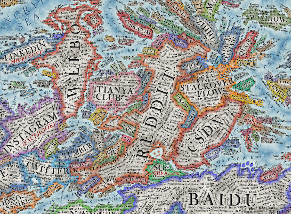
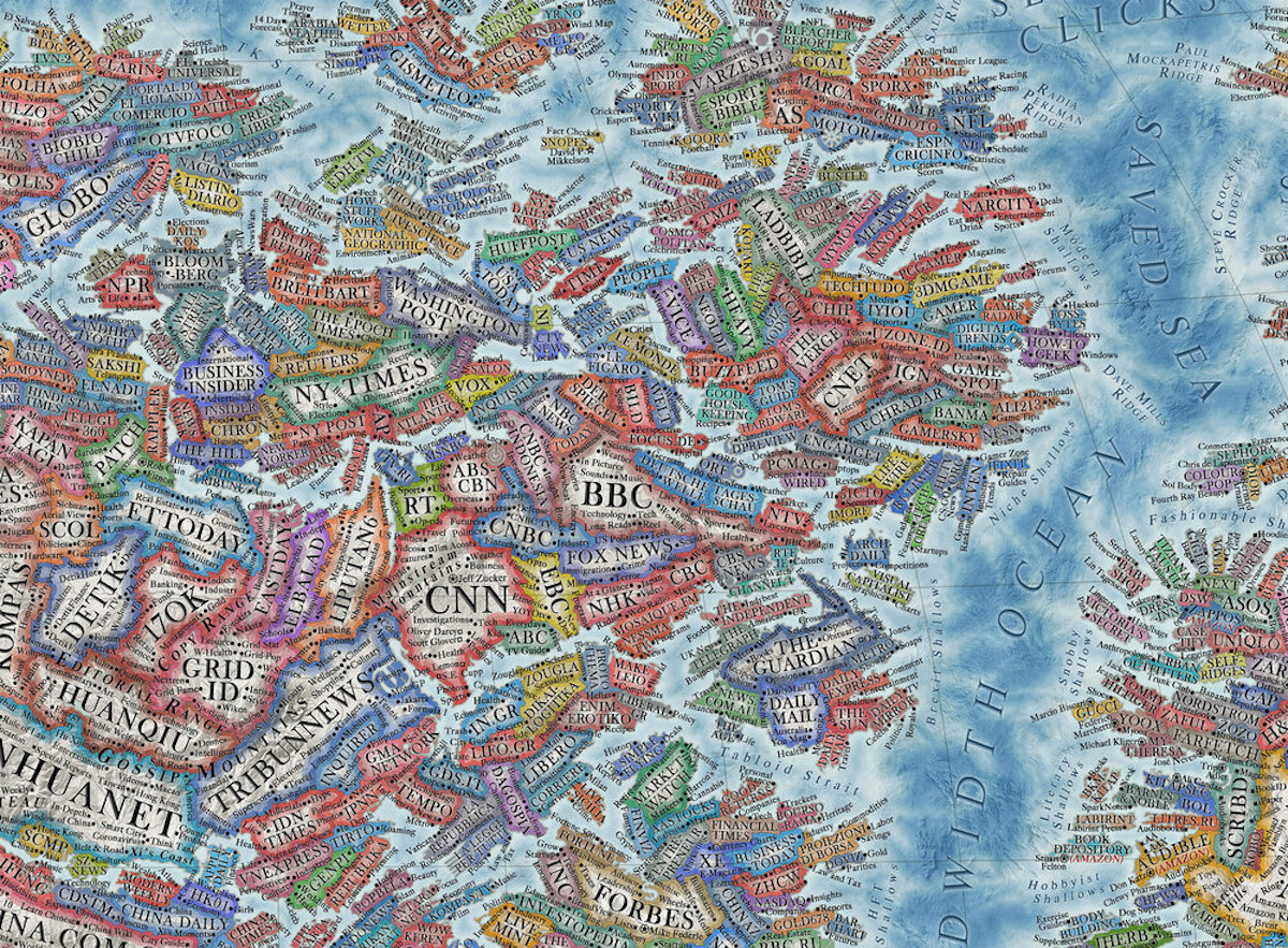
Websites are clustered together based on their category and general purposes, such as e-commerce, video sharing, image hosting social networks, online encyclopedias, sites of software companies, and many more. There are well over 100 of these clusters/regions of sites on the map, while I also tried to take language and culture into account (i.e within each region, websites from the same country are often grouped together as well).
What was one of the most challenging things about creating this map?
The sheer size of it was by far the most challenging. All in all, it took me over 1,000 hours to create the map, distributed within six months. The map also includes about 20,000 “cities,” which show features, products, subcategories, or most popular content creators and contributors (while CEOs and founders are represented as “capitals”). I had to do extensive research to gather a list of these for each major site, many if not most of them in foreign languages—a big part of the map shows Chinese websites where the direct translation is not easy.
What did making this map teach you about the current state of the World Wide Web?
Since 2014, the popularity of non-English websites has increased considerably—about a third of the world's most visited 50 websites are based in China, with Tmall, QQ, Baidu, and Sohu surpassing Amazon, Yahoo, and even Facebook in terms of traffic. There is also a much larger amount of popular Indonesian, Indian, Iranian, Brazilian, and other sites than seven years ago. While making the map, I had to do considerable research on the content of these websites, their services, features, and most popular users, which was not very easy with so many different languages.
What are some of the biggest changes you’ve seen on the internet since 2014, and how is that reflected in the 2021 map itself?
The popularity of streaming, video and live cam sites, news sites, as well as e-government and education sites, has increased quite a bit since 2014, while the relative popularity of sites of software companies, as well as many forums, communities, imageboards, and porn sites have gone down.
How has your map-making changed?
Since 2014, when I was 15–16 years old, my skills have improved considerably. The first map was drawn in paint.net, at low resolution, with a ramshackle plugin used to render curved text with inconsistent spacing. Since then, I have worked on a multitude of other projects and now work in Photoshop with higher quality files at a much higher resolution.
What are you working on next?
As the map took a very large amount of time to make, I don't think I will work on a new one soon. I plan to focus on other projects for now, such as a new, reworked series of real-world and historical maps and posters, a series of educational YouTube videos, a periodic table, as well as new infographic posters, showing such things as the extremes of temperature, depths of the sea, and an overview of the electromagnetic spectrum.