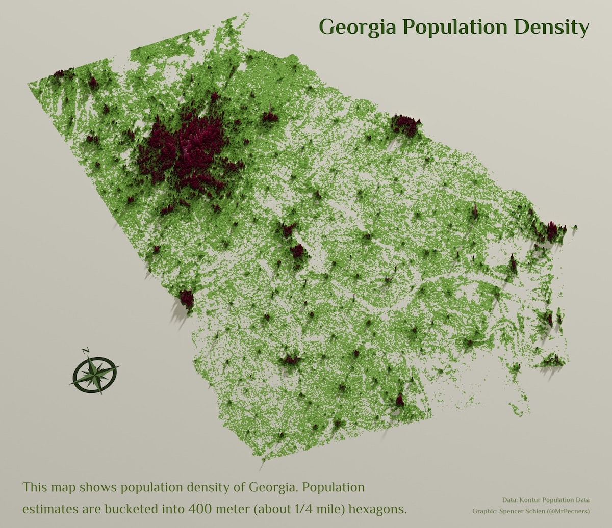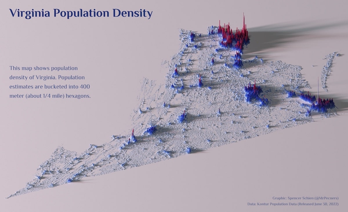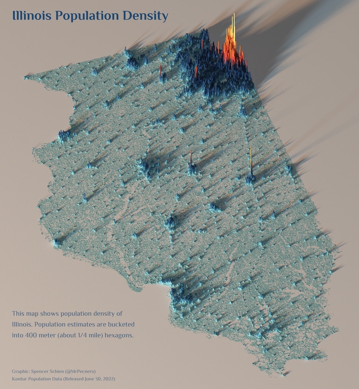
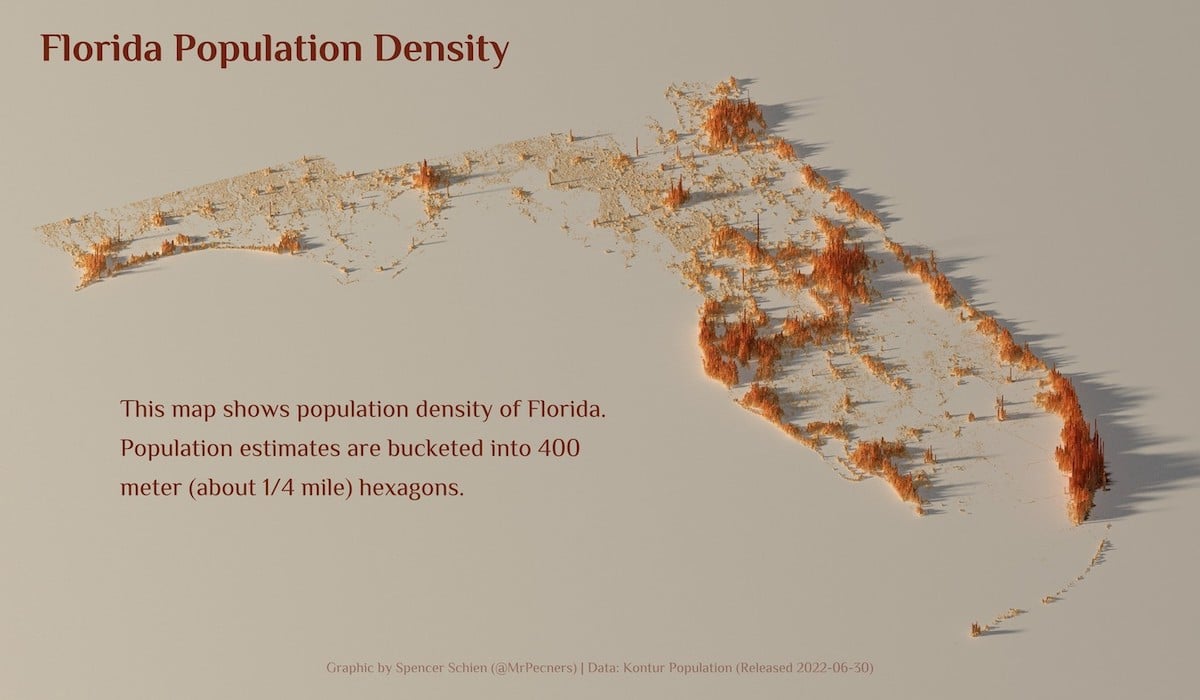
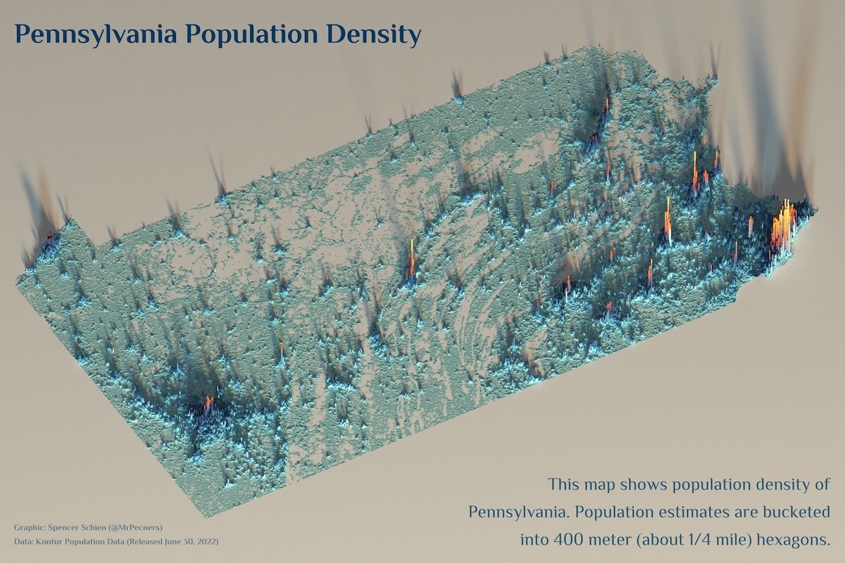
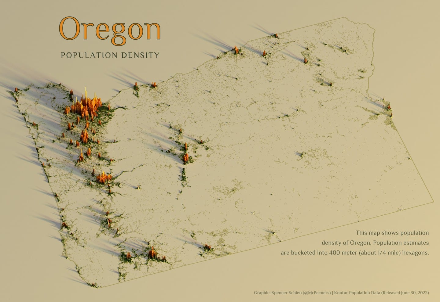
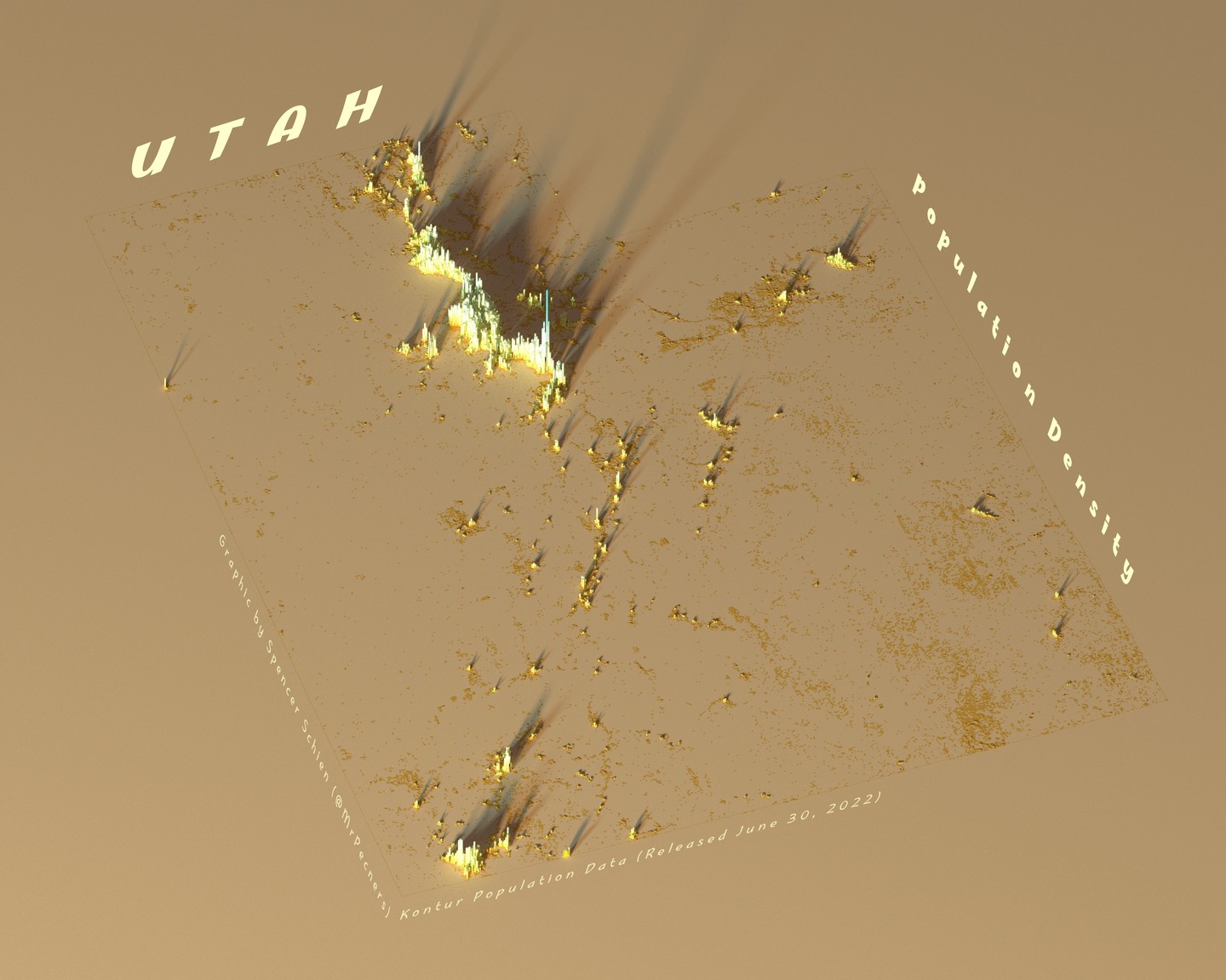
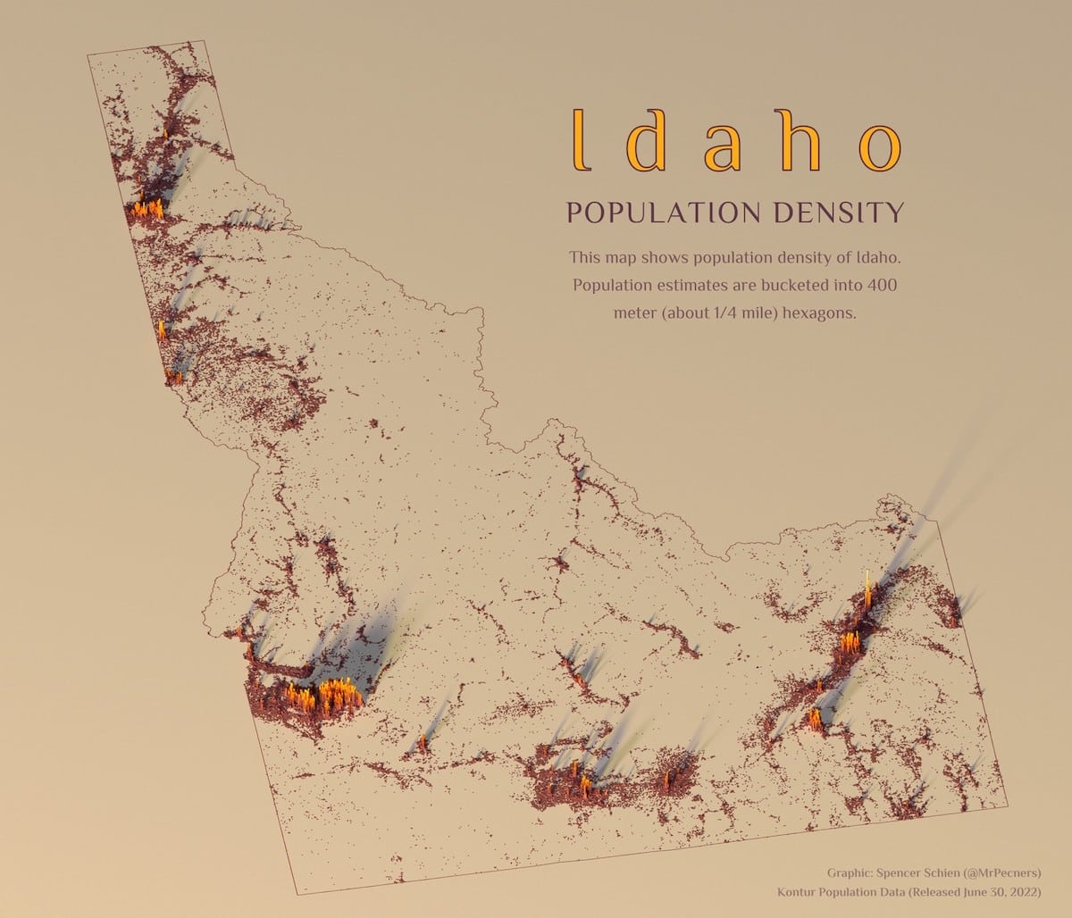
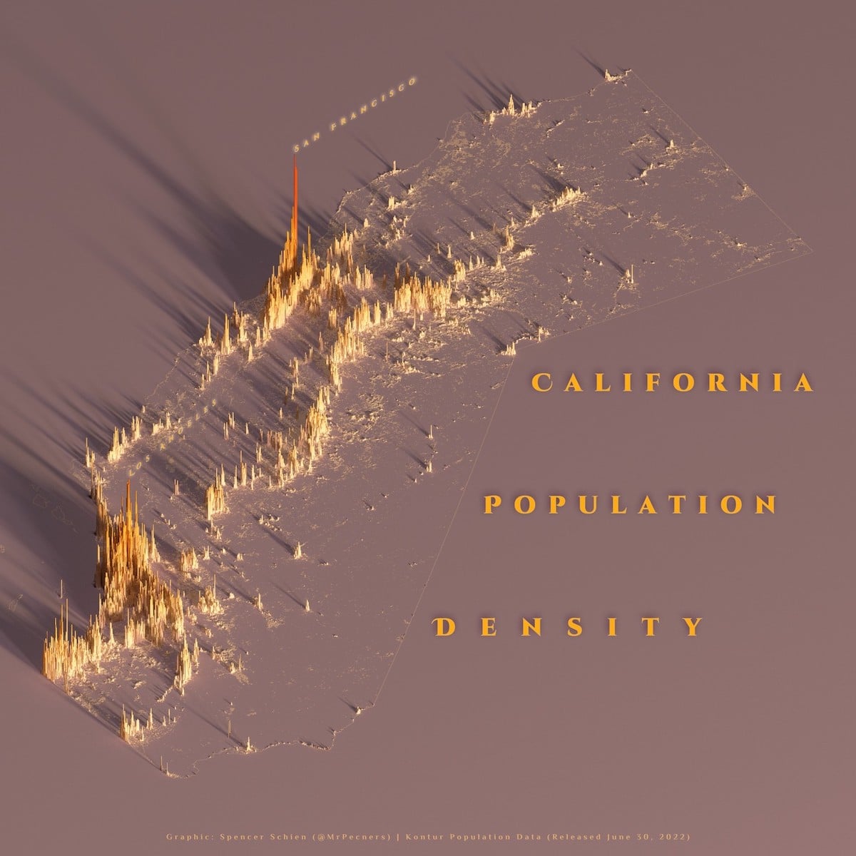
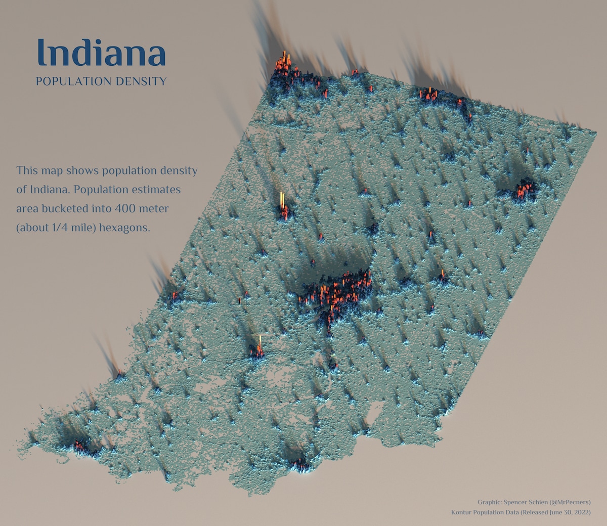
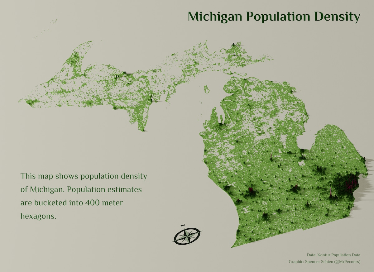
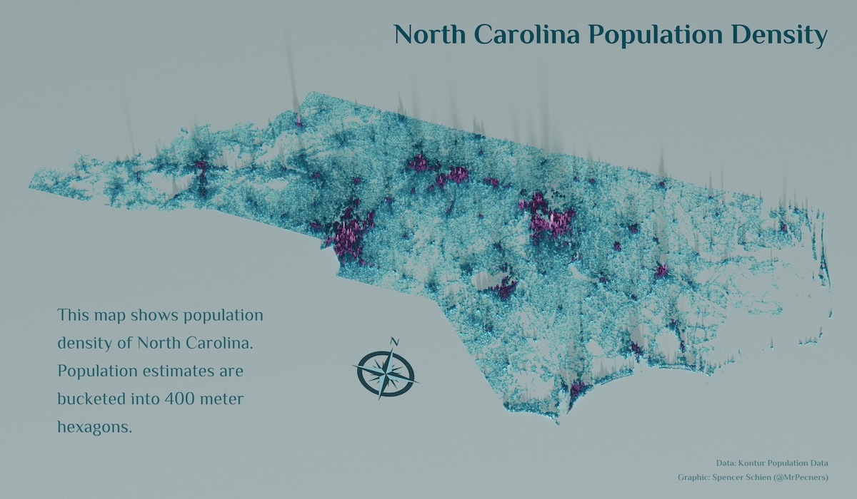
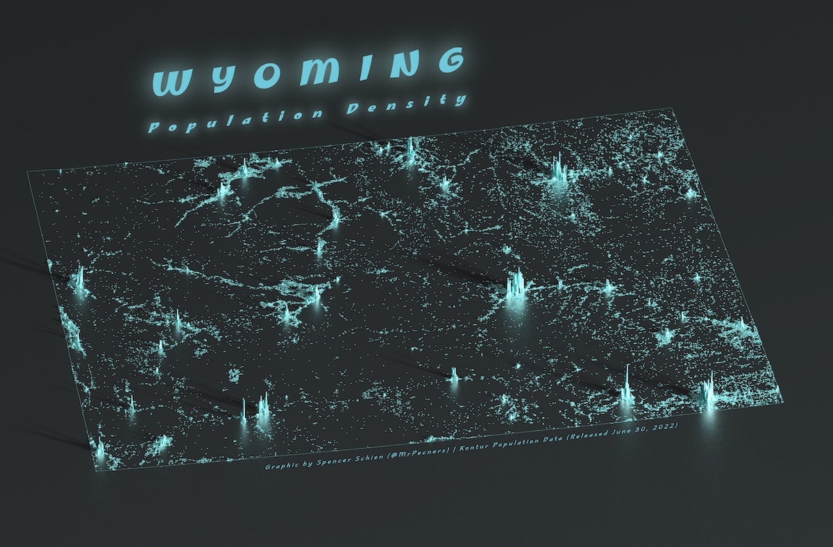
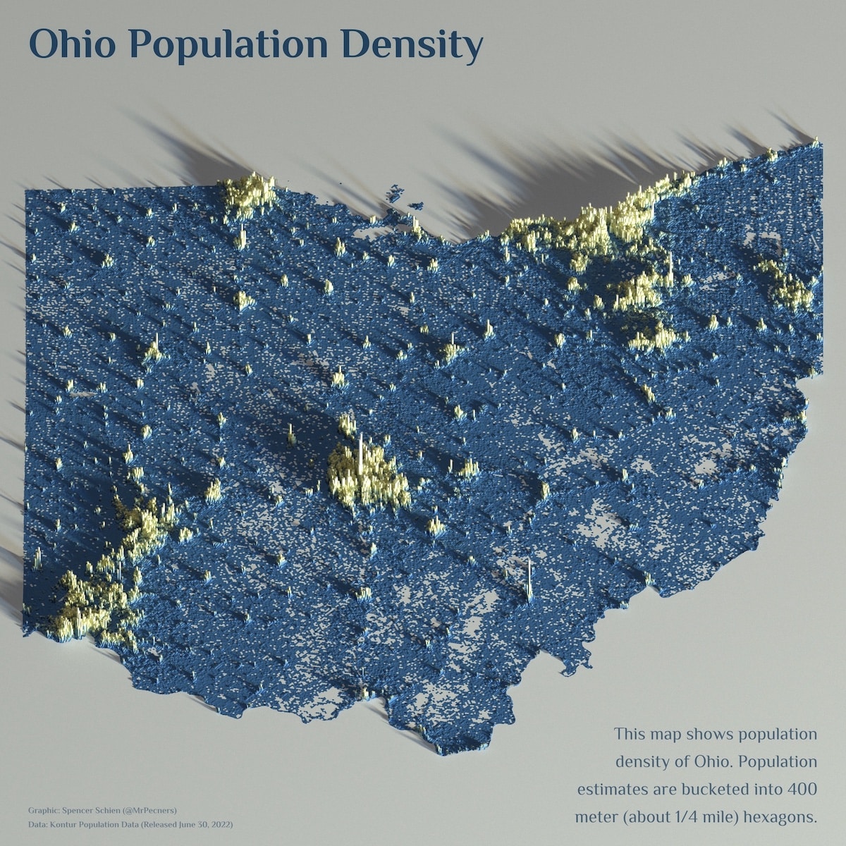
We can read about the population of a state, but it can be hard to visualize what its density looks like. Data technologist Spencer Schien is demystifying a selection of U.S. states with his fascinating population density maps. In each of his three-dimensional visualizations, he uses publicly available data and R programming language to chart the areas where people live.
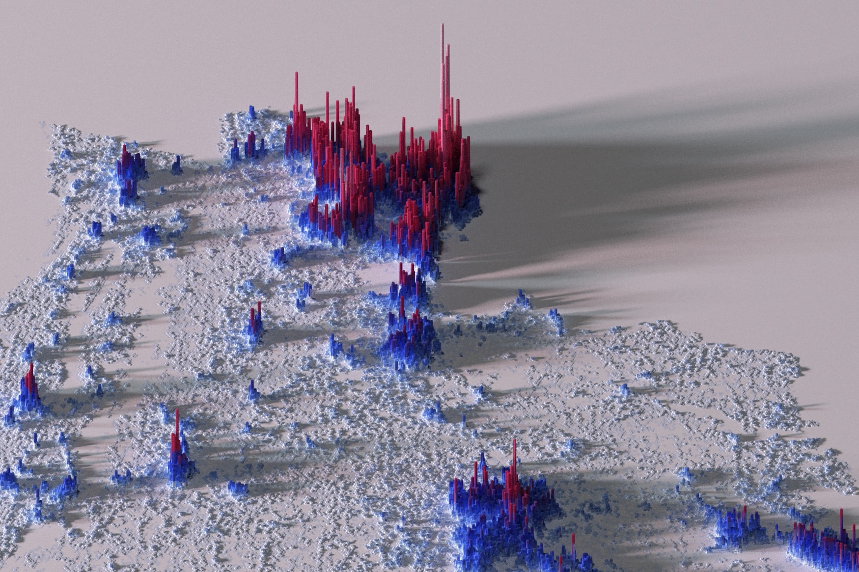
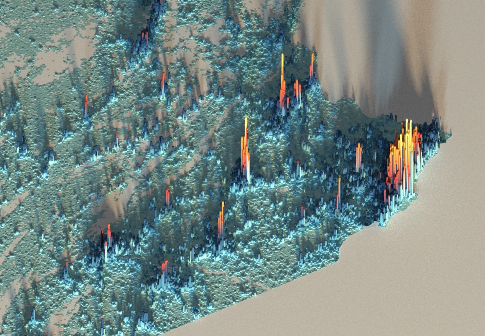
What this looks like, in practice, are bold maps that have the more densely populated areas represented by bars resembling skyscrapers. The more people there are, the higher these sites get, making them reminiscent of a topographical map. For some states, the difference between rural population areas and urban centers looks extreme, such as in the case of Chicago, Illinois. The lower population sectors are light blue while there are so many people in the Windy City that the bars transition from an orange to a bright yellow.
Schien was inspired to make these maps as part of the #30DayMapChallenge in November 2021. “The theme for day 21 was the Kontur Population Dataset,” he explains to My Modern Met. “The specific style was inspired by maps created with Aerialod (3D rendering software), and I was also driven to create comparable maps with my open-source software of choice, the R program language.”
His aesthetic was further inspired by the internet at large. “I also have long drawn inspiration from the Twitter user @researchremora,” Schien explains, “who started making beautiful shaded relief elevations maps a while ago (they're an anonymous account).”
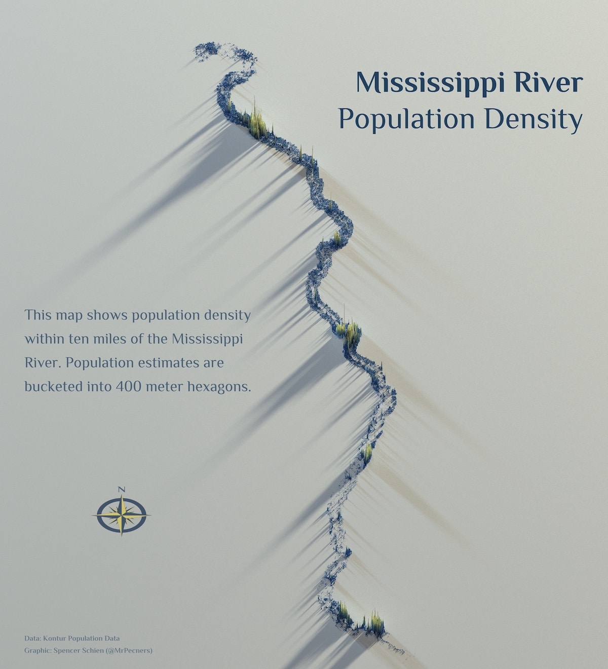
As of now, Schien has created several state maps, city maps, and comparative maps, as well as some maps of regional areas like neighboring towns along the Mississippi river bank. He plans to continue the project. “At this point, I think I'll probably do all the states. I also like to come up with creative ways to portray the data beyond standard administrative boundaries of states.”
To see what Schien is working on next, follow him on Twitter.
We can read about the population of a state, but it can be hard to visualize what its density looks like. Data technologist Spencer Schien is demystifying a selection of U.S. states with his fascinating population density maps.
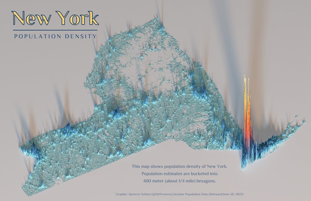
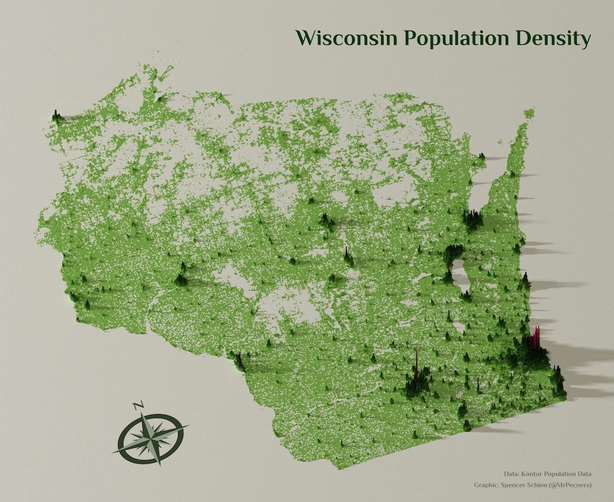
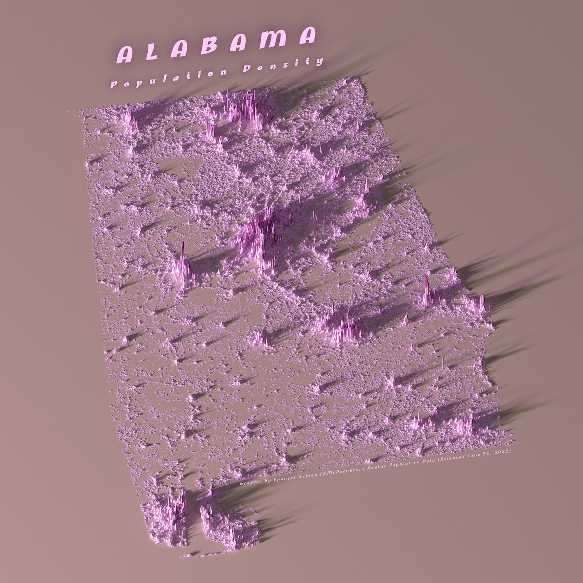
In each of his three-dimensional visualizations, he uses publicly available data and R programming language to chart the areas where people live.
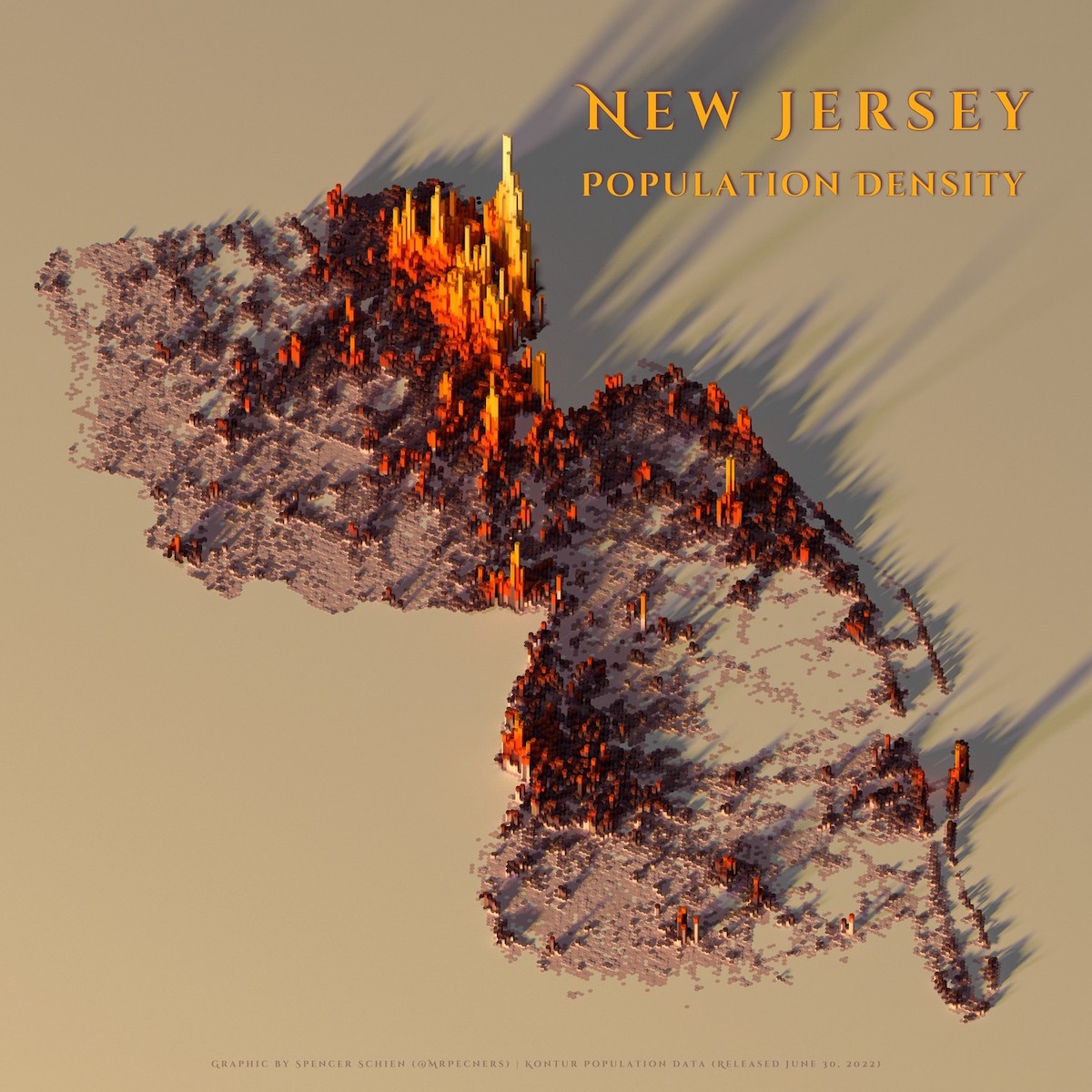
The more people there are, the higher these sites get, making them reminiscent of a topographical map.
“The specific style was inspired by maps created with Aerialod (3D rendering software),” Schien tells My Modern Met, “and I was also driven to create comparable maps with my open-source software of choice, the R program language.”
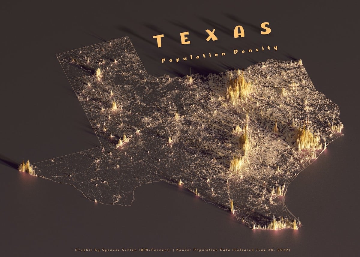
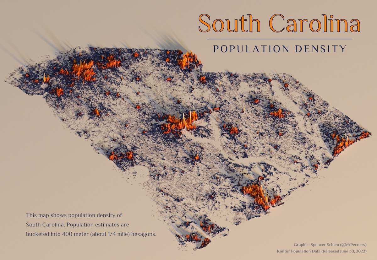
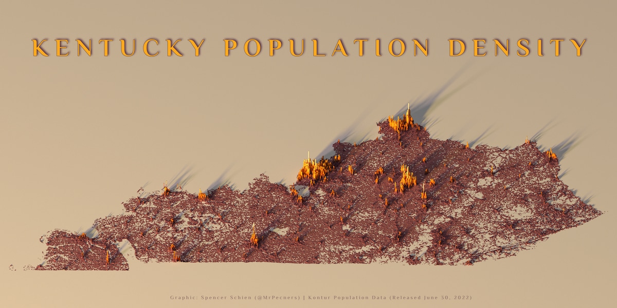
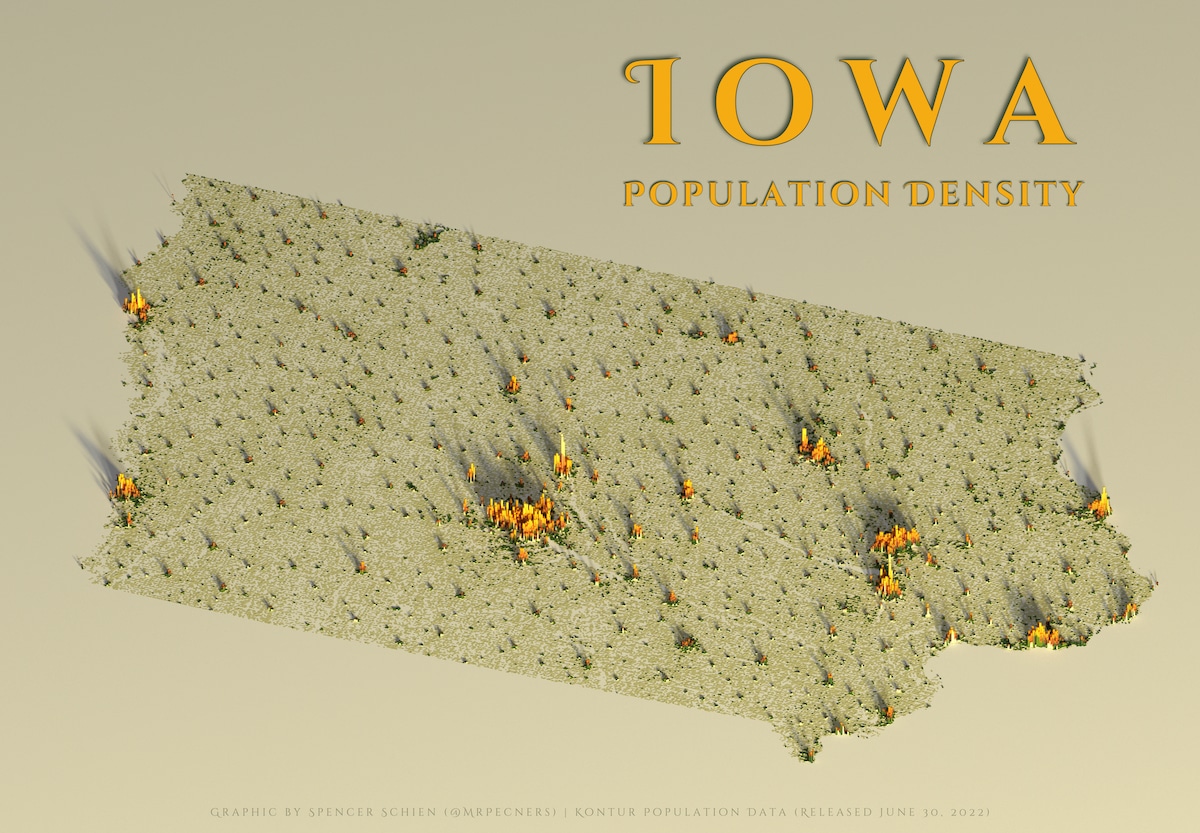
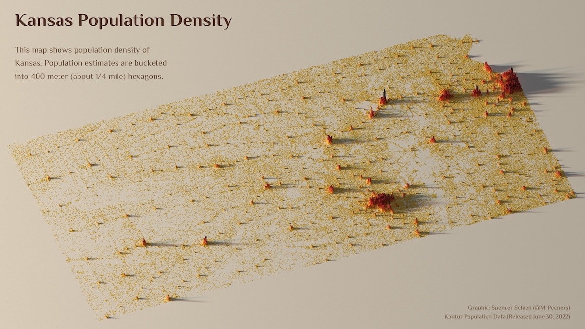
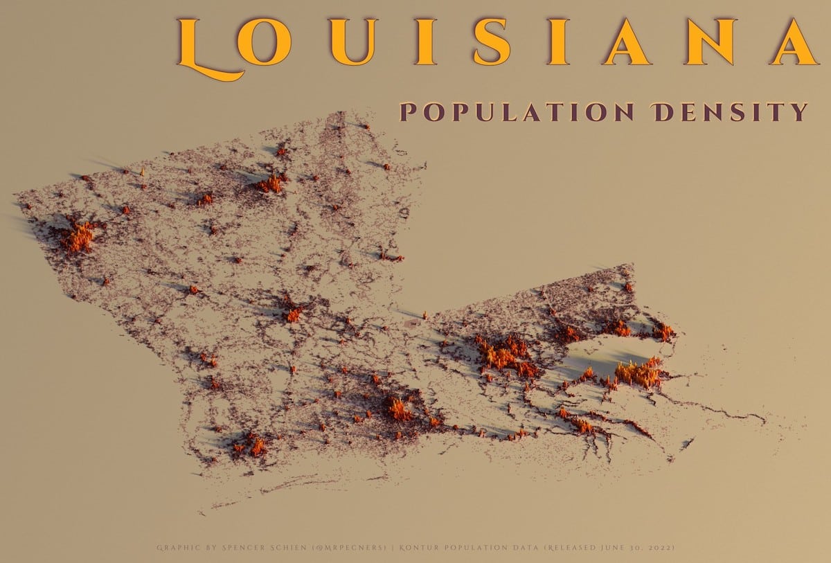
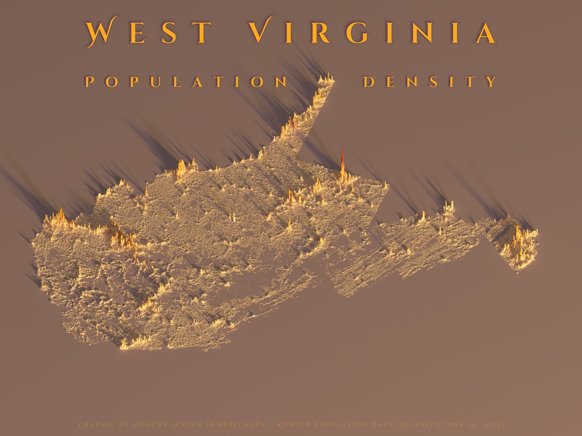
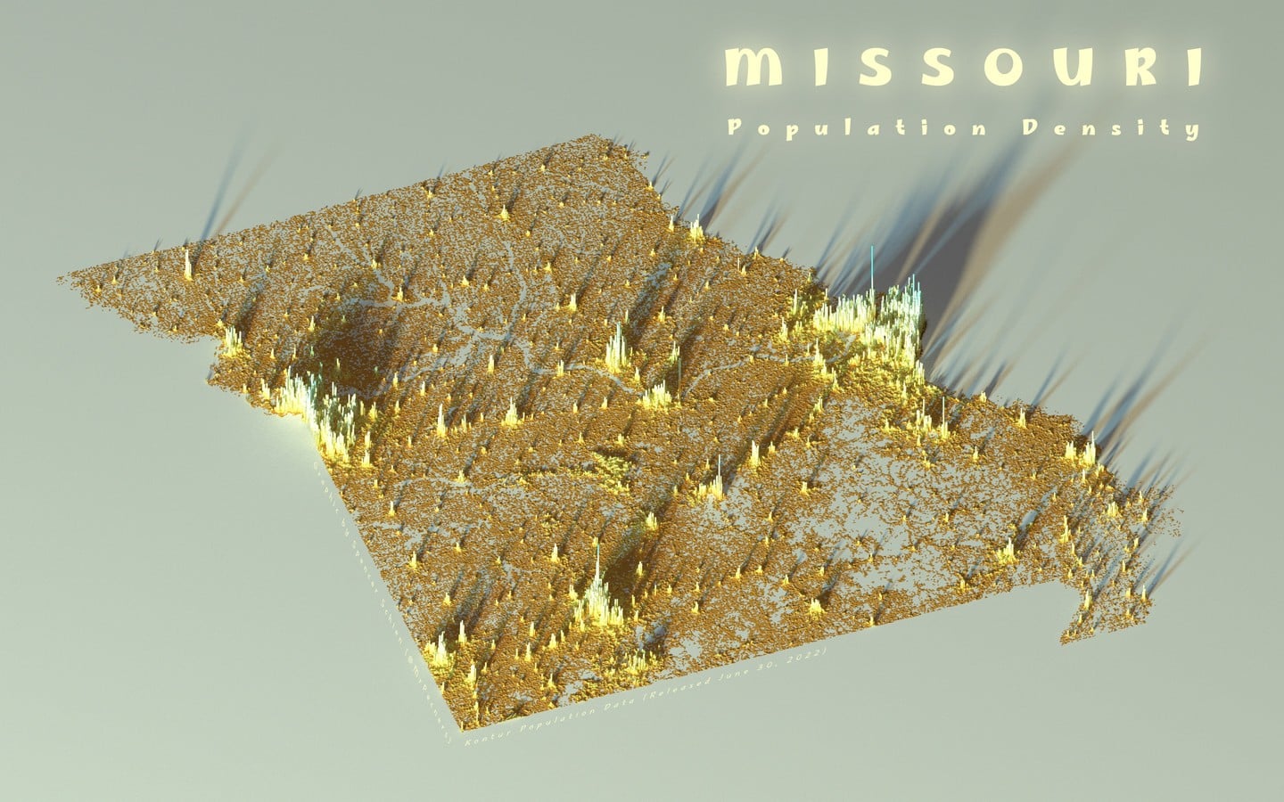
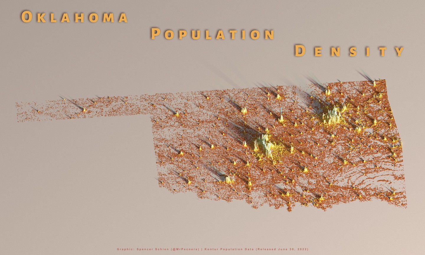
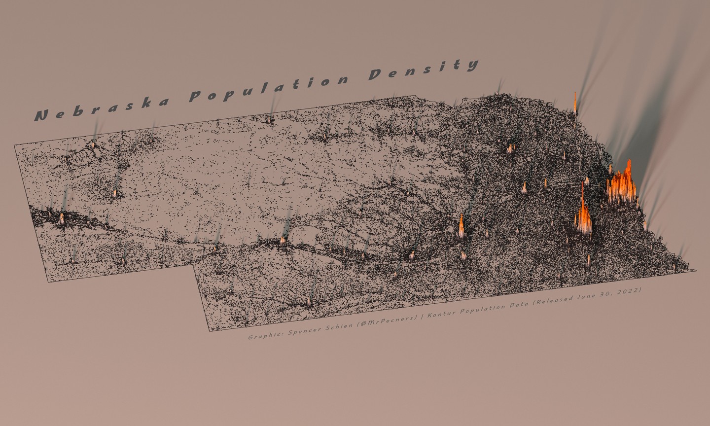
One thing these visualizations make very clear is how some states may have a lot of land mass but people tend to live in only a few parts of it.
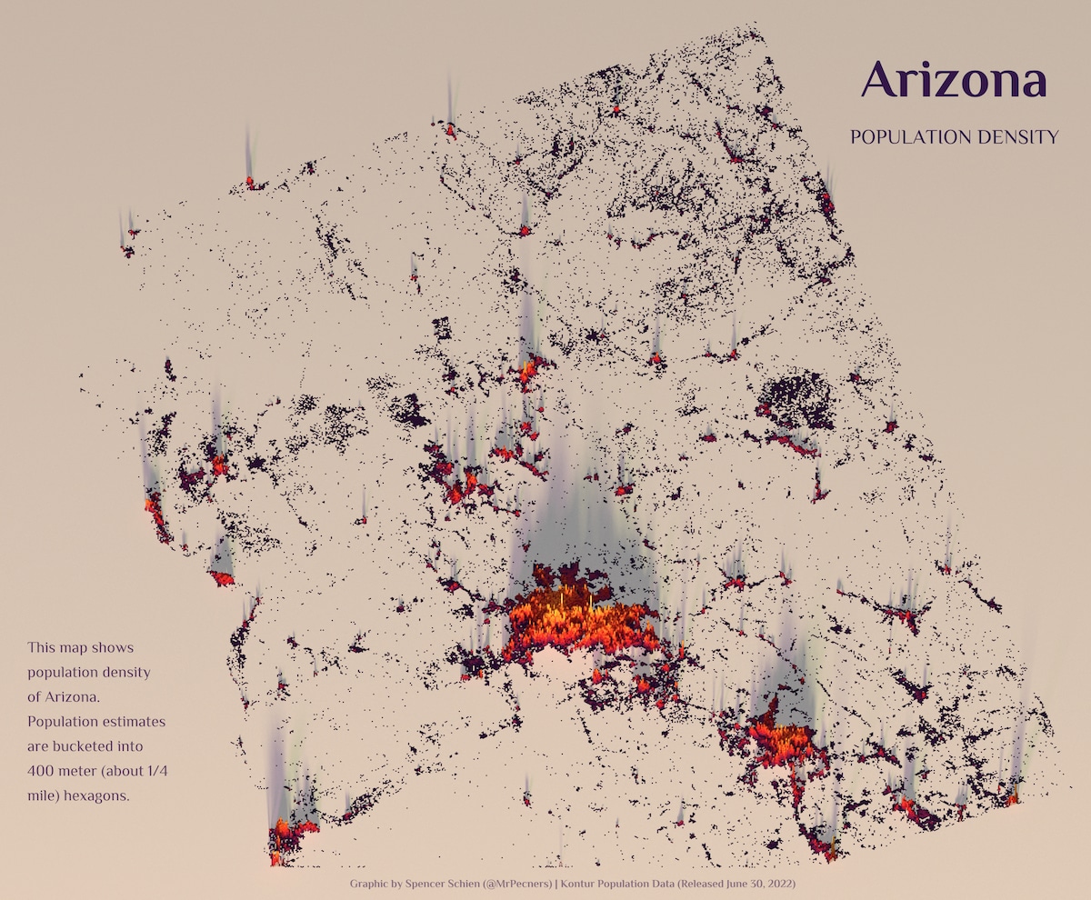
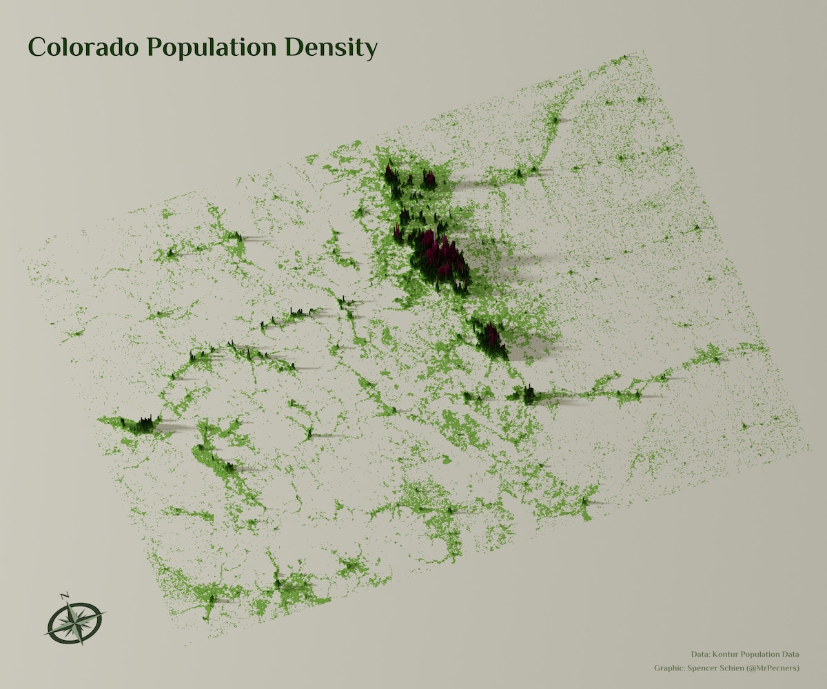
They make it easier to differentiate urban areas from rural areas.
Schien intends to continue the project with more states, cities, and areas.