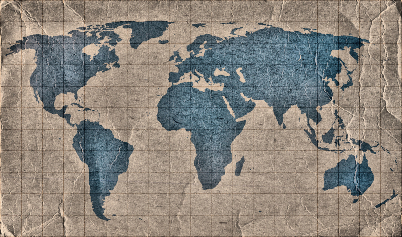
On September 4, 2026, the United Nations voted to adopt a new world map. This updated version more accurately depicts the true scale of each continent. The initiative, approved by 164 votes to 1, was led by Togo, with the backing of the other 54 states that make up the African Union.
But why would a new world map be needed? After all, the map of the world is one of the most familiar images out there. But for something so common, it can be deceiving. The main issue is that Earth is round, so depicting it as a flat image hasn’t been straightforward throughout history. The most popular map is known as the Mercator projection, which has ruled the cartography world since its creation in the 16th century. Conceived by Flemish cartographer Gerardus Mercator, it was meant to help European sailors find their way around using a compass.
However, the Mercator projection has one major problem: it distorts places depending on how close they are to the Equator. Think of it as if our world were a globe with light in its center. Then wrap that globe with a piece of cardboard that touches our planet only in its middle part, like this. This makes regions closer to the center look smaller than those near the poles, even if they are significantly larger in real life. For example, in many maps, Greenland looks the same size as Africa, when in reality the latter is about 14 times larger than the former.
According to the Togo delegation, this has affected global politics, contributing to the “symbolic minimization” of Africa, which is larger, more diverse, and more influential than the Mercator projection makes it seem. In turn, this has perpetuated an unbalanced view that particularly affects the Global South. “Maps shape our understanding of the world,” Robert Dussey, Togo’s foreign minister, said before the vote. “They guide education, nourish the imagination, and influence collective perceptions.”
The campaign is rallying the United Nations, governments, schools, international organizations, and technology companies to use the Equal Earth projection, an equal-area pseudocylindrical projection that maintains the relative size of each region. It was created by Bojan Šavrič, Bernhard Jenny, and Tom Patterson in 2018. However, similar approaches that do not significantly distort land areas are also welcome.
While this initiative has faced pushback, particularly from the U.S., which calls it part of a “much larger and more radical ideological project,” it doesn’t call for an overall ban on the Mercator projection or impose a single, particular approach. After all, each way of translating the world into a map requires losing something in the process, whether it’s an area, direction, or proportions.
Ultimately, cartography has come a long way in the last centuries. New, more inclusive techniques are not only possible but also reflect an integrated world. “A fair map does not change the geography of the world,” Dussey added, “it changes how we see the world.”
Sources: UN tells the world: Stop making Africa look small
Related Articles:
Infographic Map Reveals the Most Spoken Language of Each Country in the World
Student Transforms Amusing World Facts into Colorful Map Infographics
Map Shows What U.S. States Would Look Like if They Were Sized According to Population