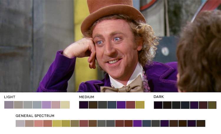
Willy Wonka & the Chocolate Factory, 1971
Fantastic cinematography can make a film unforgettable. When done well, it's like every still frame is a work of art. Color plays a vital role in this, and a cinematographer’s choices set the mood of a scene. Graphic designer Ruby Radulescu demonstrates the importance of a movie's color spectrum in a fascinating series called Movies in Color. The premise is simple: she creates detailed color palettes based on a frame of a famous film. Underneath each screen cap are the hues split up by intensity—from light to medium to dark.
The 2012 film Skyfall first inspired Radulescu's ongoing project. “I was taken with the cinematography and use of color more-so than the story itself,” she says. “I wanted to find out what colors made up certain stills and after making a few color palettes for Skyfall, took it a step further by extending it to all films and starting a blog.”
The meticulous process has been a valuable learning experience. It requires, first and foremost, research. “I search for stills that are compositionally interesting as well as rich in color,” Radulescu explains. “I use the help of a color generator to get a very basic range of swatches.” From there, she herself adds other prominent hues. When it’s all done, the visual nuances of the frame is revealed. As a whole, the collection of palettes demonstrates powerful color relationships between the actors, props, and the overall environment.
What film's color palettes would you like to see on Movies in Color? Radulescu takes requests.
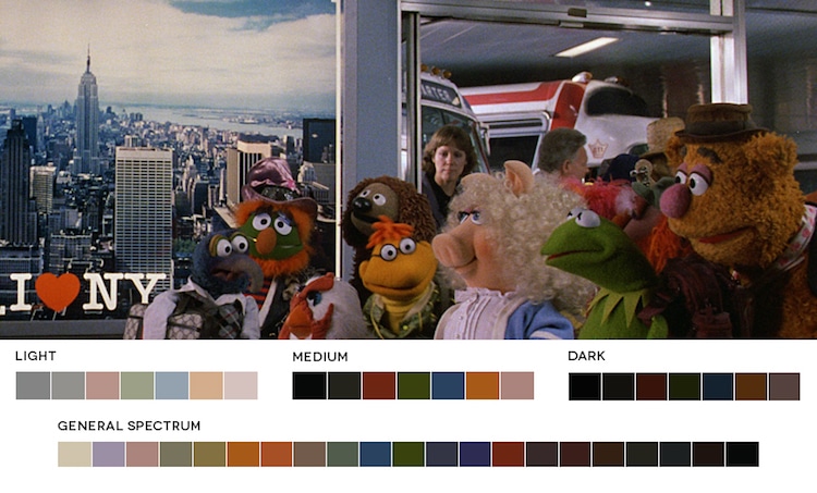
The Muppets Take Manhattan, 1984
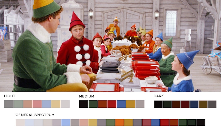
Elf, 2003
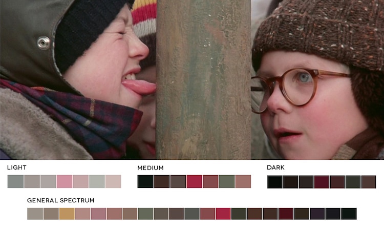
A Christmas Story. 1983
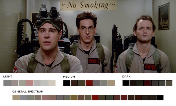
Ghostbusters, 1984
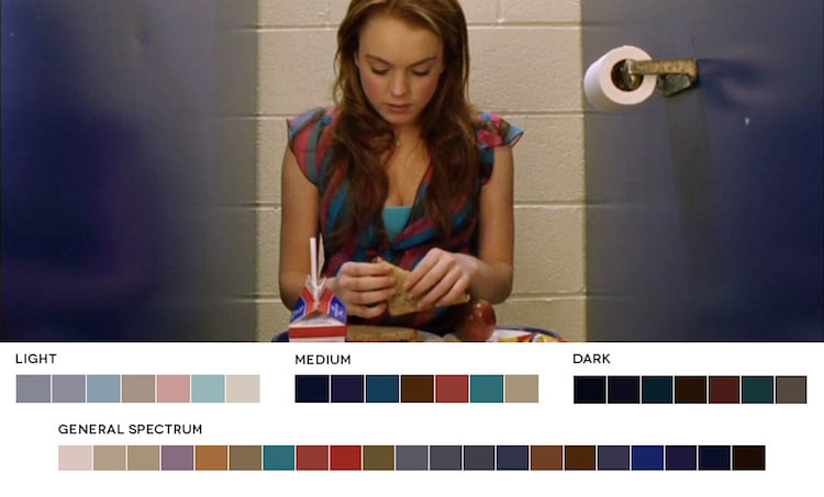
Mean Girls, 2004
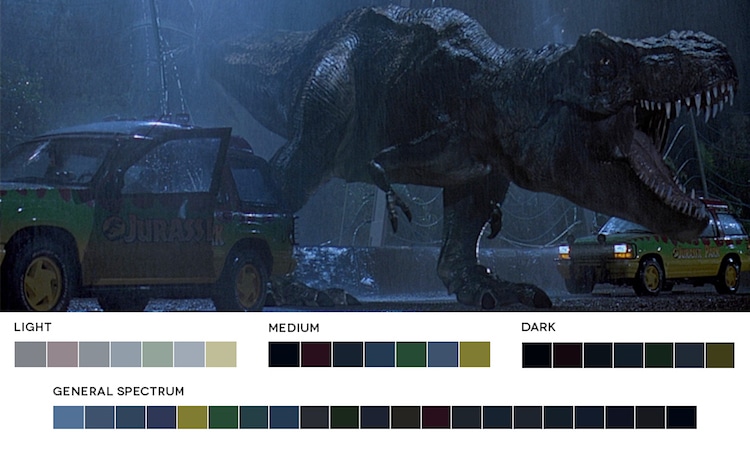
Jurassic Park, 1993
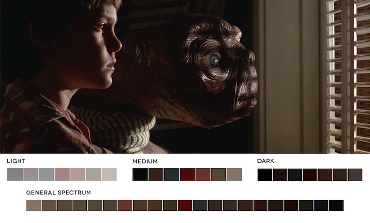
ET, 1982
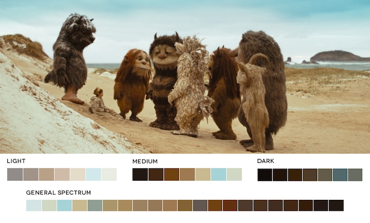
Where the Wild Things Are, 2009
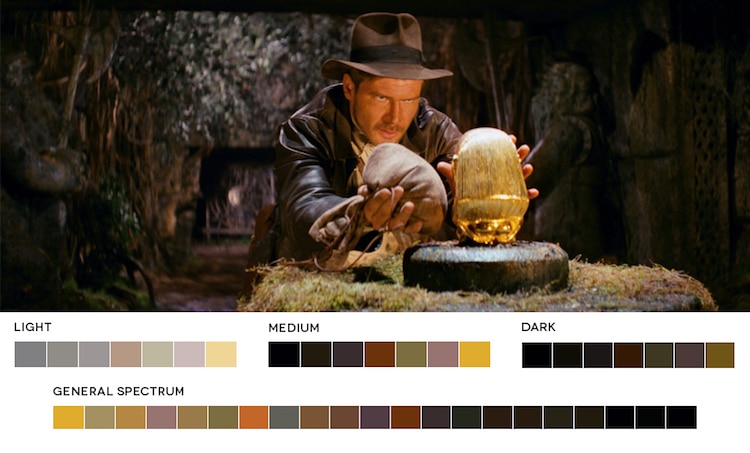
Raiders of the Lost Ark, 1981
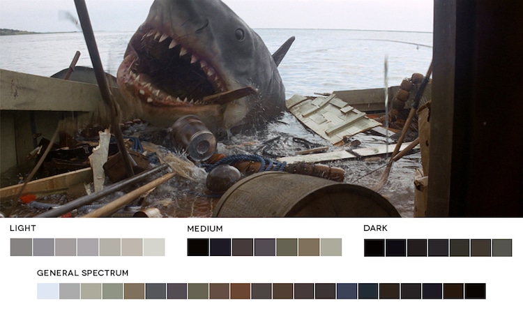
Jaws, 1975
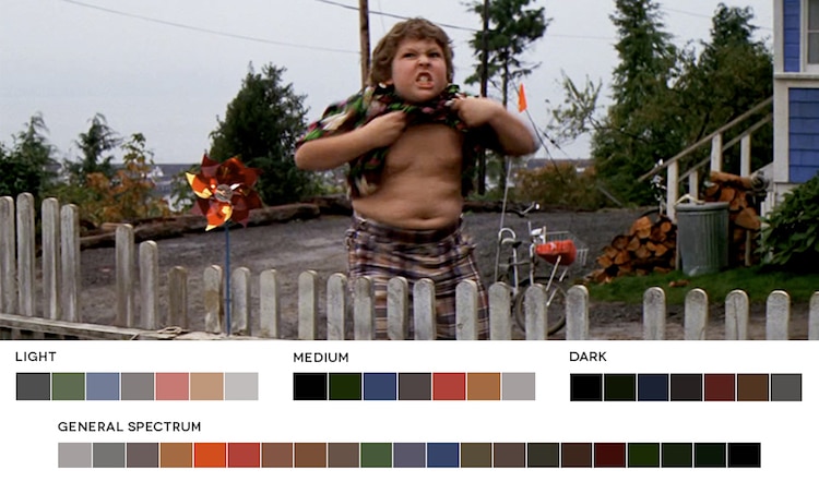
The Goonies, 1985
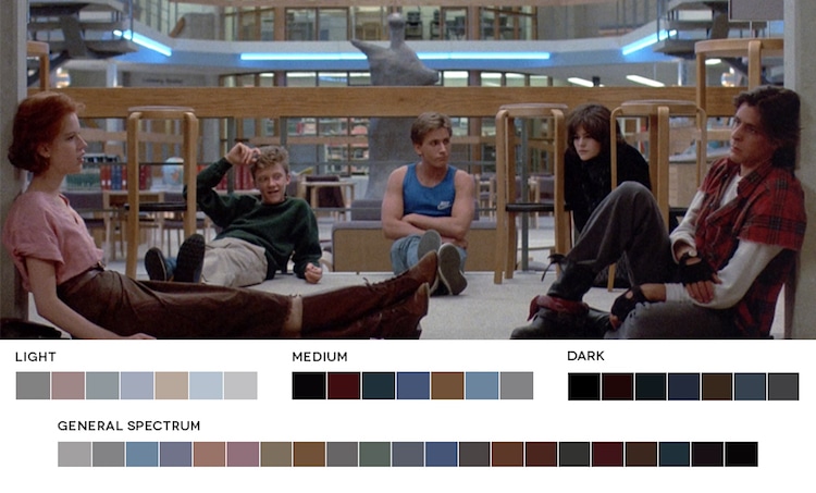
The Breakfast Club, 1985
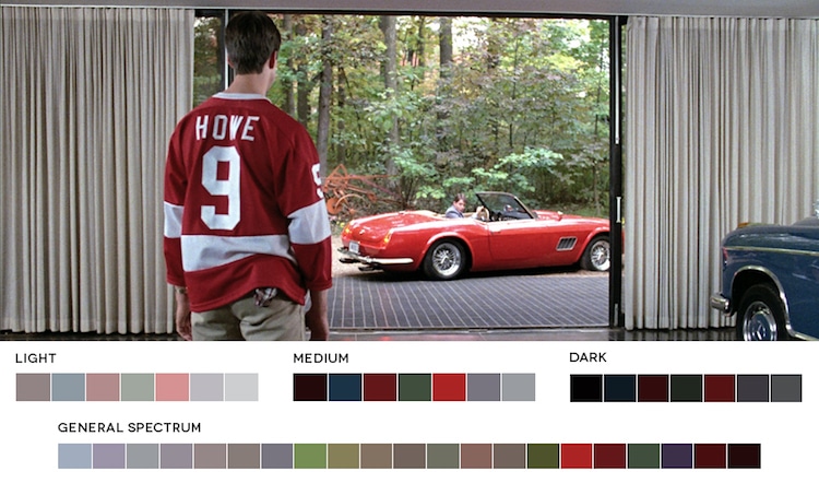
Ferris Bueller's Day Off, 1986
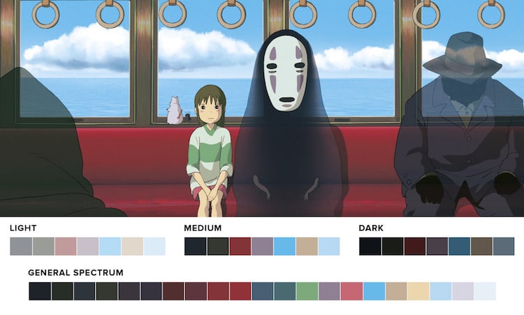
Sprited Away, 2001
Movies in Color: Website
Roxy Radulescu: Website | Facebook | Etsy
h/t: [Visual News]