The design ideology of Massimo Vignelli often sounds a bit intense. During his almost half-century-long career, he would design the legendary New York City subway map, modernist furniture, iconic kitchenware, logos, books, and so much more. But despite these inherently creative projects, Vignelli would never call himself an artist. He was famously quoted saying, “Design is not art. Design is utilitarian, art is not.”
This quote ultimately reveals Vignelli’s belief that all problems have a clear solution that could be found using logic. These problems—such as what logo best defines a company—were not artistic in nature. It required one to strip down complicated ideas into simpler concepts until the solution became clear.
After hearing such a strict description, those unfamiliar with Vignelli’s work may imagine results that lack color or joy. But a logical design process does not mean a boring one. Vignelli simply believed that beautiful design meant understanding human nature and maximizing the efficiency of function in such a way that the work excited anyone who encountered it.
Vignelli founded Vignelli Designs with his wife Lella—another modernist designer who specialized in jewelry making. Under the firm’s name, the couple designed iconography that is still familiar today including the identity of famous brands such as Bloomingdales and American Airlines. Vignelli completed all of this work under the belief that people deserved good design—and he was convinced that good design was pure, with no meaningless decoration.
He believed that his life, like the life of all designers was, “a fight against the ugliness.” Read on to learn more about some of Vignelli's most famous projects and the legacy he leaves behind after his death in 2014.
Vignelli and American Airlines

Vignelli Old American Airlines Logo (Photo: American Airlines)
Vignelli intensely disliked “marketing people.” He often complained that young businesspeople did not understand the beauty of crafting an identity and that they often added meaningless “vulgarity.” He thought that some business people did not give clients proper respect. They instead added decoration through an additive process—where meaningless pictures and colors were added with little critical thought. Instead, Vignelli believed in a subtractive process. Remove lines until you have found the core elements or form of the concept—and hence the solution.
“You can reach timelessness if you look for the essence of things and not the appearance. The appearance is transitory—the appearance is fashion, the appearance is trendiness—but the essence is timeless.”
When the Vignellis designed the American Airlines logo under the name Unimark International, they simplified the design into its basic forms. They used a simple, sans serif font and two basic colors. The American eagle was simplified to a based X-shape that divided the letters. To Vignelli, this logo symbolized that American Airlines was an honest company, no-frills and no-nonsense—just good service.
American Airlines would later rebrand after 45 years of using this logo. Vignelli responded with a break-down of the new design, demonstrating its meaninglessness that came from ignoring important design rules. For example, the new design included 11 stripes though the flag has 13. He reminded people that this was a constant problem that designers had to face—that folks were fickle and constantly rebranded for attention instead of using an honest design that did not add useless visual noise.
It is also important to note that the Vignelli American Airlines logo is so iconic because it utilized the font that the designer helped turn into the design staple that it is today: Helvetica.
Helvetica on the Rise, Thanks to Vignelli

Helvetica on NYC Subway Sign (Photo: Stock Photos from Cory Seamer/Shutterstock)
Among his many other claims to fame, Vignelli is known as one of the people who popularized the font Helvetica. He used it in his designs extensively, and towards the end of his career, it was one of only four fonts that the firm Vignelli Associates ever used. The others were Garamond, Bodoni, and Century Expanded.
Vignelli explained the font’s flexibility by describing its ability to express love. “You can say ‘I love you’ in Helvetica. And you can say it with Helvetica Extra Light if you want to be really fancy. Or you can say it with the Extra Bold if it’s really intensive and passionate, you know, and it might work.”
One of the most obvious embodiments of Vignelli’s legacy can be found all over New York City, in the signs and branding of the NYC Subway system—and all written in Helvetica.
Untangling the NYC Subway

1972 Vignelli NYC Subway Diagram Map (Photo: MTA)
Vignelli believed that the subway map was essentially two components— lines, which symbolized the direction trains were going in, and dots, which symbolized the stops along those routes. He believed everything else was unnecessary visual complexity. Why did travelers need to see every single twist and turn that the train would take?
Vignelli’s map “untangled” the jumble of the NYC subway and has become the permanent branding of the system. The simple colored dots are deeply engrained in everyone who lives in and visits the city today. Unfortunately, New York replaced the map, but some of his logic still remains in the current version and the consolidated signage and dot system are still in use.
“Good design is a matter of discipline. It starts by looking at the problem and collecting all the available information about it. If you understand the problem, you have the solution. It’s really more about logic than imagination,” he says. The NYC Subway map is the perfect example of how Vignelli believed in logical solutions that pushed the boundary of simplicity.
Product Design by the Vignellis

Heller Vignelli Dish Set (Photo: Pamono)
Massimo and Lella worked together on many industrial and product design projects. One of their most famous works is the Heller Vignelli kitchenware set, especially the famous mugs. These products adhered to traditional modernist ideals with a focus on simplicity and logic.
The mugs were designed so that the handle bent to create a place for your thumb. Though popular in Europe, the cups ran into some cultural issues in the U.S. as consumers complained that they tended to spillover through the handle. Vignelli explained that Europeans filled their cup halfway, which is how he intended for them to be used. Americans filled their cup closer to the top, leading to a leaking problem when the mugs were moved too quickly. These were later capped to prevent issues.
Despite the initial controversy, the Heller Vignelli dish sets are a highly sought-after example of modernist kitchenware.
Books on Design
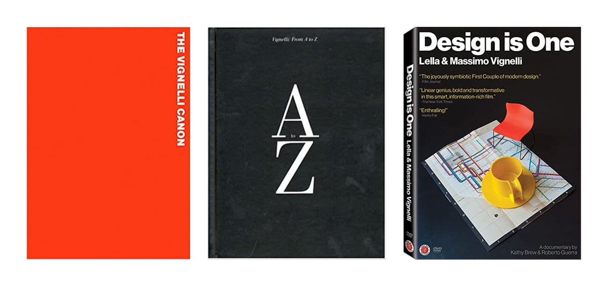
Vignelli Books (Photos via Amazon)
Vignelli's best-known design logic for books was a highly developed grid. He was quoted saying, “a grid is like underwear, you wear it but it’s not to be exposed.” Every page that he designed started with this grid, even if many of the guidelines were not used on every page.
Many great design rule books have been written both by and about Vignelli. These include: The Vignelli Canon, Vignelli From A to Z, and Design: Vignelli
The Work Is the Reward
View this post on Instagram
Artists and designers are often living proof of the idea that if you do what you love, you’ll never work a day. Massimo and Lella undeniably loved the design practice that they dedicated their lives to. In an interview following their recognition of the 1982 Medal from the AIGA—Professional Association for Design—the couple was asked what motivates them to continue the work. Massimo fittingly responded: “The reward? Why, the reward is to do all this!”
This post may contain affiliate links. If you make a purchase, My Modern Met may earn an affiliate commission. Please read our disclosure for more info.
Related Articles:
Designer Reveals the Fonts Used in the Logos of the World’s Biggest Brands
Changing NYC Storefronts Documented Across a Decade
Portraits of NYC Subway Drivers Enjoying a Quiet Moment
Antoni Gaudí: The Creative “Madman” Behind La Sagrada Familia


