Oscar Niemeyer International Cultural Centre (Avilés, 2011)
Freelance graphic designer and illustrator Levente Szabó is known for his crisp, clean style that has attracted clients like Harper Collins, Simon & Schuster, and Penguin Books. Recently, he completed a personal project exploring the modernist architecture of Oscar Niemeyer. The resulting illustrations are a brilliant marriage between Szabó's minimalist style and the abstract curves of Niemeyer's buildings.
While Szabó first learned of the acclaimed Brazilian architect's work during his time at university, at the time he wasn't a fan of modern architecture. Too cold for his tastes, he couldn't connect. But a few months ago, he came across a work by Niemeyer that made him change his mind. “I caught a glimpse of a strange plate-shaped architecture that sparked my interest—it was the Niterói Contemporary Art Museum,” Szabó tells My Modern Met. “It looked fantastic—a bright white shape against the deep blue sky with a red ramp going up to the entrance. I immediately knew that I wanted to make an illustration based on this building, and the project quickly outgrew itself after some Googling.”
Across ten vibrant illustrations, Szabó captures the magic of Niemeyer's architecture. Best known for designing the civic buildings in Brasilia, as well as his work with other architects on the UN Headquarters in New York, Niemeyer's career spanned more than 75 years until his death in 2012. Niemeyer was a key figure in developing modern architecture and was particularly lauded for his work with reinforced concrete. His examination of concrete's aesthetic possibilities would go on to influence 20th- and 21st-century architectural styles like Brutalism.
Throughout the project, Szabó learned more about Niemeyer and his architectural philosophy. In particular, the architect's belief that architecture should represent the female form was interesting to the illustrator. As Niemeyer once said, “My work is not about ‘form follows function,’ but ‘form follows beauty’ or, even better, ‘form follows feminine.’ ”
The minimalist drawings are filled with bright color blocks that make each organic shape pop, bringing Niemeyer's signature curves to the forefront. And in selecting pieces of architecture from all stages of Niemeyer's career, Szabó allows viewers to see how his signature style translates to any moment in history. Beginning with 1943's Casa do Baile, a small restaurant built on an artificial island, and ending with 2011's monumental Oscar Niemeyer International Cultural Centre, it's incredible to see how the acclaimed architect adapted his style without compromising his beliefs.
Levente Szabó's minimalist illustrations celebrate the work of acclaimed modernist architect Oscar Niemeyer.

Niterói Contemporary Art Museum (Rio de Janeiro, 1996)
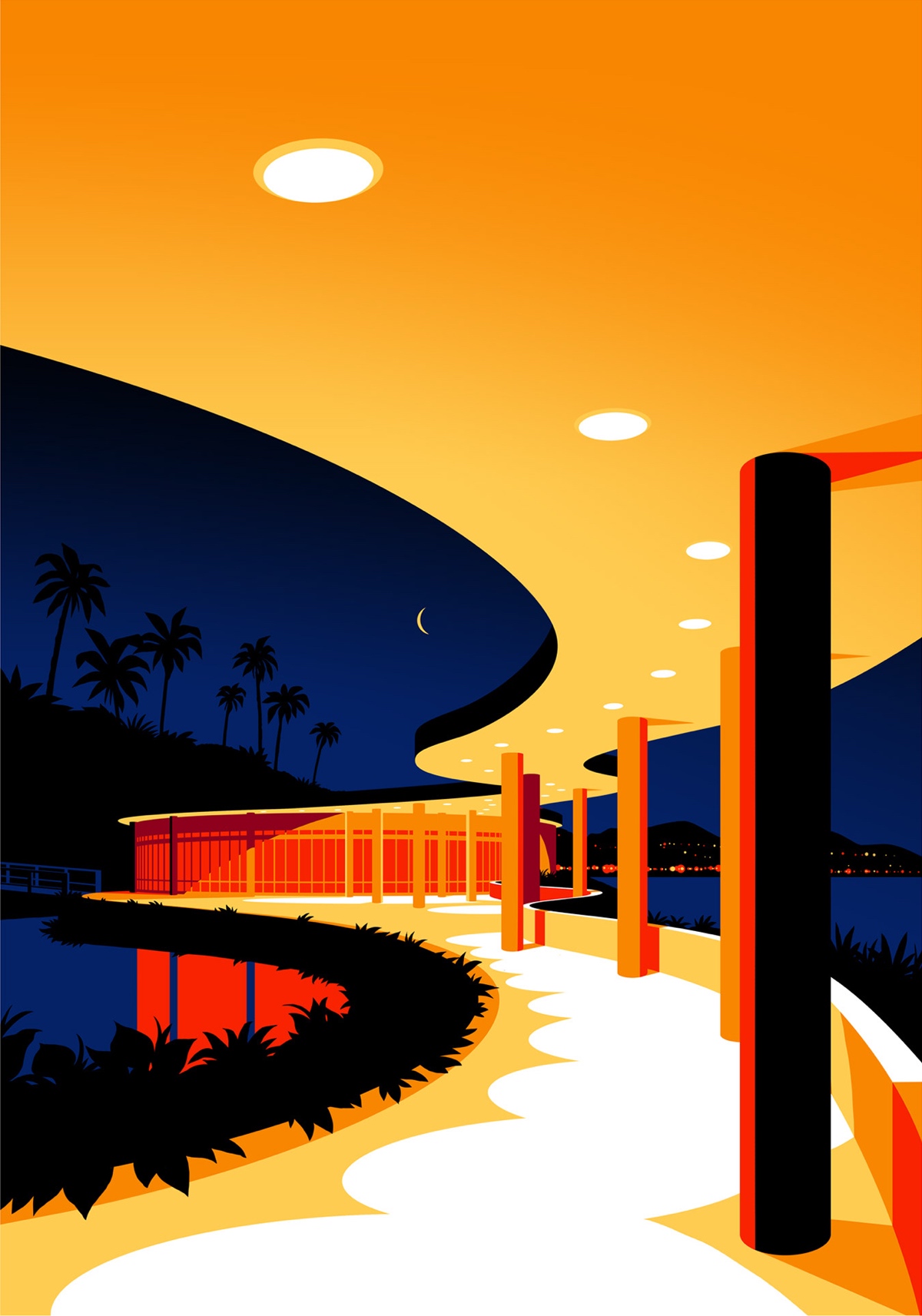
Casa do Baile (Pampulha, 1943)

Oscar Niemeyer Museum
(Curitibá, 2003)

Palacio da Alvorada (Brasília, 1958)

Casa de Canoas (Rio de Janeiro, 1953)

Cathedral of Brasília (Brasília, 1970)

Niemeyer Popular Theater (Rio de Janeiro, 1997)

Palace of the National Congress (Brasília, 1985)

Biblioteca Nacional de Brasília (Brasília, 1960)
