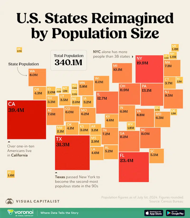
With a population of approximately 340 million people, the U.S. is the third most populous country in the world, behind India and China. Despite being the fourth-largest country by area, nearly one-third of its residents are concentrated in just three states: California, Texas, and Florida. With this in mind, online publisher Visual Capitalist reimagined the U.S. map, scaling each state according to its population.
To understand how America’s population is spread out, Visual Capitalist gathered data from the 2024 Census Bureau. The team found that California (39.4 million), Texas (31.3 million), and Florida (23.4 million) have the largest populations, with New York (19.9 million) not far behind.
Meanwhile, despite being the largest state by land area (665,384 square miles), Alaska has the third-smallest population, with just 700,000 residents. This makes Alaska the third-smallest state on Visual Capitalist’s map, represented by a small yellow box on the left.
Similarly, a few large states in the western U.S., like Wyoming, the Dakotas, and Montana, together, have fewer than 4 million residents. This is due to much of the land in these states being covered by parks and farmland. Meanwhile, Vermont and Wyoming both have the smallest populations, with just 600,000 people each.
That data also revealed that New York City, with its 8.5 million residents, boasts a larger population than 38 entire states. And on the West Coast, one in every 10 Americans call California home, likely drawn in by the state’s sunny climate and rich cultural diversity.
Visual Capitalist sought to redraw the map to explore how populations influence votes. “Rural areas with low populations can sometimes have outsized political influence due to structures like the Electoral College or the Senate,” they explain. “And when densely populated urban areas often lean one way politically, and sparsely populated rural regions lean another, then the gap between population-based representation and geographic-based influence is even more pronounced.”
Check out the map above and find more fascinating infographics from Visual Capitalist on Instagram.
Visual Capitalist: Website | Facebook | Instagram | YouTube
Source: Mapped: Every U.S. State, Resized Based on Population
Related Articles:
3D Maps Visualize the Stark Population Density Differences in Cities in the U.S.
Data Scientist Makes Stunning Maps of the Average Colors of the World
Colorful “Map of Plants” Visualizes the Complex Diversity and Evolution of Our Planet’s Flora
Vibrant Data Visualizations of Famous Classical Music Scores Burst with Color