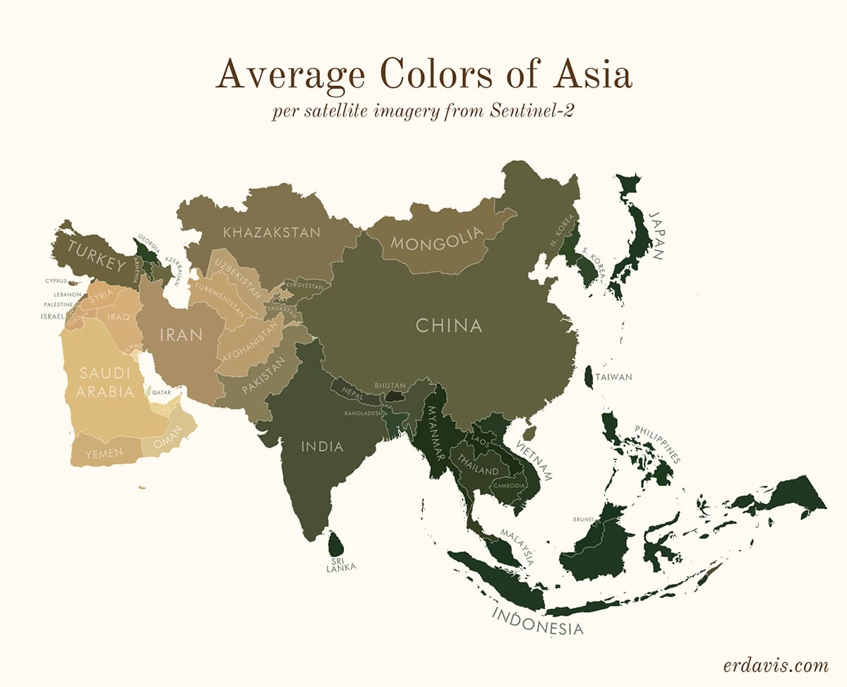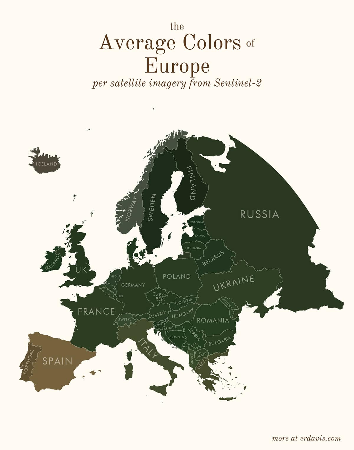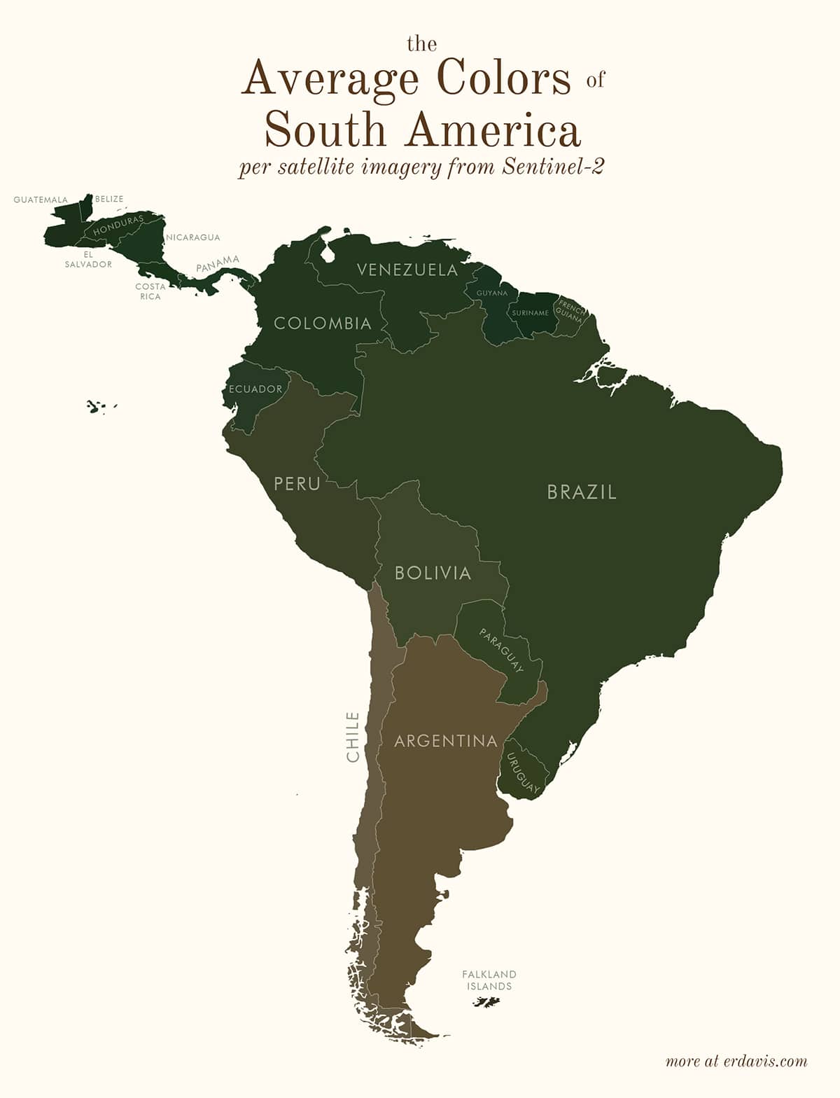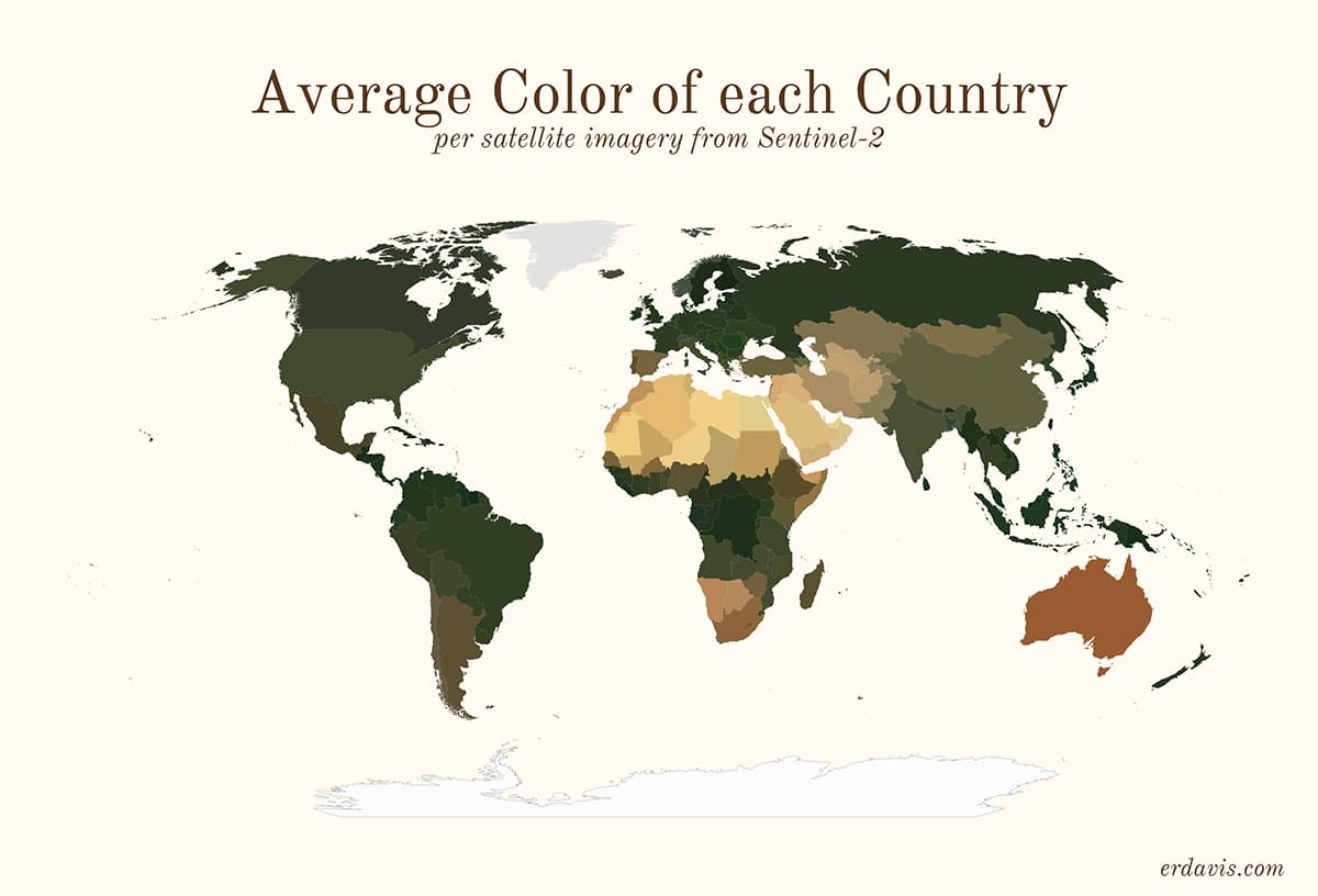
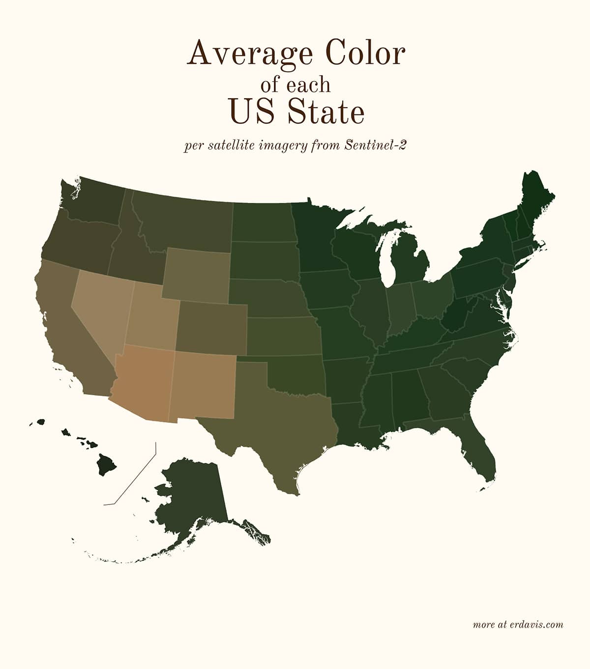
When you look at a satellite map, the colors displayed range from white to deep brown. Earth's features—from icecaps to deserts—offer a seemingly infinite range of color when photographed from on high. Data scientist Erin Davis creates awesome data visualizations to help bring the “big picture” into focus. Davis posted a project entitled Average Colors of the World, a series of maps which aggregate satellite data to find and display the average color of defined regions.
Davis describes herself as an artsy kid who studied math and engineering in college. The result has been her creative data visualizations which are frequently based on maps. For example, she analyzed the fascinating (literal) question, “When it rains, does it pour?” For Average Colors of the World, Davis was primarily interested in the visual impact of analyzing the colors of satellite footage.
She used satellite imagery from Sentinel-2, a satellite which observes Earth. Using coding and computer programs, Davis collected data to create special geotiff images. First, each focus area was decided on—whether it be a country, a state, or the world map. Then, the images were converted to a png file, which allowed Davis to take the average of the colors within. The result is a fascinating new type of maps depicting the world.
Data scientist Erin Davis makes creative visualizations to demonstrate the meaning and artistic possibilities of data.
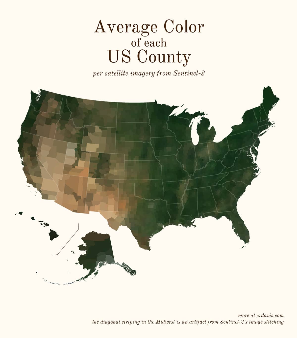
Her Average Colors of the World series takes satellite imagery and aggregates the color data within regions.
What is the average color where you live, if viewed from space?