Drawings: Samantha Pires/My Modern Met
Graphic design affects everyone, from people who think about design every day to people who never give it much thought. Whichever group you identify with or if you find yourself somewhere in between, this glossary of 50 graphic design terms will help you test your knowledge or learn something new.
We have included some really specific terms that will give you a sneak peek at some technical things graphic designers think about. Some other terms are more general ideas about design that overlap with photography and other art forms, but we think that you’ll learn something new in My Modern Met’s latest art and design glossary.
If you enjoyed this list and want to test your knowledge of other design fields, be sure to read our article on 100 Architecture Terms That Will Help You Describe Buildings Better.
Here are 50 terms to help you understand graphic design better!
Alignment/Justification
Alignment refers to the lines that text or a graphic is set to sit along. For example, if all text is perfectly set to the right side of a text box and is irregular at the left end of each line, you would say that the text in question is right-aligned.
Justified refers to when text or other elements are aligned to both boundaries. This is made possible because the spaces in between the words or elements vary in size to make sure one word or element meets the boundary on both sides.
Analogous
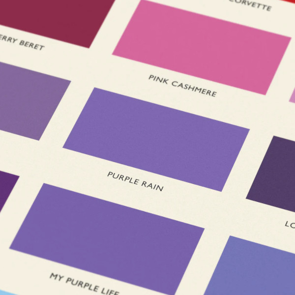
Analogous colors are a trio of colors that are close to each other on the color wheel. They are often used to add some variety to a monochromatic design as they add some diversity while staying in the same general range. For example: the trio of violet, cyan, and blue would be considered analogous colors.
Ascender/Descender
Ascender and descender are terms used to describe specific elements of letters. We first need to understand that the x-height of a letter is the height of a lowercase letter x. An ascender is anything that goes above this height, like the top part of the letter “t.” A descender is any element that goes below this height, like the bottom part of the letter “p.”
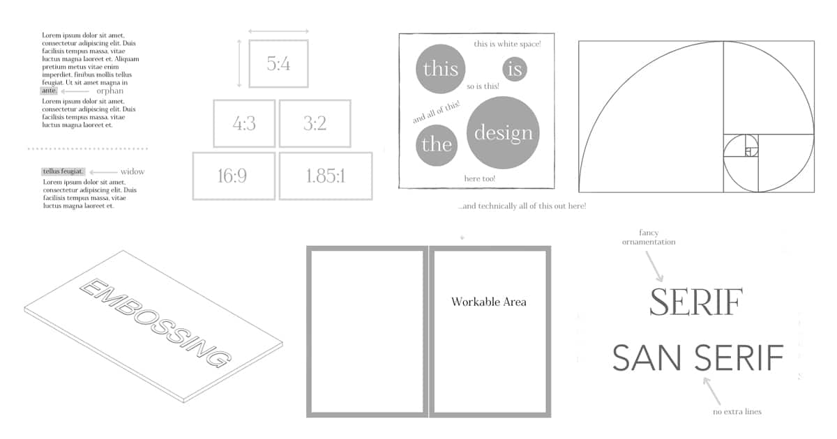
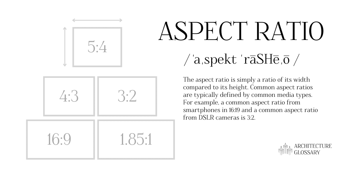
Aspect Ratio
Drawings: Samantha Pires/My Modern Met
The aspect ratio is simply a quantitative relation of its width to its height. Aspect ratios are typically defined by common media types. For example, a common aspect ratio for smartphones is 16:9 and a common aspect ratio for DSLR cameras is 3:2.
Bleed
Bleed is an important idea to consider for printed works. It is the amount of ink planned to surpass the boundary, or “bleeds,” past the desired printed image. Bleed is important because it ensures that if the cuts are not precise, the design will not get cut off and will not include an awkward blank border that results from the design not extending far enough.
CMYK
CMYK, or cyan, magenta, yellow, and black, are the basis of colors planned for print. This color system is similar to another term on this list, RGB. Like RGB, combining these colors in different amounts creates a wide range of colors.
Color Theory
Color theory involves ideas about the best uses of color. Many different theories on color exist that help understand how to combine colors and the effect different colors have on people.
Complementary
Complementary colors are often called opposite colors because of their stark contrast. If complementary colors are added together they produce something between white and black. For example: red and green are complementary colors.
Composition
Composition is a general but important term to understand about graphic design. It refers to the general arrangement and text, images, and graphic elements on a work. Good composition often includes other general graphic design terms including balance and hierarchy.
Contrast
Contrast essentially refers to the difference between colors or difference between elements. Contrast is a useful design tool to add variation, visual interest, and hierarchy into a design.
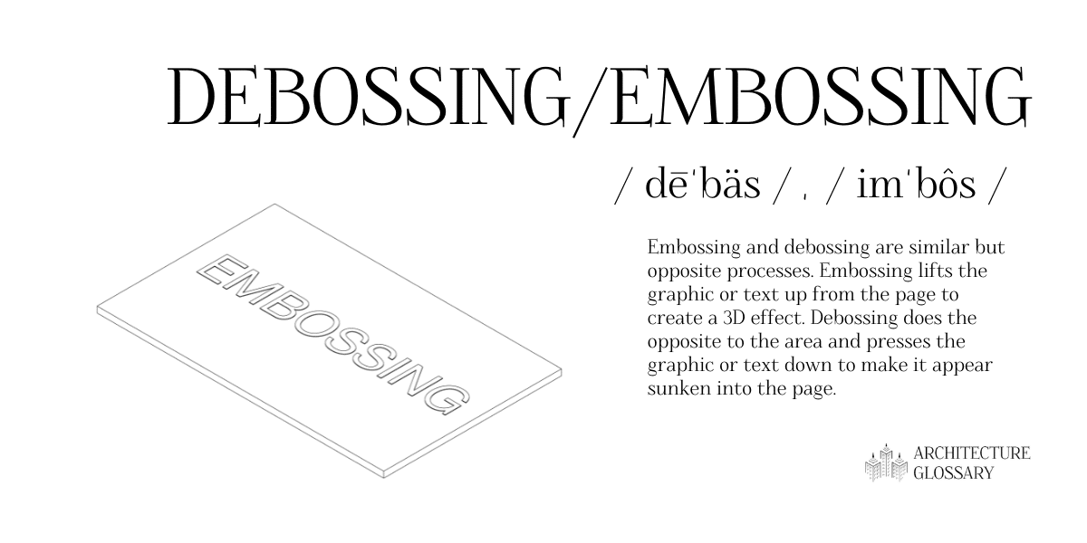
Debossing/Embossing
Drawings: Samantha Pires/My Modern Met
Embossing and debossing are similar but opposite processes. Embossing lifts the graphic or text up from the page to create a 3D effect. Debossing does the opposite to the area and presses the graphic or text down to make it appear sunken into the page.
DPI/PPI
PPI, or pixels per inch, and DPI, or dots per inch, are units of measurement that identify how many pixels or dots exist along one inch. The higher this number is, the better the resolution of the work.
Foiling
Foiling is a design style used on printed work. It involves using a thin metal foil that is pressed on paper to give a shiny appearance. It is possible to use a variety of metals and color.
Font
Font refers to the variations possible with a typeface. For example, Times New Roman Bold or Times New Roman 10 pt (referring to the text size) are two different fonts. The tern font is often confused with the term typeface, which is also defined on this list.
Golden Ratio

Drawings: Samantha Pires/My Modern Met
The golden ratio is a mathematical ratio found in nature that heavily influenced design. Using the golden ratio in art and design help to create a well-balanced work that feels effortlessly natural. Though a classical idea, the golden ratio and simplified versions of it are still used in graphic design today. One simplified idea of the golden ratio is the Rule of Thirds and it is also defined on this list.
Gradient
A gradient is when one color gradually transitions into another color. A gradient can include any two colors or can include more than two. Gradients can also transition on a static line or can change diagonally, radially, or along the edges of a set boundary.
Grid
A grid is a critical system of organization that defines a design. Most organized design follows some type of grid. Grids are often made up of perpendicular lines but can be made of curvy or parametric guidelines as well. It may be difficult to achieve the desired visual balance without using a grid as structure.
Hex Code
Hex codes are a method of defining specific colors. These six-digit codes are used in many formats including HTML and CSS. They are also related to another term on this list, RGB. The first two digits in a hex code refer to the amount of red in a color, the next two digits define the amount of green, and the last two digits define the amount of blue.
Hierarchy
Hierarchy, in both graphic design and in other disciplines, refers to the idea that some elements have more importance than others. In graphic design, hierarchy is indicated by some text being larger and bolder than others or by some images being made larger than other less important ones. It is a very important element to consider in a project because it has serious implications for compositions. Successful hierarchy allows users to immediately take away important pieces of information.
Hue
Simply put, a hue is a pure color. Hues include primary (red, yellow, and blue) and secondary colors (orange, green, and violet). Tertiary colors are not hues because they are created by mixing colors that are not primary. Other terms related to hue on this list include shade, tint, and tone. Many of these other terms are created by adding something to a hue.
Kerning
Kerning is a typography term that is very similar to another typography term on this list: tracking. Like tracking, it also refers to the spacing between letters, but it refers to adjusting the spacing between just two characters. Also like tracking, designers have to be careful when messing with kerning because it could lead to legibility issues.
Leading
Leading is a typography term that refers to the vertical space between two lines of text. It is important to have a good amount of vertical separation for legibility, but too great of a space may become frustrating to read.
Lorem Ipsum
Lorem Ipsum is a very popular form of placeholder or filler text. It is the standard placeholder text that signifies where writing will be but has not yet been finalized. You might find lorem ipsum used in a mock-up, another term on this list.
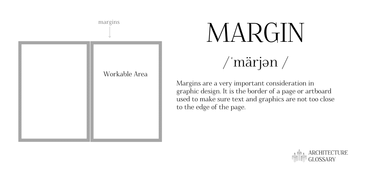
Margin
Drawings: Samantha Pires/My Modern Met
Margins are a very important consideration in graphic design. It is the border of a page or artboard used to make sure text and graphics are not too close to the edge of the page.
Mock-up
A mock-up is a draft of a design or work that helps others to understand it. Mock-ups can be printed or digital.
Monochromatic
Though some people assume monochromatic means black and white, black and white design work is only one example of monochromatic colors. Monochrome design can be anything made from a single color.
Mood Board
A mood board is essentially a collage of concepts, textures, colors, or examples that act as inspiration. They also sometimes act as a good resource for presentations to describe the qualities of a project before it is done. Mood boards often include palettes, another term on this list.
Opacity
Opacity refers to the transparency of an image or an object in graphic design.
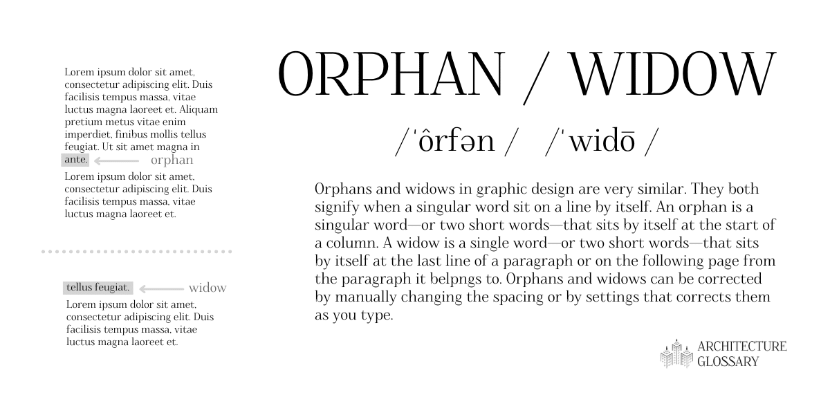
Orphan/Widow
Drawings: Samantha Pires/My Modern Met
Orphans and widows in graphic design are very similar. They both signify when a singular word sits on a line by itself. An orphan is a singular word—or two short words—that sits by itself at the start of a column. A widow is a single word—or two short words—that sits by itself at the last line of a paragraph. Orphans and widows can be corrected by manually changing the spacing or by settings that stop them from happening as you type in the first place.
Overprint
Overprinting is an interesting technique where colors are printed over each other to create a layered effect. For example, when magenta is printed over yellow, it results in a red color. The effect of shifting the two original prints creates an effect where the yellow and magenta can be seen in the areas where only one color is printed and the red can be seen in the overlap.
Palette
Palettes are an important part of any design. They are the standard components of a design, including colors and textures that are part of the brand identity or a specific piece.
Raster
Raster graphics are made up of pixels. They are the opposite of vectors which are made up of shapes, lines, curves, and other computer-made elements. Unlike vectors (which are also defined on this list), raster images cannot be scaled up without losing quality.
Resolution
Resolution is the quality of an image. The resolution of an image is definition by how many units are included, usually measured in DPI or PPI, terms also defined on this list. High resolution images are higher quality and low resolution images are lower quality. The latter will appear pixelated or unclear.
RGB
RGB, or red, green, and blue, are the basis of a popular color model. When combined, the three colors are capable of creating many colors. RGB colors include a code for each of the three colors from 0 to 255.
Rule of Thirds
The rule of thirds is essentially a simplification of the golden ratio. Like the golden ratio, it is a guide to creating a work that is well balanced and pleasing to the eye. To follow the rule of thirds, divide the work into thirds horizontally and into thirds vertically. The subject or subjects of the work should be centered along these lines.
Saturation
Saturation is a general term used to describe colors. Saturation describes how intense and vibrant a hue is.
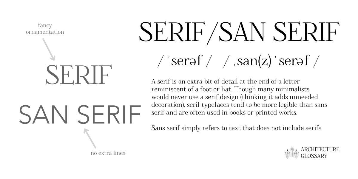
Serif/ Sans Serif
Drawings: Samantha Pires/My Modern Met
A serif is an extra bit of detail at the end of a letter reminiscent of a foot or hat. Though many minimalists would never use a serif design (thinking it adds unneeded decoration), serif typefaces tend to be more legible than sans serif and are often used in books or printed works.
Sans serif simply refers to text that does not include serifs.
Shade
Similar to how a tint of a color is created when white is added, shade is when black is added to a color which makes for a darker hue.
Style Guide/Branding Package
A style guide, manual of style, graphic standards, or branding package is a collection of standards for a project, company or individual. It may include fonts, colors, textures, logos, or any other design elements that represent an identity. Style guides ensure consistency across a set of works. For example, NASA has a Graphics Standards Manual that simplifies all official documents and graphic projects.
Swatch
In digital design, a swatch is a digital palette of colors and textures. It is useful to keep track of the elements used in a work.
Tint
Similar to how a tone of a color is created, tint is when white is added to a color which makes the hue lighter.
Tone
Similar to how a tint of a color is created, tone is when gray is added to a color which reduces the chroma of the hue.
Tracking
Tracking is a typography term that is very similar to another typography term on this list: kerning. Like kerning, it also refers to the spacing between letters, but it refers to the spacing between letters in an entire word. Also like kerning, designers have to be careful when messing with tracking because it could lead to legibility issues.
Triadic
Triadic colors are a trio of colors that are evenly spaced from each other on the color wheel. There is often a bit of hierarchy in the grouping of colors as one is used more often and the other two colors are used for contrast. For example: the trio of red, cyan, and green would be considered triadic colors.
Typeface
Typeface refers to a type design and includes all variations of that design. For example, Times New Roman is a famous typeface. The term typeface is often confused with the term font, which is also defined on this list.
Typography
Typography is another art form distinct from the more general graphic design. It is the art of all thing type, including the design of actual letters, their sizes, alignment, spacing, orientation, and everything else that turns dots and lines into legible text.
Vector
Vector graphics are made up of shapes, lines, curves, and other computer-made elements. Unlike raster images which are also defined on this list, vector-based graphics can be made as large as you want since they are not made up of pixels, but objects that can be used at any scale.
Weight
Weight is a term related to typography. It is the thickness of each letter of character in relation to the letter or character’s height. A particular typeface may come in a variety of weights including light, book, bold, and more.
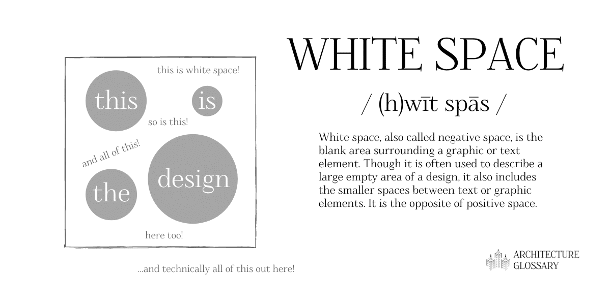
White Space
Drawings: Samantha Pires/My Modern Met
White space, also called negative space, is the blank area surrounding a graphic or text element. Though it is often used to describe a large empty area of a design, it also includes the smaller spaces between text or graphic elements. It is the opposite of positive space.
X-height
For x-height, the definition is pretty much right there in the name. For any font, the x-height refers to the height of the lowercase letter “x.” Though it may seem overly specific, it is important to understand because this dimension helps to define how legible the font is.