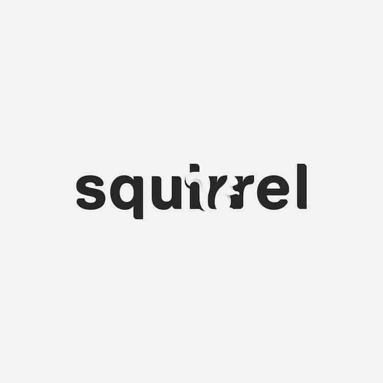
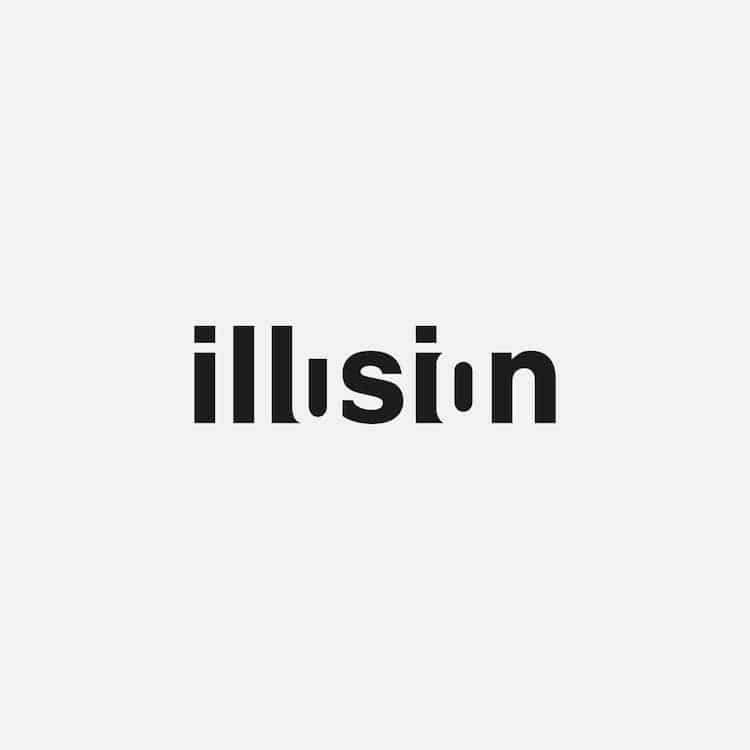
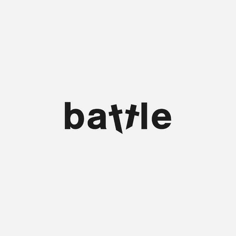
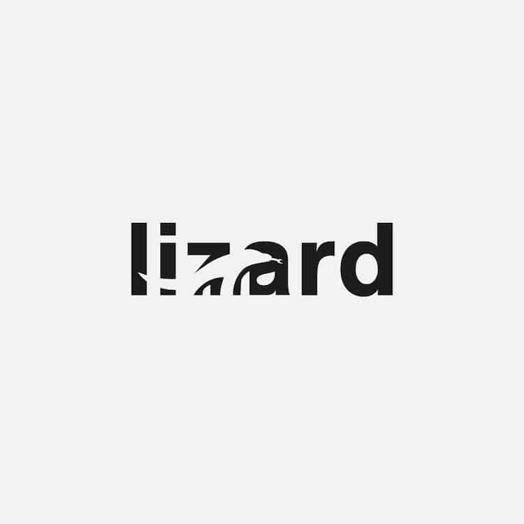
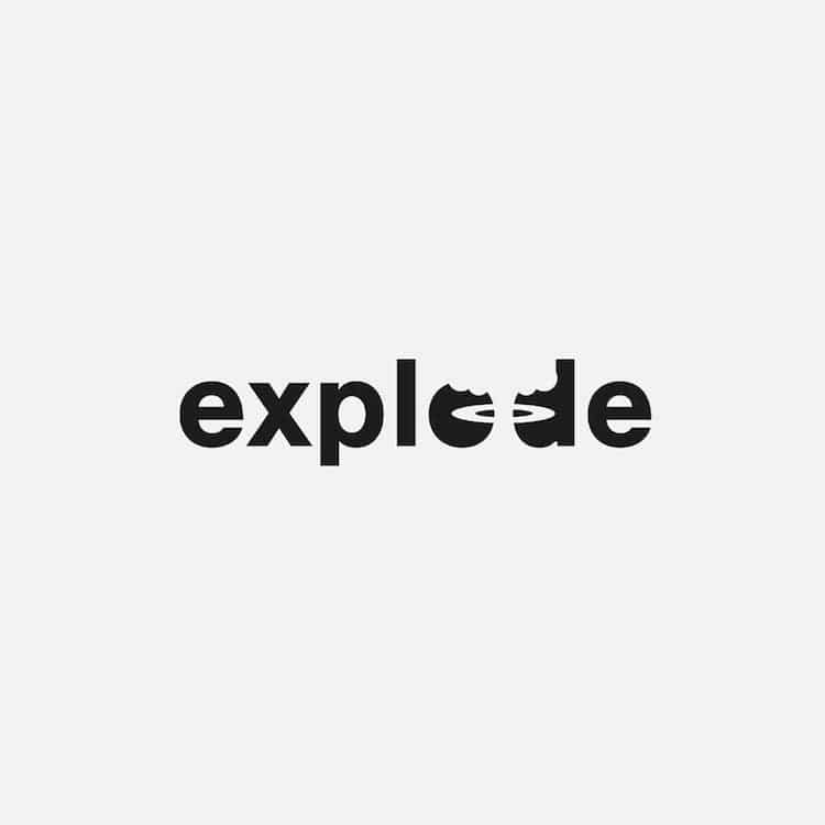
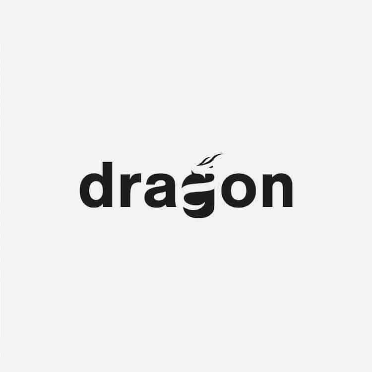
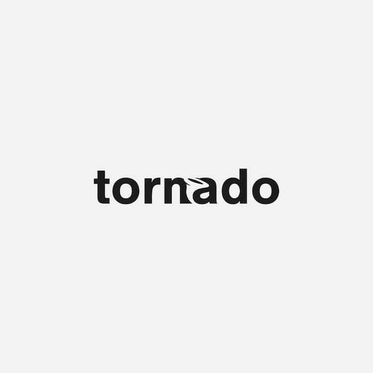
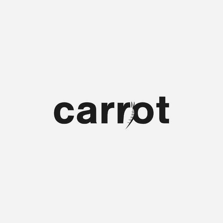
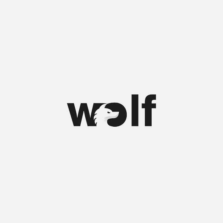
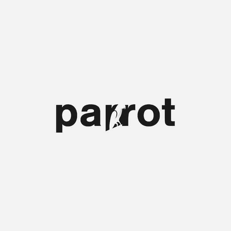
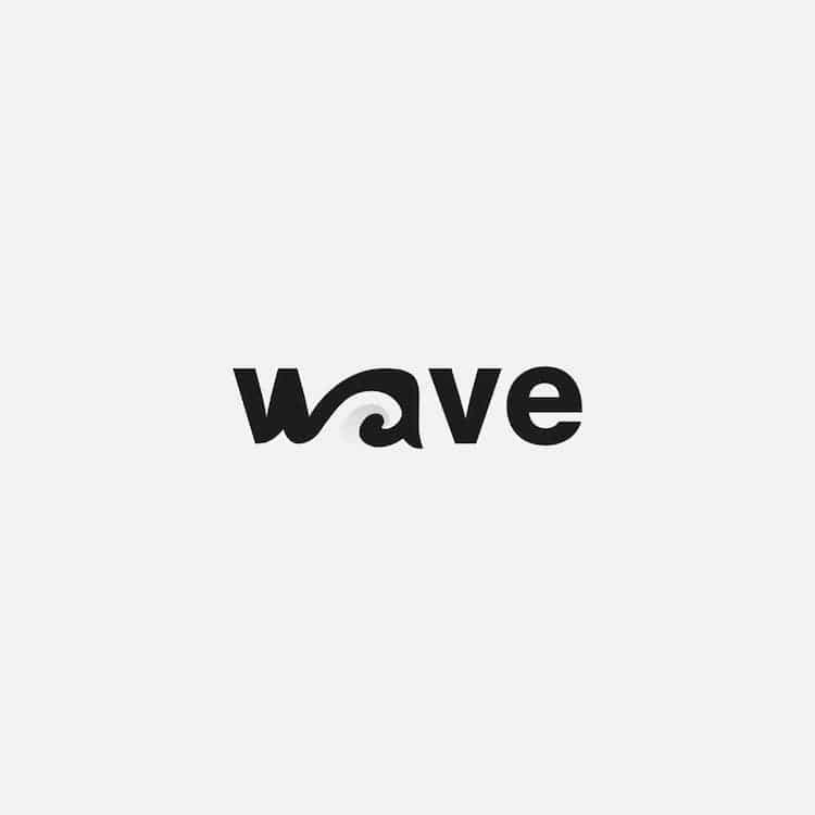
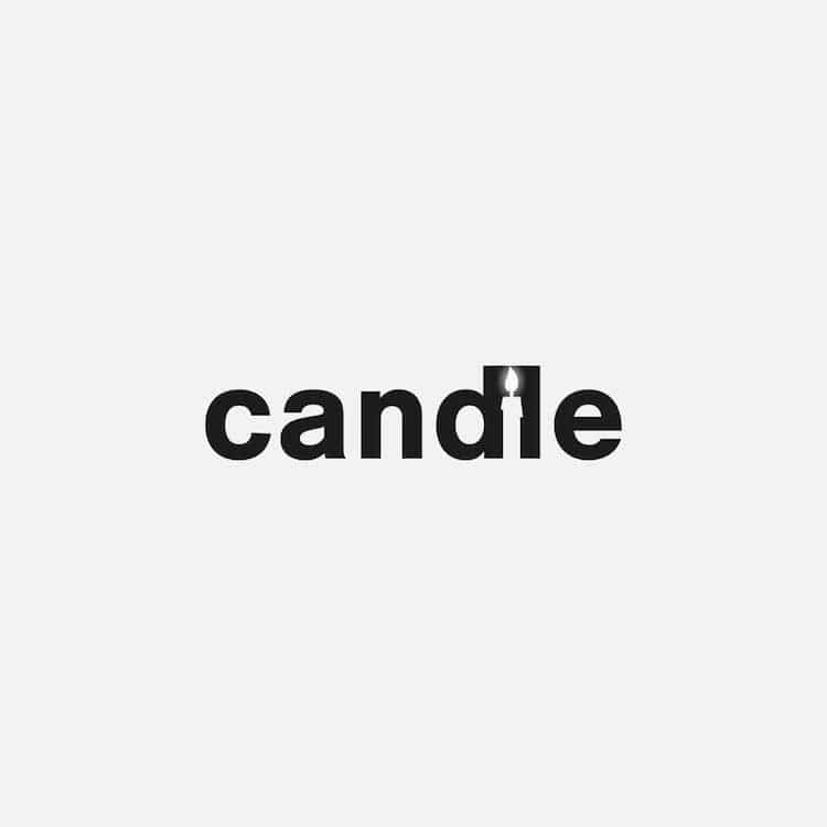
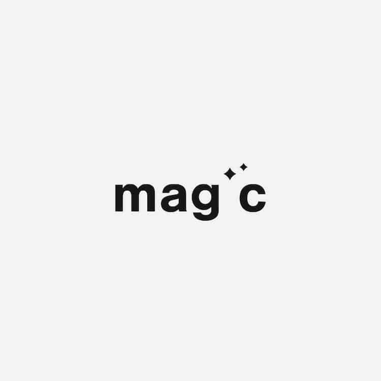
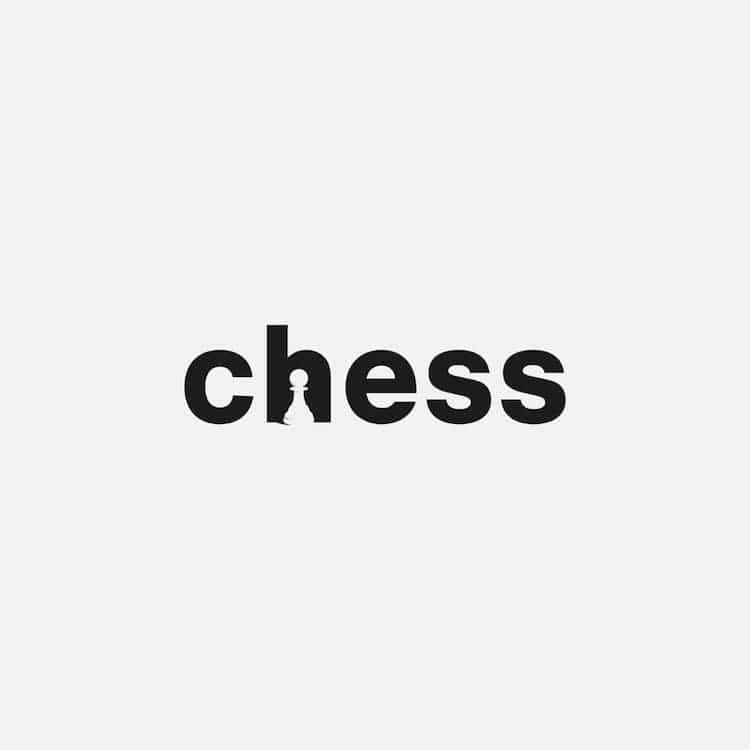
Netherlands-based graphic designer Sander Flink demonstrates the visual power of language in his striking wordmarks. These designs are a kind of logo that depends on typography rather than an abstract or pictorial mark. The relatively limited selection of letterforms must be used in a way that makes them memorable; Flink has chosen to do this through his clever use of negative space that illustrates the meaning of the word.
Flink's project began a way for him to generate new work while exploring his creativity. “It was initially the idea to combine the typography with a corresponding recognizable element but I soon started to challenge myself to do this in the negative space between letters,” the designer tells My Modern Met.
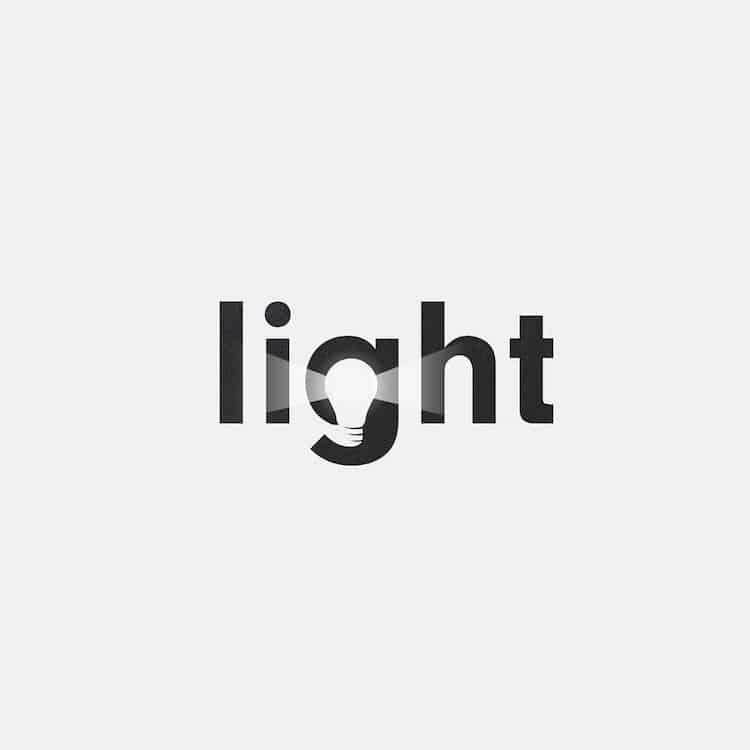
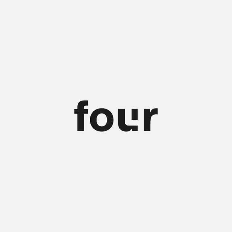
Experimentation is at the heart of Flink's creative process. “When I think a word has potential, I type it out in Adobe Illustrator and play with the white space until I arrive at something that visually works for me,” Flink explains. “The combination of letterforms in a word (together with the font used) helps determine the negative space.” He then manipulates the spaces in a way that defines the meaning of the text. The “g” in “light,” for instance, contains a bulb that illuminates the nearby letters. Likewise, the word “four” contains the number “4” inside the letters “u” and “r.” It is these minimalistic touches that elevate the arbitrary terms into striking designs.
Scroll down to see more wordmarks by Flink, and follow the artist on Instagram to keep up to date with his latest creations.
Graphic designer Sander Flink uses negative space within a word to illustrate its meaning.


Sander Flink: Instagram | Dribble
My Modern Met granted permission to feature photos by Sander Flink.
Related Articles:
Designer Reveals the Fonts Used in the Logos of the World’s Biggest Brands
Graphic Designer Reimagines Iconic Logos in the Age of Coronavirus
Logos of the World’s Biggest Brands Redesigned in the Bauhaus Style