View this post on Instagram
Whether you’re a visitor or a lifelong resident, you’re undoubtedly familiar with the iconic I ❤️ NY logo that’s emblazoned on t-shirts and throughout New York City. Now, a new campaign is taking a cue from this beloved emblem. The city has introduced a logo that looks similar to Milton Glaser’s 1977 creation: We ❤️ NYC. The ad campaign is meant to bring a sense of optimism to the city’s future and encourage residents to make a difference on their block and the metropolis at large.
“We’re hopefully going to be able to cut through divisiveness and negativity,” said Kathryn Wylde, the president and chief executive of Partnership for New York City, an association made up of corporations and business executives with the intent to advance New York City’s future. “We want to remind them we don’t have to maintain these divisions that have grown up between business and labor and rich and poor.”
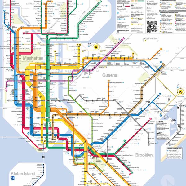
We ❤️ NYC has some familiar elements. The font is the same that’s used on NYC’s subway signs, and Glaser's 2D heart has been replaced with an emoji that has some dimensionality to it. The emoji heart, however, will be just one graphic element sandwiched between “We” and “NYC.” The creative team is planning on adding New York City-specific emoji. “We hope the identity system grows along with community spirit and optimism within the city,” explained designer Graham Clifford.
There have been obvious comparisons between Glaser’s I ❤️ NY logo and the new We ❤️ NYC. One of the biggest differences, as many see it, is the authenticity of the creation. Glaser famously sketched the logo on the back of an envelope while riding in a taxi cab. It had an air of spontaneity and simplicity that comes from the self-expression of one person. And for fans of the I ❤️ NY logo, that makes it utterly perfect. (The symbol has since become a trademarked logo that’s owned by the New York State Department of Economic Development.)
We ❤️ NYC, by contrast, has not found the same love. “Don't mess with perfection [of I ❤️ NY],” one Twitter reaction read. “The original looks like the voice of a city,” another tweeted. “The new one looks like the voice of an investment bank or possibly a healthcare provider.”
The Partnership for New York City has unveiled We ❤️ NYC, a campaign meant to bring a sense of optimism to the city’s future and encourage civic engagement. It uses a heart emoji which will eventually be swapped with other NYC-centric imagery.
View this post on Instagram
The campaign's logo brings obvious comparisons to the iconic I ❤️ NY logo, designed by Milton Glaser in 1977.
View this post on Instagram
Not everyone is feeling the love for We ❤️ NYC, though.
Live from the launch of @NYCMayor new “We ❤️ NYC” campaign. Kind of like the old logo but ok! pic.twitter.com/fjByqJLOAD
— Gwynne Hogan (@GwynneFitz) March 20, 2023
Don't mess with perfection. pic.twitter.com/LaVELlyGed
— The Bowery Boys Podcast (@BoweryBoys) March 20, 2023
The original looks like the voice of a city.
The new one looks like the voice of an investment bank or possibly a healthcare provider.
So…yeah, very 2023.
— Ben Stephens (@stephens_ben) March 20, 2023
We ❤️ NYC: Website | Instagram
h/t: [Gothamist]
Related Articles:
Self-Taught Violinist Becomes NYC Street Performer Wowing People With His Amazing Skills
Funny Artist Draws “Really Bad Portraits” of Strangers on the Street of NYC for $3
This NYC Instagram Shares the Free Items People Leave Outside Their Stoops


