Typography is primarily thought of by designers, but there are some typefaces so popular that they enter the larger cultural zeitgeist. Helvetica is one of those typefaces. Developed in 1957, it has become ubiquitous and can be found everywhere from labels on grocery store shelves to transportation to the logo of American Apparel.
Helvetica was not the first name for this now-iconic typeface. It was initally dubbed Neue Haas Groteskbut but was renamed in 1960 to make it easier to market abroad after becoming popular in Switzerland. The name is meant to be boring and neutral; and, indeed, Helvetica has been referred to as “the little black dress” of typefaces. Sure, it might not be the most exciting thing in a closet (or type collection), but it is versatile and can be worn at all types of events.
Interested to learn more about this typeface? Scroll down to understand the characteristics of Helvetica, its historical development, and why it remains so popular today.
What does Helvetica look like?
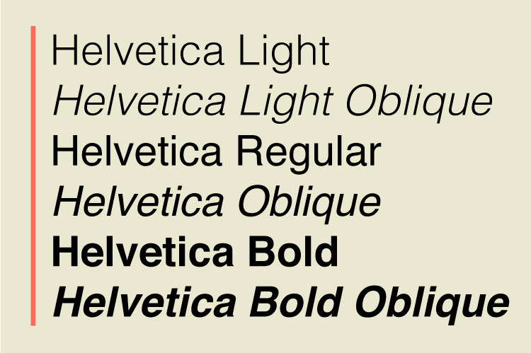
Photo: Sara Barnes / My Modern Met
Before delving into the specifics of Helvetica, it’s necessary to get some basic terminology out of the way. One common flub that people make when talking about typography is that they use “font” and “typeface” as interchangeable terms. This is not correct. A typeface refers to a type design and all of its variations. Helvetica is a typeface. Fonts, on the other hand, refer to those specific variations. Helvetica Bold 12pt is an example of a font. Another way to remember the distinction is that a typeface is like an album and a font is like a song on that album.
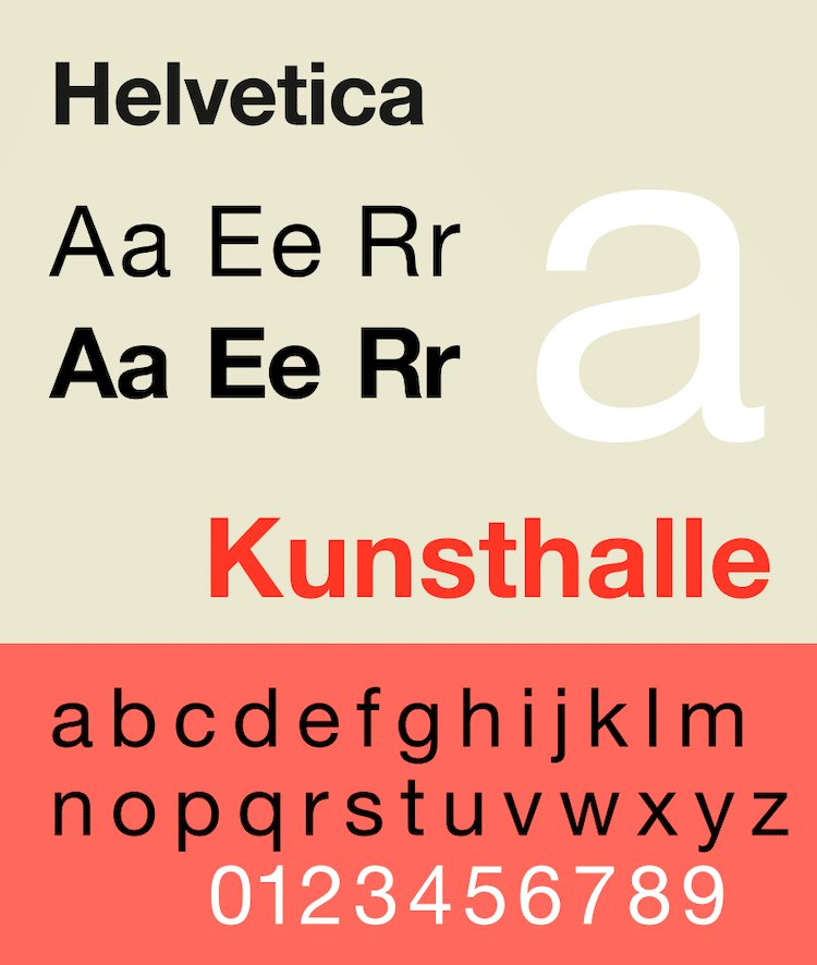
With those terms in mind, let’s discuss the characteristics of Helvetica. Helvetica is a Neo-Grotesque style typeface. Neo-Grotesque is a category of san-serif (typefaces without “feet” or “hats”) that began in the 1950s with the emergence of the International Typographic Style (also known as Swiss Style) that was created with an emphasis on simplicity—something that Helvetica embodies.
Characteristics of Helvetica
Here are the basic characteristics of Helvetica:
- The typeface has a high x-height, which refers to the height of its lowercase x.
- The capital letters have a wide width as well as a uniform one. You’ll notice that the letterform doesn’t taper throughout the character—it is all the same.
- The S is a square shape.
- Helvetica features tight apertures—the space between an open counter (including letters c, f, h, etc.) and the outside of the letter—make it challenging to read at small sizes.
- There is tight spacing between the letters for a dense appearance.
Developing Helvetica
Helvetica was not pulled out of thin air; it was inspired by an 1896 typeface called Akzidenz-Grotesk. It was conceived by Eduard Hoffmann and developed by Max Miedinger with input from Hoffmann at the Haas Type Foundry.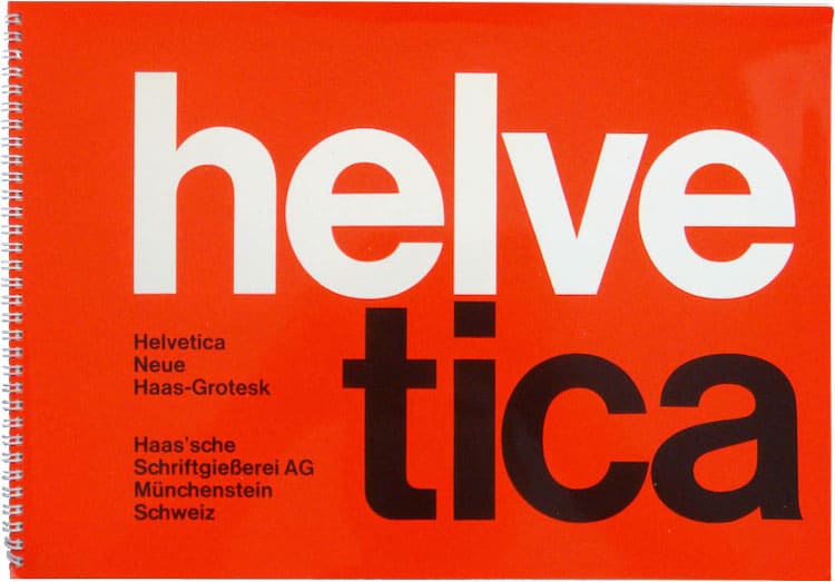
As the two worked on Helvetica, there was one word by which the typeface was judged: “Hamburgers.” Hoffmann knew that the word contained a complete range of characters that would help them evaluate the typeface’s quality. If “Hamburgers” was easy to read, Helvetica would achieve its goal.
Why is Helvetica everywhere?

Helvetica has remained stylish and relevant throughout the years, and it won’t be falling out of favor anytime soon. But while in vogue, it's also invisible. It isn't too distinctive, and that’s the point. Helvetica is easy to read without calling attention to itself, which is why it has been used in places like the New York City subway system for so long.
Ellen Lupton, curator of contemporary design at the Cooper-Hewitt, offers insight into its rise and longevity. “It provided something that designers wanted: a typeface apparently devoid of personality,” she explains. “In contrast, other popular sans serif typefaces that existed at the time, such as Gill Sans and Futura, have stronger voices and more distinctive geometries. Helvetica met our craving for corporate vanilla.”
If this sounds like a disparagement of Helvetica, you can look at it from the standpoint that design is not the same as art. Design solves a problem. And in scenarios where a typeface is needed to quickly and effortlessly convey information—while also offering variety (in font choices)—then it should be celebrated as a success.
To appreciate Helvetica’s indelible mark on our culture, check out the documentary Helvetica by Gary Hustwit. It was released in 2007 to coincide with typeface’s 50th anniversary and delves into many of the topics discussed here.
Related Articles:
Ingenious Device Can Capture and Identify Any Colors and Fonts in the Real World
8 of the Best Free Font Websites Offering Thousands of Stylish Typefaces
Designer Reveals the Fonts Used in the Logos of the World’s Biggest Brands


