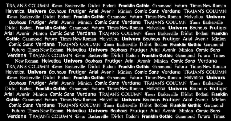
Typography is a design tool so universally used that almost everyone can name at least one typeface. Many creatives have strong opinions on typefaces and fonts, and some have strict rules on which they use and when.
Before we dive into some famous and historically important typefaces, there are two basic distinctions you should understand. Though often used interchangeably, “font” and “typeface” do not mean the same thing. Typeface refers to a type design and includes all variations of that design. For example, Times New Roman is a famous typeface. Fonts, however, refer to the variations possible with a typeface. For example, Times New Roman Bold or Times New Roman 10 pt (referring to the text size) are two different fonts.
Types of Typefaces
It is also important to know that there are three major kinds of typefaces. The first two categories are the most well-known: serif and sans serif. A serif is an extra bit of detail at the end of a letter reminiscent of a foot or hat. Though many minimalists would never use a serif design (thinking it adds unneeded decoration), serif typefaces tend to be more legible than sans serif and are often used in books or printed works. Sans serif simply refers to text that does not include serifs. The last category includes decorative typefaces that have other details purely for ornamentation. Some say that script is a fourth category while others claim it fits under decorative.
Why are there different fonts?
There is a need for a wide array of fonts, but you might be wondering why. French type designer Jean-Baptiste Levee explains that “building a good font collection is like populating one’s wardrobe. It requires a balance between versatility and expressivity… everyday accessories, and special outfits for special occasions.” Typography helps us convey ideas that we cannot directly express. Even if you are not a designer, sometimes a design choice can make you draw conclusions about a company, person, or piece of media. You may inherently know that a law firm would probably use a serif typeface, a fancy clothes store may use script, and that a fast-food brand would probably use a sans serif. These assumptions are based on common themes we see every day.
Influential Typefaces and Their Design History
Trajan's Column
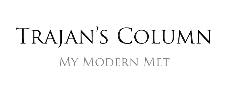
Though Trajan’s Column rarely gets much use in modern graphic design, it signifies an important style in history. It is considered the world’s oldest typeface as its design comes from the lettering carved into Trajan’s Column in Rome. The classic Roman square capitals are even older than that, as examples have been found dating as early as 43 BCE.
Despite its age, Roman Lettering has been used in public buildings and other architectural works that want to convey authority. During the Arts and Crafts movement of the 19th and 20th centuries, typeface designers pushed back against the minimalist modern designs and created fonts inspired by these Roman Letters. Typeface designer Carol Twombly adapted the historic typeface for Adobe in 1989.
Textura
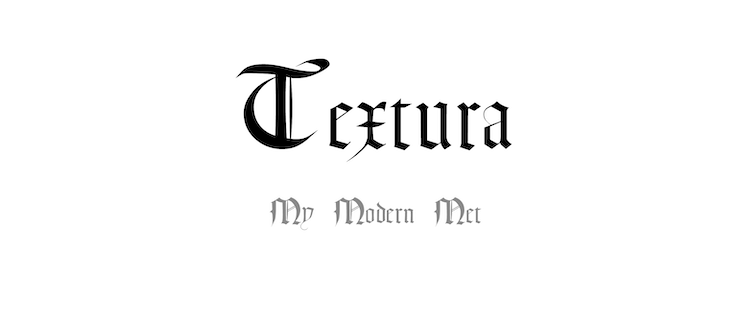
Textura is another digital typeface with a timestamp long before its digitization. It is one of four types of blackletter calligraphy, a lettering style that was extremely popular in medieval times. A full history of its influences and developments is difficult to define as some characteristics have remained the same since drawings of the Phonecian alphabet in 1200 BCE. It is sometimes described as gothic or the “Old English” typeface. Neither descriptions are correct as Old English refers to a language and gothic letters typically refer to the gothic alphabet. Other variations of Blackletter, like Fraktur, are considered child systems of this typeface.
Baskerville
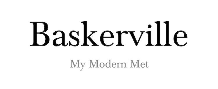
John Baskerville designed this typeface in the 1750s as a more modern and high-quality version of “old-style” typefaces. Baskerville wanted the typeface to help in his mission to improve the overall quality of book production. His letters were defined for legibility with more abrupt serifs and a greater difference between the thick and thin strokes of the letters. His original typefaces now exist as a range of legible serif fonts.
Didot
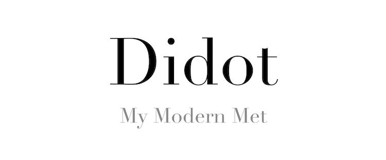
The Didot typeface is named after the printing Didot family. Firmin and Pierre Didot developed many variations of the style between 1784 and 1811. These designs, along with Bodoni, were the beginning of the Didone style of typefaces. Didot and other typefaces in the modern or Didone classification are designed for title or subheading text. The high contrast between thick and thin strokes in the letters makes it difficult to read in body text but creates an elegant composition when printed in a large size.
Bodoni
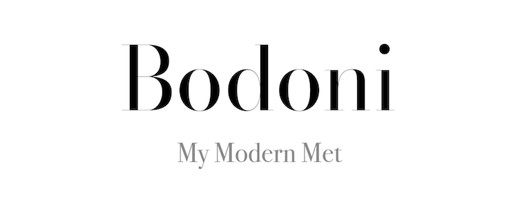
Giambattisa Bodoni designed the Bodoni typeface in 1798 but has since undergone many revisions. It is a popular typeface for movie posters and logos, including the famous “CK” for Calvin Klein. It may seem similar to Baskerville, an earlier serif typeface on this list. This is because Bodoni furtively agreed with Baskerville’s methods of increasing legibility through thicker vertical lines and drastically contrasting weights of opposing strokes. Legendary designer Massimo Vignelli, who famously preferred Helvetica, claims that “Bodoni is one of the most elegant typefaces ever designed.”
Franklin Gothic
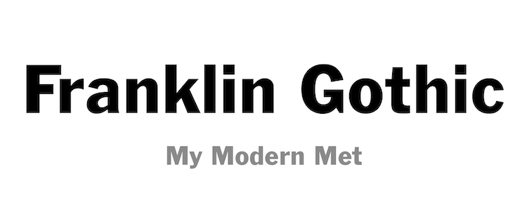
Franklin Gothic is a great example of a grotesque sans serif typeface. “Franklin” is in reference to Benjamin Franklin, while “gothic” used to refer to any sans serif typeface. Franklin Gothic was popular for simple and bold advertising and worked great as a header. It was briefly forgotten as more geometric typefaces like Futura came into fashion, but later was saved by the International Typeface Corporation which created new versions that inspired creatives. Today, the Franklin Gothic typeface family includes many variations, but all are united in their dynamic sizing and clean lettering.
Garamond
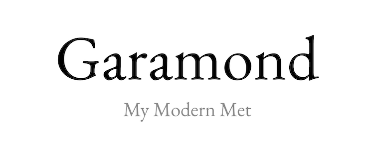
Garamond includes many typefaces based on the “old-style” typefaces. It is misleading to talk about Garamond as a single typeface because it refers to the design methods of Claude Garamond, a 16th-century French engraver. Revivals of the typeface in the 19th and 20th centuries modernized it for the digital age, allowing modern books to widely take advantage of the legible and clean serif typeface.
Futura
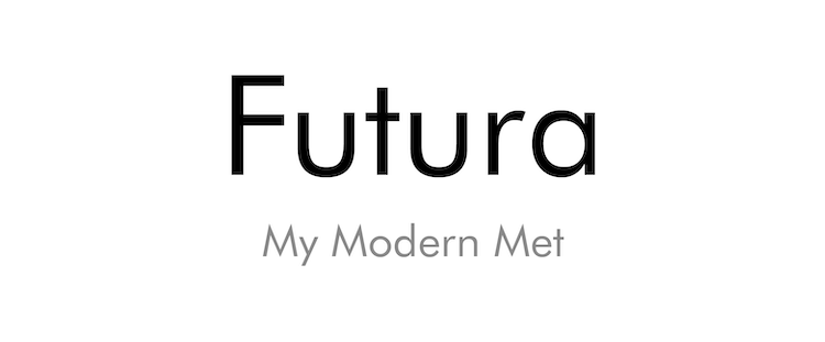
You may think that naming a font Futura is a bold move. Many fonts aimed to meet demands for futuristic and modern design sensibilities, but considering that this font has appeared everywhere from famous movie posters to a plaque on the moon, Futura may have earned its name. Like many other fonts on this list, Futura pushed back against the grotesque fonts of the day and established itself as a successful geometric sans serif. It was designed by Paul Renner in 1927 in accordance to trends of the International Style. This is why you may find some similarities between Futura and the Bauhaus font. Both were interested in creating a universal or “International” font.
Times New Roman
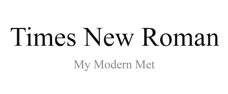
Times New Roman may be the most recognizable name on this list of influential fonts. Stanley Morrison, a well-known type designer, challenged the London Times for their bad design choices, claiming that their type was old-fashioned. The Times London then asked him to create a better alternative himself. The result was a font that is almost undeniably more legible. Times New Roman was more condensed and it had thicker vertical lines so that the words were darker and easier to distinguish. Morrison believed that his font was more economical since more text fit on a page and easier to read due to his subtle adjustment to line thickness. Considering its widespread use today, we can be sure that Morrison’s design was a success.
Helvetica
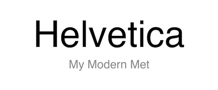
Legendary designer Massimo Vignelli once explained Helvetica’s versatility by claiming “You can say, ‘I love you,’ in Helvetica. And you can say it with Helvetica Extra Light if you want to be really fancy. Or you can say it with Extra Bold if it’s really intensive and passionate, you know, and it might work.”
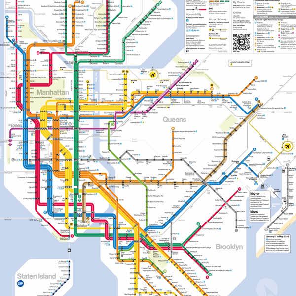
This may seem overly romantic for people not passionate about typography. However, Vignelli’s description of Helvetica must have some truth as the typeface is often considered the most popular typeface in the world. It was created in 1957 by designers Mac Meidinger and Eduard Hoffman at the Haas Type Foundry in Switzerland. The International Style was in need of a “poster child” typeface, and Helvetica met the demand. It did this not by being spectacularly different, but by being so simple that it could be used anywhere. Though it is still used everywhere today, one of its most famous uses is in the signage for the New York City subway system.
Univers

Univers was invented by Adrian Frutiger and released in 1957. Though it is important to include on this list for its popularity, the typeface is also influential because it pioneered a new idea in type design. Other typefaces included large differences in the lettering between fonts (variation of the typeface). Univers attempted to standardize many variations so that all elements stayed consistent and could be used in multiple ways. The typeface also acted as a pushback against the series of geometric typefaces that were popular just before Univers’ release.
Bauhaus
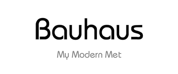
The Bauhaus was a German school at the center of the International Style. It attempted to standardize elements of design to help make them universal and accessible to everyone. The Bauhaus font was the attempt to create a universally good typeface. Bauhaus professor László Moholy-Nagy explains the Bauhaus stance on typography stating that it “must be communication in its most intense form. The emphasis must be on absolute clarity.”
The font most would recognize as the Bauhaus typeface came from years of art nouveau inspired serif typefaces. The one we know instead focused on geometry, simplifying letters to the core characteristics for legibility and function.
Frutiger
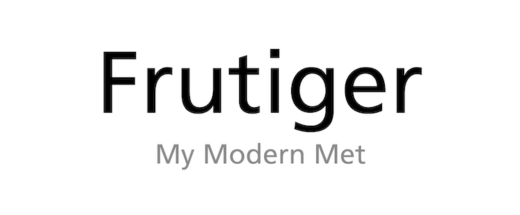
Frutiger is a humanist sans serif typeface designed for clarity and legibility. It is named for the famous Swiss designer Adrian Frutiger who created it and other typefaces on this list. It was derived from Frutiger’s earlier font Univers, but the designer was positive that this particular typeface was one of a kind and would find great success. He once wrote, “I felt I was on the right track with this grotesque; it was a truly novel typeface.” This pride was based on the belief that Frutiger lacked all unnecessary ornamentation.
Arial

Arial was designed by Robin Nicholas and Patricia Saunders and released in 1982 as a versatile and simple sans serif. Nicholas describes, “It was designed as a generic sans serif; almost a bland sans serif.” This simplicity helped it become widely used. Microsoft developed the font as an alternative to Helvetica and used it as one of the four main typefaces in Windows 3.1.
Avenir
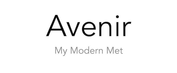
Avenir is a popular sans serif font among designers whose name is also the French word for “future.” Its creator, Adrian Frutiger, chose this name because of its modern and geometric qualities. These characteristics make it stylistically similar to Futura, but Avenir is far more adaptable; while Futura typically only works for headings and titles, Avenir is still legible as body text.
Minion
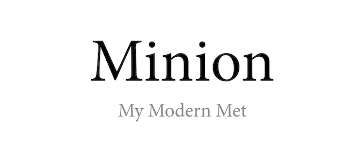
Minion was designed by Robert Slimbach and Carol Twombly for Adobe in 1990. The serif font was inspired by Renaissance lettering and classic text from early book printing. Since its simple serif makes it easily legible, Minion is very popular in modern book production as well. It was produced as part of Adobe Originals, a type design program that created a series of typefaces for a new technological age.
Comic Sans
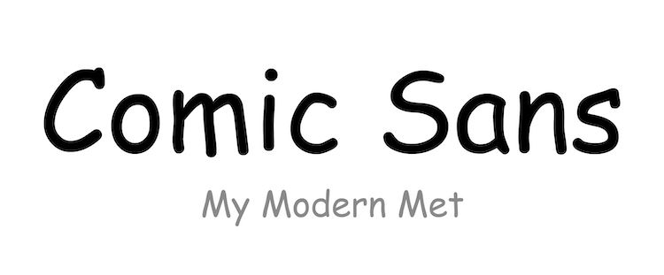
Comic Sans is almost as widely hated as it is known. As the name suggests, it was designed to mimic the text used in comic books by Vincent Connare in 1995. Despite all of the negativity from designers, he is still proud of his invention and thinks that the average person can appreciate its lighthearted fun.
Connare explains that the typeface was born out of necessity. While testing a beta version of the comic book software Microsoft Bob, he noticed that the cartoon dog had a speech bubble with Times New Roman text. The colorful cartoon was an odd contrast with the serious serif font, and Connare decided it was time for a design change. He has said, “My inspiration for Comic Sans came from the shock of seeing Times New Roman used so inappropriately.”
Verdana
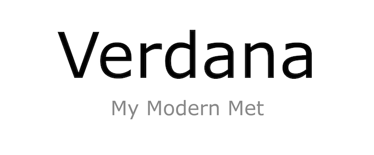
The inspiration for Verdana’s name comes from “verdant” (as used to describe lush grass) and “Ana” in honor of Ana Howlett—the daughter of Virginia Howlett, who worked with designer Matthew Carter to complete the typeface.
You may find similarities between Verdana and Frutiger, found earlier on this list. Both are examples of humanist fonts. The wide and simple letters are legible on computer screens, which is why Virginia Howlett suggested its creation.
All images created by Samantha Pires / My Modern Met.
Related Articles:
Ingenious Device Can Capture and Identify Any Colors and Fonts in the Real World
8 of the Best Free Font Websites Offering Thousands of Stylish Typefaces
NYC Parks Are Using a Designer’s ‘Tree Font’ to Plant Secret Messages with Real Trees
Designer Reveals the Fonts Used in the Logos of the World’s Biggest Brands


